0
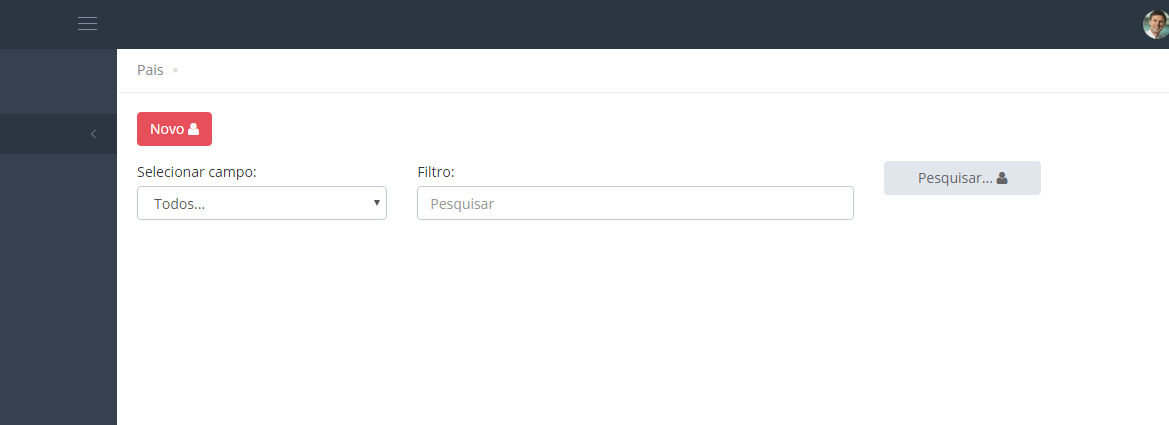
I’m having a hard time positioning components in css, in this project I’m using the bootstrap techniques to make a form, and as picture below I can’t leave the centered components right in a row when I place Abels on top of some components. I’m beginner and this and tried to fix with css but I could not, because as soon as the browsed is resized the responsiveness is wrong, follow images and code.
<style>

</style>

<!-- MENU -->
<div class="page-bar">
    <ul class="page-breadcrumb">
        <li>
            <a href="/Pais/Index"> Pais </a>
            <i class="fa fa-circle"></i>
        </li>
    </ul>
</div>
<!-- MENU -->
</br>

<div class="row">
    <!-- BOTAO NOVO -->
    <div class="form-group">
        <div class="col-md-1">
            <a href="javascript:;" class="btn red">
                Novo
                <i class="fa fa-user"></i>
            </a>
        </div>
    </div>
</div>

<div class="row">
    <form role="form">

        <!-- DROPDOWN CAMPOS PESQUISA -->
        <div class="form-group">
            <div class="col-md-3">
                <label for="dropdownColunasPesquisa" class="control-label"> Selecionar campo: </label>
                <select class="form-control" id="dropdownColunasPesquisa">
                    <option>Todos...</option>
                    <option>Handle</option>
                    <option>Descrição</option>
                    <option>Sigla</option>
                </select>
            </div>
        </div>

        <!-- TEXTBOX PESQUISA -->
        <div class="form-group" id="divTxtPesquisa">
            <div class="col-md-5">
                <label for="txtPesquisa" class="control-label"> Filtro: </label>
                <input type="text" class="form-control" placeholder="Pesquisar" id="txtPesquisa">
            </div>
        </div>

        <!-- BOTAO PESQUISAR -->
        <div class="form-group">
            <div class="col-md-2" id="divTeste">
                <button type="button" class="form-control btn default" id="btnPesquisar">
                    Pesquisar...
                    <i class="fa fa-user"></i>
                </button>
            </div>
        </div>

    </form>
</div>
try the padding-top on divTeste <!-- SEARCH BUTTON --> <div class="form-group"> <div class="col-Md-2" id="divTeste" style="padding-top:20px;">
– Marco Antonio Quintal
@Marcoantonioquintal, it even worked what you told me, but my question is a following, when I resize my navigated to the screen size of a mobile phone for example, this component will still assume this configuration, would take for certain size of it ? I just wanted to save it for when I go col-Md on the case.
– Nicola Bogar
Will work yes.
– Marco Antonio Quintal
I’ll put in the answer then
– Marco Antonio Quintal