How do you line up a div inside another div and put 100% size buttons at the end of the div?

Asked

Viewed 710 times

1

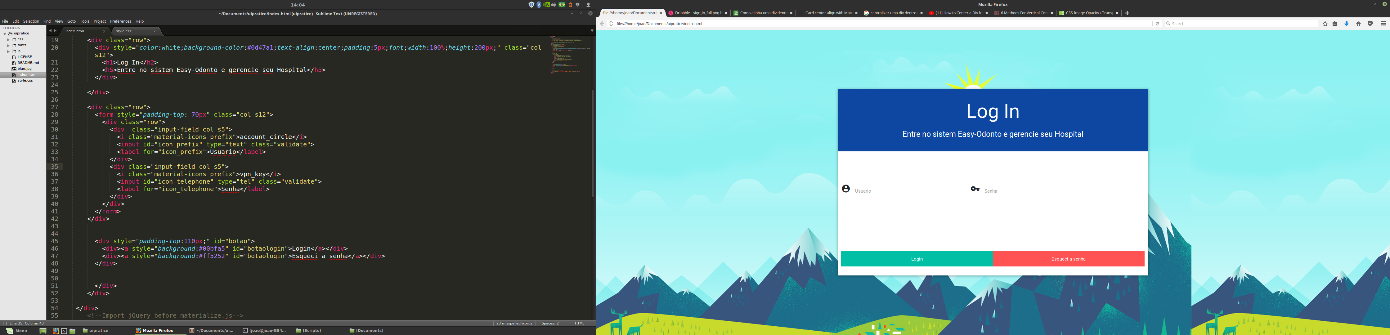
Hello. I am making a login screen and would like to center the forms and put the buttons login and forgot the password at the end of that white rectangle, like the title of the rectangle. I’m using materialize css and am beginner in html and css.

Print da tela de login

The code and the following

body{

	background-color:#44BBFF;
}

#logincard{
	background-color:white;
	height:600px;
	width:1000px;
	max-width:100%;
    max-height:100%;
    overflow:auto;
	 position:absolute; /*it can be fixed too*/
        left:0; right:0;
        top:0; bottom:0;
        margin:auto;
-webkit-box-shadow: 1px 1px 8px 1px rgba(0,0,0,0.31);
-moz-box-shadow: 1px 1px 8px 1px rgba(0,0,0,0.31);
box-shadow: 1px 1px 8px 1px rgba(0,0,0,0.31); 


}

#parent{
}

html, body{
  height: 100%;
}

#botaologin{
	width:50%;
	height:50px;
	color:white;
	padding: 15px 40px;
	text-align:center;
	float:left;

}

 #header {
    position: relative;
    min-height: 150px;
  }
  #header-content {
    position: absolute;
    bottom: 0;
    left: 0;
  }


#inner {
  display: table;
  width: 40%; /* Altere para o valor da largura desejada. */
}
<!DOCTYPE html>
  <html>
    <head>
      <!--Import Google Icon Font-->
      <link href="https://fonts.googleapis.com/icon?family=Material+Icons" rel="stylesheet">
      <!--Import materialize.css-->
      <link type="text/css" rel="stylesheet" href="css/materialize.min.css"  media="screen,projection"/>
      <link type="text/css" rel="stylesheet" href="style.css"  media="screen,projection"/>

      <!--Let browser know website is optimized for mobile-->
      <meta name="viewport" content="width=device-width, initial-scale=1.0"/>
    </head>

    <body style="background:url(blue.jpg);">
   <div  class="container"><!--Comeco tela login -->
      <div class="row col s12">
        <div class="col s12" id="logincard">

      <div class="row">
        <div style="color:white;background-color:#0d47a1;text-align:center;padding:5px;font;width:100%;height:200px;" class="col s12">
          <h1>Log In</h2>
          <h5>Entre no sistem Easy-Odonto e gerencie seu Hospital</h5>
        </div>
        
      </div>    

      <div class="row">
        <form style="padding-top: 70px" class="col s12">
          <div class="row">
            <div  class="input-field col s5">
              <i class="material-icons prefix">account_circle</i>
              <input id="icon_prefix" type="text" class="validate">
              <label for="icon_prefix">Usuario</label>
            </div>
            <div class="input-field col s5">
              <i class="material-icons prefix">vpn_key</i>
              <input id="icon_telephone" type="tel" class="validate">
              <label for="icon_telephone">Senha</label>
            </div>
          </div>
        </form>
      </div>    


        <div style="padding-top:110px;" id="botao">
          <div><a style="background:#00bfa5" id="botaologin">Login</a></div>
          <div><a style="background:#ff5252" id="botaologin">Esqueci a senha</a></div>
        </div>


        </div>
      </div>
     
   </div>
      <!--Import jQuery before materialize.js-->
      <script type="text/javascript" src="https://code.jquery.com/jquery-3.2.1.min.js"></script>
      <script type="text/javascript" src="js/materialize.min.js"></script>
    </body>
  </html>
        

2 answers

1

See if it helps:

#botaologin {
  width: 100%;
  color: white;
  text-align: center;
  padding: 20px;
}

In the div father of the buttons has been set to style:

display:flex;
justify-content:space-around;

See the result:

body {
  background-color: #44BBFF;
}

#logincard {
  background-color: white;
  height: 600px;
  width: 1000px;
  max-width: 100%;
  max-height: 100%;
  overflow: auto;
  position: absolute;
  /*it can be fixed too*/
  left: 0;
  right: 0;
  top: 0;
  bottom: 0;
  margin: auto;
  -webkit-box-shadow: 1px 1px 8px 1px rgba(0, 0, 0, 0.31);
  -moz-box-shadow: 1px 1px 8px 1px rgba(0, 0, 0, 0.31);
  box-shadow: 1px 1px 8px 1px rgba(0, 0, 0, 0.31);
}

#parent {}

html,
body {
  height: 100%;
}

#botaologin {
  width: 100%;
  color: white;
  text-align: center;
  padding: 20px;
}

#header {
  position: relative;
  min-height: 150px;
}

#header-content {
  position: absolute;
  bottom: 0;
  left: 0;
}

#inner {
  display: table;
  width: 40%;
  /* Altere para o valor da largura desejada. */
}
<!DOCTYPE html>
<html>

<head>
  <!--Import Google Icon Font-->
  <link href="https://fonts.googleapis.com/icon?family=Material+Icons" rel="stylesheet">
  <!--Import materialize.css-->
  <link type="text/css" rel="stylesheet" href="css/materialize.min.css" media="screen,projection" />
  <link type="text/css" rel="stylesheet" href="style.css" media="screen,projection" />

  <!--Let browser know website is optimized for mobile-->
  <meta name="viewport" content="width=device-width, initial-scale=1.0" />
</head>

<body style="background:url(blue.jpg);">
  <div class="container">
    <!--Comeco tela login -->
    <div class="row col s12">
      <div class="col s12" id="logincard">

        <div class="row">
          <div style="color:white;background-color:#0d47a1;text-align:center;padding:5px;font;width:100%;height:200px;" class="col s12">
            <h1>Log In</h2>
              <h5>Entre no sistem Easy-Odonto e gerencie seu Hospital</h5>
          </div>

        </div>

        <div class="row">
          <form style="padding-top: 70px" class="col s12">
            <div class="row">
              <div class="input-field col s5">
                <i class="material-icons prefix">account_circle</i>
                <input id="icon_prefix" type="text" class="validate">
                <label for="icon_prefix">Usuario</label>
              </div>
              <div class="input-field col s5">
                <i class="material-icons prefix">vpn_key</i>
                <input id="icon_telephone" type="tel" class="validate">
                <label for="icon_telephone">Senha</label>
              </div>
            </div>
          </form>
        </div>


        <div style="padding-top:110px; display:flex;
  justify-content:space-around;" id="botao">
          <div style="background:#00bfa5" id="botaologin"><a>Login</a></div>
          <div style="background:#ff5252" id="botaologin"><a>Esqueci a senha</a></div>
        </div>


      </div>
    </div>

  </div>
  <!--Import jQuery before materialize.js-->
  <script type="text/javascript" src="https://code.jquery.com/jquery-3.2.1.min.js"></script>
  <script type="text/javascript" src="js/materialize.min.js"></script>
</body>

</html>

  • I tried the resolution but unfortunately it did not work

  • I decided by setting the Forms as col S4 and placing col s2 on both sides with nothing.

0

I believe that if you use the bootstrap and use the GRID commands as col-Sm and col-Md you solve this quickly, what I could notice is that the division of your columns are 5, you need to separate better, take into account that the maximum is 12.

Browser other questions tagged

You are not signed in. Login or sign up in order to post.