0
Hello,
I have a responsive template installed in Wordpress, but the responsiveness on mobile phones this presenting a small right spacing. I tried to change the margins by css, but it had no effect. Strange is because in some responsiveness tests I do on some sites, mine does not present this inconsistency, is responsive correctly.
Site that made the tests responsive: http://www.codeorama.com/responsive/? u=lojaknek.com.br
By accessing my website and using the mobile tools of the Chrome browser you can see this inconsistency as shown below:

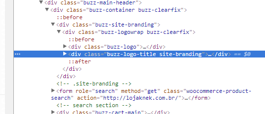
Ola Wander Lima, it was exactly this div that was hurting, with the display: None did not work, but I withdrew in code and everything worked out. I want to thank you so much for your attention and help me in this problem, all of good hugs.
– Jonatas Dutka