Resize Input Bootstrap in Inline Form

Asked

Viewed 581 times

1

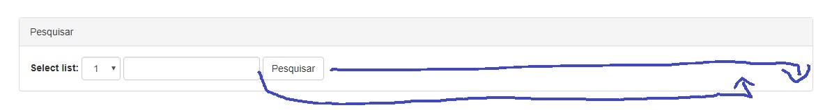
I have the following inline form, and would like to resize the input according to the design:

inserir a descrição da imagem aqui

Follows code:

<div class="row">
<div class="col-lg-12">
  <div class="panel panel-default">
    <div class="panel-heading">Pesquisar</div>
    <div class="panel-body">

      <form class="form-inline ">
        <div class="form-group">
          <div class="form-group">
            <label for="sel1">Select list:</label>
            <select class="form-control" id="sel1">
              <option>1</option>
              <option>2</option>
              <option>3</option>
              <option>4</option>
            </select>
          </div>
        </div>
        <input type="text" class="form-control" id="campoPesquisa">
        <button type="submit" class="btn btn-default">Pesquisar</button>
      </form>

    </div>
  </div>
</div>

I have tried to put inside a Row, outside the Row. Beginner doubt.

2 answers

1

Opa Brother, quiet ?

Well it has numerous forms, I’ll show you one that I use, that only you will use a Bootstrap class!

That would be Offsetting Columns!

It is important that you remember the concept of grid that is used in bootstrap, Bele ?

Your code would look like this:

<div class="row">
<div class="col-lg-12">
  <div class="panel panel-default">
    <div class="panel-heading">Pesquisar</div>
    <div class="panel-body">

      <form class="form-inline col-lg-offset-7">
        <div class="form-group">
          <div class="form-group">
            <label for="sel1">Select list:</label>
            <select class="form-control" id="sel1">
              <option>1</option>
              <option>2</option>
              <option>3</option>
              <option>4</option>
            </select>
          </div>
        </div>
        <input type="text" class="form-control" id="campoPesquisa">
        <button type="submit" class="btn btn-default">Pesquisar</button>
      </form>

    </div>
  </div>
</div> 

Note that within the form class, I placed the col-lg-offset-7, which would be basically a left margin through the grid, that is, this column jumps 7 blocks to the right side!

And the cool thing is that it keeps the project responsive!

As I said, there are numerous ways to do this, this is the one I like to use!

Edit: In case of resizing the input is also simple: Just add a class in the input and tinker with the width:

<input type="text" class="form-control input-custom"id="campoPesquisa">

and in css put something like this:

.input-custom {width:75%;}

And adjust the percentage according to your need

  • And there, thank you for the answer, but he shifted the content to the right. I had already moved it unintentionally, however I wanted to resize the intput to higher.

  • Sorry if I misunderstood, in case you want to increase the field of select ?

  • No, the input you’d like to resize.

  • I made an Edit, in my post commenting on the input, take a look and see if it helps you brother!

1

Old I managed to solve by dividing the width of each inline element and applying inline-block for the same. Remembering that, never let arrive at 100% otherwise it will automatically break line. !important is necessary because it superimposes the style of Bootstrap.

Remembering that the button is responsive IE, it gets big as you decrease or increase the screen.

.form-group label{
  width:15% !important;
  display:inline-block;
}

.form-group select{
  width:25% !important;
  display:inline-block;
}

.form-group input[type="text"]{
  width:35% !important;
  display:inline-block;
}

.form-group button[type="submit"]{
  width:20% !important;
  display:inline-block;
}

.form-group{

width:100%;

}
<script src="https://ajax.googleapis.com/ajax/libs/jquery/2.1.1/jquery.min.js"></script>
<!-- Latest compiled and minified CSS -->
<link rel="stylesheet" href="https://maxcdn.bootstrapcdn.com/bootstrap/3.3.7/css/bootstrap.min.css" integrity="sha384-BVYiiSIFeK1dGmJRAkycuHAHRg32OmUcww7on3RYdg4Va+PmSTsz/K68vbdEjh4u" crossorigin="anonymous">

<!-- Optional theme -->
<link rel="stylesheet" href="https://maxcdn.bootstrapcdn.com/bootstrap/3.3.7/css/bootstrap-theme.min.css" integrity="sha384-rHyoN1iRsVXV4nD0JutlnGaslCJuC7uwjduW9SVrLvRYooPp2bWYgmgJQIXwl/Sp" crossorigin="anonymous">

<!-- Latest compiled and minified JavaScript -->
<script src="https://maxcdn.bootstrapcdn.com/bootstrap/3.3.7/js/bootstrap.min.js" integrity="sha384-Tc5IQib027qvyjSMfHjOMaLkfuWVxZxUPnCJA7l2mCWNIpG9mGCD8wGNIcPD7Txa" crossorigin="anonymous"></script>

<div class="row">
<div class="col-lg-12">
  <div class="panel panel-default">
    <div class="panel-heading">Pesquisar</div>
    <div class="panel-body">
      <form class="form-inline ">
        <div class="form-group">
            <label for="sel1">Select list:</label>
            <select class="form-control" id="sel1">
              <option>1</option>
              <option>2</option>
              <option>3</option>
              <option>4</option>
            </select>
            <input type="text" class="form-control" id="campoPesquisa">
            <button type="submit" class="btn btn-default" >Pesquisar</button>
          </div>
      </form>

    </div>
  </div>
</div>

  • Ops noticed that in "full page" it does not resize, but tests in your code what I did, maybe it works because here I used the snippet.

  • Now the form-group was not in 100%

  • Man, thanks, it worked out pretty well. However the page is giant and packed that part and messed up the rest of the page.. kkkk.

  • Dude, do so remove the "col-Md-12 col-Xs-12" and put the "col-lg-12" as you had left, I was remove to see if that was it !

  • @Robss70 Ready, corrected see if this solves !

  • The research part worked, just a few adjustments of mine. However the rest of the page came out of formatting. I think it is because of the form-group classes.

  • May also !

  • It is that the form-group class it is not covering the whole form, then ends up only in half. I will try to solve without using form-group(width:100%)

  • Damn, man, I don’t know what else to do.

  • I face a lot of problems with bootstrap because it is something "pre-molded" is sometimes difficult to customize, but we are there, so I solve already send it to you.

Show 5 more comments

Browser other questions tagged

You are not signed in. Login or sign up in order to post.