How to progress steps using thread chart?

Asked

Viewed 964 times

6

I am developing a screen using the student’s progress, for example, he has 10 activities to complete, and is in activity 2, so this represents 20% of the total activity.

I’d like to represent that through a thread chart, a button for next exercise, something like that:

inserir a descrição da imagem aqui

As I click next, the progress bar moves to the right in order to complete the circle rotation, and the number inside rises from 1/7 to 2/7.

It would be very interesting to answer only in CSS and Javascript, or something like that.

Thank you

5 answers

7

I made this model using a circle on SVG bypass and dasharray to control the size of the contour, and css variable that I will switch with JS to make the outline in SVG grow by completing the graph every click.

About the circle made with SVG in this graphic form you can read more here: Draw circle in Html5

About CSS variables you can read more here: What does -- specified in bootstrap css :root mean?

inserir a descrição da imagem aqui

The total value of the circumference of dasharray is 255, So I divide 255 by 7 and have 36.42 which is the value of each step. In JS I’m doing this increment until the counter get at 7, at the same time I get the variable --size stated in the :root and I’m decreasing the fractions of 7.

Follow the image code above:

var btn1 = document.getElementById("button1");
var counters = document.querySelectorAll(".counter");
let root = document.documentElement;
var size = 36.42;

btn1.addEventListener("click", btn1Count);

function btn1Count(event) {
    let atual = parseInt(counters[0].innerHTML);
    
    if (atual == 7) return;

    counters[0].innerHTML = atual + 1;
    root.style.setProperty('--size', 255 + 36.42 - (size += 36.42));
}
.graph {
    text-align: center;
    width: 100px;
    height: 100px;
    line-height: 60px;
    text-transform: uppercase;
    font-family: sans-serif;
    text-decoration: none;
    font-size: 14px;
    position: relative;
    display: flex;
    justify-content: center;
    align-items: center;
}

svg {
    position: absolute;
    width: 100%;
    height: 100%;
    top: 0;
    left: 0;
    fill: transparent;
    stroke-width: 12px;
    stroke: #ddd;
}

:root {
    --size: 255;
}

.graph svg.cor {
    stroke: green;
    stroke-dasharray: 255;
    stroke-dashoffset: calc(var(--size) - 36.42);
    transform: rotate(-90deg);
    transform-origin: center;
}
<div class="graph">
    <svg>
        <circle cx="50" cy="50" r="40" />
    </svg>
    <svg class="cor">
        <circle cx="50" cy="50" r="40" />
    </svg>
    <span class="counter">1</span><span>/7</span>
</div>
<button id="button1">próxima</button>

  • 1

    Hugo, I really liked the way you exemplified, sometimes the total activities can change, but it’s easy to change that, congratulations !

  • 2

    @David was worth my dear! the advantage is that it has virtually nothing code compared to plugins and other libraries, so it is easier for you to keep track of what you have in your project etc... And yes, it’s very easy to edit etc, just as in JS in CSS you can create as many --var as you want and use where the number of tasks is different. [] s

4


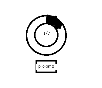
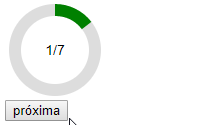
One suggestion is to create progress bars with Javascript and show the bars according to progress, proportional to the maximum steps, no use of libraries or jQuery, with pure Javascript.

The code pulls the value of the div to determine the number of steps. For example, if the div has the text 1/7, the code pulls the 7:

HTML:

<div>1/7</div>

JS:

var maximo = +prog.textContent.trim().split("/")[1]; // 7

That is, you don’t need to change anything in CSS or code, because the value of the steps is automatically captured according to the text in the div.

As the button Next is clicked, increasing the steps and showing proportionally the progress bars.

I will leave 3 examples with different values:

Example with 7 steps:

document.addEventListener("DOMContentLoaded", function(){
   
   const p_ = document.getElementById("progresso");
   var b_ = '';
   for(let x=0; x < 360; x++){
      b_ += '<span style="transform: rotate('+x+'deg);"></span>';
   }
   p_.innerHTML += b_;
   
   var prog = document.querySelector("#progresso div");
   var maximo = +prog.textContent.trim().split("/")[1];
   var atual = 1;
   var bar_step = Math.floor(360/maximo);
   var bars = document.querySelectorAll("#progresso span");

   function passos(atual){
      var limit = atual == maximo ? bars.length : atual*bar_step;
      
      prog.innerHTML = atual + "/" + maximo;
      for(let b = 0; b < limit; b++){
         bars[b].style.display = "inline-block";
      }
   }
   passos(atual);
   
   document.getElementById("next").onclick = function(){
      if(atual < maximo){
         atual++;
         passos(atual);
      }
   }
   
});
#progresso, #progresso div{
   width: 100px;
   height: 100px;
   border: 2px solid #000;
   border-radius: 50%;
   background: #fff;
   display: flex;
   justify-content: center;
   align-items: center;
   position: relative;
}

#progresso div{
   position: absolute;
   width: 60%;
   height: 60%;
   z-index: 1;
}

#progresso span{
   display: inline-block;
   width: 2px;
   height: 50%;
   background: red;
   position: absolute;
   left: 50%;
   margin-left: -1px;
   top: 0;
   transform-origin: bottom;
   display: none;
}
<div id="progresso">
   <div>1/7</div>
</div>
<br>
<button id="next">Próximo</button>

Example with 3 steps:

document.addEventListener("DOMContentLoaded", function(){
   
   const p_ = document.getElementById("progresso");
   var b_ = '';
   for(let x=0; x < 360; x++){
      b_ += '<span style="transform: rotate('+x+'deg);"></span>';
   }
   p_.innerHTML += b_;
   
   var prog = document.querySelector("#progresso div");
   var maximo = +prog.textContent.trim().split("/")[1];
   var atual = 1;
   var bar_step = Math.floor(360/maximo);
   var bars = document.querySelectorAll("#progresso span");

   function passos(atual){
      var limit = atual == maximo ? bars.length : atual*bar_step;
      
      prog.innerHTML = atual + "/" + maximo;
      for(let b = 0; b < limit; b++){
         bars[b].style.display = "inline-block";
      }
   }
   passos(atual);
   
   document.getElementById("next").onclick = function(){
      if(atual < maximo){
         atual++;
         passos(atual);
      }
   }
   
});
#progresso, #progresso div{
   width: 100px;
   height: 100px;
   border: 2px solid #000;
   border-radius: 50%;
   background: #fff;
   display: flex;
   justify-content: center;
   align-items: center;
   position: relative;
}

#progresso div{
   position: absolute;
   width: 60%;
   height: 60%;
   z-index: 1;
}

#progresso span{
   display: inline-block;
   width: 2px;
   height: 50%;
   background: red;
   position: absolute;
   left: 50%;
   margin-left: -1px;
   top: 0;
   transform-origin: bottom;
   display: none;
}
<div id="progresso">
   <div>1/3</div>
</div>
<br>
<button id="next">Próximo</button>

Example with 5 steps:

document.addEventListener("DOMContentLoaded", function(){
   
   const p_ = document.getElementById("progresso");
   var b_ = '';
   for(let x=0; x < 360; x++){
      b_ += '<span style="transform: rotate('+x+'deg);"></span>';
   }
   p_.innerHTML += b_;
   
   var prog = document.querySelector("#progresso div");
   var maximo = +prog.textContent.trim().split("/")[1];
   var atual = 1;
   var bar_step = Math.floor(360/maximo);
   var bars = document.querySelectorAll("#progresso span");

   function passos(atual){
      var limit = atual == maximo ? bars.length : atual*bar_step;
      
      prog.innerHTML = atual + "/" + maximo;
      for(let b = 0; b < limit; b++){
         bars[b].style.display = "inline-block";
      }
   }
   passos(atual);
   
   document.getElementById("next").onclick = function(){
      if(atual < maximo){
         atual++;
         passos(atual);
      }
   }
   
});
#progresso, #progresso div{
   width: 100px;
   height: 100px;
   border: 2px solid #000;
   border-radius: 50%;
   background: #fff;
   display: flex;
   justify-content: center;
   align-items: center;
   position: relative;
}

#progresso div{
   position: absolute;
   width: 60%;
   height: 60%;
   z-index: 1;
}

#progresso span{
   display: inline-block;
   width: 2px;
   height: 50%;
   background: red;
   position: absolute;
   left: 50%;
   margin-left: -1px;
   top: 0;
   transform-origin: bottom;
   display: none;
}
<div id="progresso">
   <div>1/5</div>
</div>
<br>
<button id="next">Próximo</button>

  • 2

    That’s right production, we have here pure javascript and CSS <3 got fucked @Sam, congratulations !

  • 2

    So you can’t compete

  • 1

    @hugocsl rsrs.. is we!

2

There are several javascript libraries that can help you in this situation, I’ll leave two examples, one with a javascript library and the other with css only. Follow:

Percircle

With it you can manipulate values more simply, making jumps dynamic and with ajax implementations to save students' progress. Github for future reference

$(document).ready(function() {
  $("#fif").percircle({
    percent: 30,
    text: "30"
  });
  $('#pular').click(function(e) {
    e.preventDefault();
    mudar();
  });
});

function mudar() {
  $("#fif").percircle({
    text: "50",
    percent: 50,
    progressBarColor: "#1ec0b0"
  });
}
<script src="https://cdnjs.cloudflare.com/ajax/libs/jquery/2.2.4/jquery.min.js"></script>
<script src="https://thodorisbais.github.io/percircle/dist/js/percircle.js"></script>
<link rel="stylesheet" href="https://thodorisbais.github.io/percircle/dist/css/percircle.css">
<div id="fif" class="pink big center"></div>
<div class="col" style="text-align:center"><button id="pular">Pular para 50</button></div>

Example in CSS, simpler but also extensible. Github for future reference

.progress {
  width: 150px!important;
  height: 150px!important;
  line-height: 150px;
  background: none;
  margin: 0 auto;
  box-shadow: none;
  position: relative;
}

.progress:after {
  content: "";
  width: 100%;
  height: 100%;
  border-radius: 50%;
  border: 12px solid #fff;
  position: absolute;
  top: 0;
  left: 0;
}

.progress>span {
  width: 50%;
  height: 100%;
  overflow: hidden;
  position: absolute;
  top: 0;
  z-index: 1;
}

.progress .progress-left {
  left: 0;
}

.progress .progress-bar {
  width: 100%;
  height: 100%;
  background: none;
  border-width: 12px;
  border-style: solid;
  position: absolute;
  top: 0;
}

.progress .progress-left .progress-bar {
  left: 100%;
  border-top-right-radius: 80px;
  border-bottom-right-radius: 80px;
  border-left: 0;
  -webkit-transform-origin: center left;
  transform-origin: center left;
}

.progress .progress-right {
  right: 0;
}

.progress .progress-right .progress-bar {
  left: -100%;
  border-top-left-radius: 80px;
  border-bottom-left-radius: 80px;
  border-right: 0;
  -webkit-transform-origin: center right;
  transform-origin: center right;
  animation: loading-1 1.8s linear forwards;
}

.progress .progress-value {
  width: 90%;
  height: 90%;
  border-radius: 50%;
  background: #44484b;
  font-size: 24px;
  color: #fff;
  line-height: 135px;
  text-align: center;
  position: absolute;
  top: 5%;
  left: 5%;
}

.progress.blue .progress-bar {
  border-color: #049dff;
}

.progress.blue .progress-left .progress-bar {
  animation: loading-2 1.5s linear forwards 1.8s;
}

.progress.yellow .progress-bar {
  border-color: #fdba04;
}

.progress.yellow .progress-left .progress-bar {
  animation: loading-3 1s linear forwards 1.8s;
}

.progress.pink .progress-bar {
  border-color: #ed687c;
}

.progress.pink .progress-left .progress-bar {
  animation: loading-4 0.4s linear forwards 1.8s;
}

.progress.green .progress-bar {
  border-color: #1abc9c;
}

.progress.green .progress-left .progress-bar {
  animation: loading-5 1.2s linear forwards 1.8s;
}

@keyframes loading-1 {
  0% {
    -webkit-transform: rotate(0deg);
    transform: rotate(0deg);
  }
  100% {
    -webkit-transform: rotate(180deg);
    transform: rotate(180deg);
  }
}

@keyframes loading-2 {
  0% {
    -webkit-transform: rotate(0deg);
    transform: rotate(0deg);
  }
  100% {
    -webkit-transform: rotate(144deg);
    transform: rotate(144deg);
  }
}

@keyframes loading-3 {
  0% {
    -webkit-transform: rotate(0deg);
    transform: rotate(0deg);
  }
  100% {
    -webkit-transform: rotate(90deg);
    transform: rotate(90deg);
  }
}

@keyframes loading-4 {
  0% {
    -webkit-transform: rotate(0deg);
    transform: rotate(0deg);
  }
  100% {
    -webkit-transform: rotate(36deg);
    transform: rotate(36deg);
  }
}

@keyframes loading-5 {
  0% {
    -webkit-transform: rotate(0deg);
    transform: rotate(0deg);
  }
  100% {
    -webkit-transform: rotate(126deg);
    transform: rotate(126deg);
  }
}

@media only screen and (max-width: 990px) {
  .progress {
    margin-bottom: 20px;
  }
}
<link href="http://maxcdn.bootstrapcdn.com/bootstrap/3.3.0/css/bootstrap.min.css" rel="stylesheet" />
<div class="container">
  <div class="row">
    <div class="col-md-3 col-sm-6">
      <div class="progress blue">
        <span class="progress-left">
          <span class="progress-bar"></span>
        </span>
        <span class="progress-right">
          <span class="progress-bar"></span>
        </span>
        <div class="progress-value">90%</div>
      </div>
    </div>
    <div class="col-md-3 col-sm-6">
      <div class="progress yellow">
        <span class="progress-left">
          <span class="progress-bar"></span>
        </span>
        <span class="progress-right">
          <span class="progress-bar"></span>
        </span>
        <div class="progress-value">75%</div>
      </div>
    </div>
  </div>
</div>

2

When I needed to use a counter so I used the Circliful. It is a jQuery plugin very easy to use and customize, has about 20 attributes to change if you want and it works very well.

The only difficulty I found in it was that every time I wanted to change the quantity inside the circle (to go from 1 to 2 for example as you said), Oce needs to empty the div containing the circliful element and generating again with the new number. Half gambiarra but it works.

$("#test-circle5").circliful({
    animationStep: 5,
    foregroundBorderWidth: 5,
    backgroundBorderWidth: 15,
    percent: 80,
    halfCircle: 1,
});

An example of use.

  • The problem is that I need to insert more text in, and instead of % having the step values, but thank you

1

You can try using the Highcharts, is the most complete library today and vastly customizable. I remember having customized things inside a Chart once, but it was in bars, I believe it is possible with graphics in this format too.

Another nice, simple library is Progresscircle.js. With him I think you could do this customization.

var progresso = 0;
var texto = "";

function addProgress() {
  progresso += 0.25;
  if (progresso === 0.25) {
      texto = "1/4";
  } else if (progresso === 0.50) {
      texto = "2/4";
  } else if (progresso === 0.75){
      texto = "3/4";
  } else if (progresso === 1) {
      texto = "4/4";
}
};

var myCanvas = document.getElementById('my_canvas');

var circle = new ProgressCircle({
    canvas: myCanvas,
    minRadius: 30
});

circle.addEntry({
    fillColor: 'rgba(152, 155, 225, 1)',
    progressListener: function() {
        return progresso;
    },
    infoListener: function() {return texto;},
}); 

circle.start(33);
<script src="//qiao.github.io/ProgressCircle.js/ProgressCircle.min.js"></script>
<canvas id="my_canvas" width="400" height="160"></canvas>

<button onClick="addProgress()">
Add Progresso
</button>

  • Don’t you think this should be a comment!?

  • No, answer is answer.

  • Only one link is not answer according to the site. But now that you edited turned reply

  • It was expected to generate some traces inside the circle when it passes 4/4?

  • Yes, it was supposed to have a limiter, but then it’s up to whoever uses it

Browser other questions tagged

You are not signed in. Login or sign up in order to post.