0
Hello,
I have a Carousel on my site that is the basis to show my products, it works well on pc (shows 4 images in sequence) and tablet (shows 2 images in sequence) but on mobile we have a problem, the vertical position shows 1 image and so far is correct, but when I switched to the horizontal position I wanted to show 2 images. In order to show 2 images I entered the bootstrap.css file and changed the percentage of col-Xs-12 when it is in the cell in portrait position, according to the code below:
/* Landscape */
@media only screen

  and (min-device-width: 375px)

  and (max-device-width: 667px)

  and (-webkit-min-device-pixel-ratio: 2)

  and (orientation: landscape) {

      .col-xs-12 {

          width: 50%;

      }

}
This is my JS code:
$('.carousel[data-type="multi"] .item').each(function()

{

    var next = $(this).next();
    if (!next.length) {
      next = $(this).siblings(':first');
    }
    next.children(':first-child').clone().appendTo($(this));

    for (var i=0;i<2;i++) {
      next=next.next();
      if (!next.length) {
          next = $(this).siblings(':first');
      }

      next.children(':first-child').clone().appendTo($(this));
    }
});
What I would like to happen is this: Computer - 4 Entries - OK Tablet Vertical - 2 Items - OK Tablet Portrait - 4 Items - OK Mobile Vertical - 1 Item - OK Cell phone Portrait - 2 Items - Does Not Work
In the portrait cell, is showing an image and the side of it is a white space with the same size, as if to show but for some detail does not show.
My HTML:
<div id="osascogastronomia1" class="carousel slide" data-type="multi" data-interval="false" data-ride="osascogastronomia1">
                        <div class="carousel-inner">
                            <?php
                            while ($slides->have_posts()) : $slides->the_post();
                                $index1++
                                ?>
                                <?php if ($index1 == 1): ?>
                                    <div class="item active">
                                    <?php else: ?>
                                        <div class="item">
                                        <?php endif; ?>
                                        <div class="col-xs-12 col-sm-6 col-md-3 col-lg-3">
                                            <a href="<?= the_permalink(); ?>">
                                            <div class="darker">
                                                <div class="inserirDarker">
                                                    <?php the_post_thumbnail(); ?>
                                                </div>
                                            </div>
                                            <div class="carousel-caption">
                                                    <h5 style="color: white"><strong><?php the_title(); ?></strong></h5>
                                            </div>
                                            </a>
                                        </div>
                                    </div>
                                <?php endwhile; ?>
                            <?php endif; ?>
                        </div>
                        <div>
                            <a class="left carousel-control" href="#osascogastronomia1" role="button" data-slide="prev">
                                <div class="setaEsquerda"></div>
                                <!--<span class="glyphicon glyphicon-chevron-left" aria-hidden="true"></span>-->
                                <!--<span class="sr-only">Previous</span>-->
                            </a>
                            <a class="right carousel-control" href="#osascogastronomia1" role="button" data-slide="next">
                                <div class="setaDireita"></div>
<!--                                <span class="glyphicon glyphicon-chevron-right" aria-hidden="true"></span>
                                <span class="sr-only">Next</span>-->
                            </a>
                        </div>
                        <!--Fim Carousel Inner-->
                    </div>
                    </div>
Could someone help me with this detail?
Stay that way on mobile, to the right is an empty space.
So the problem is that any of the solutions that you’ve gone through keeps coming up only one image and where you should show the second one is a blank space. I don’t know what to do to bring that image here.
– Tiago Miguel Pereira
Po man, there’s no way to climb up somewhere just to take a little look at how it’s getting?
– user86267
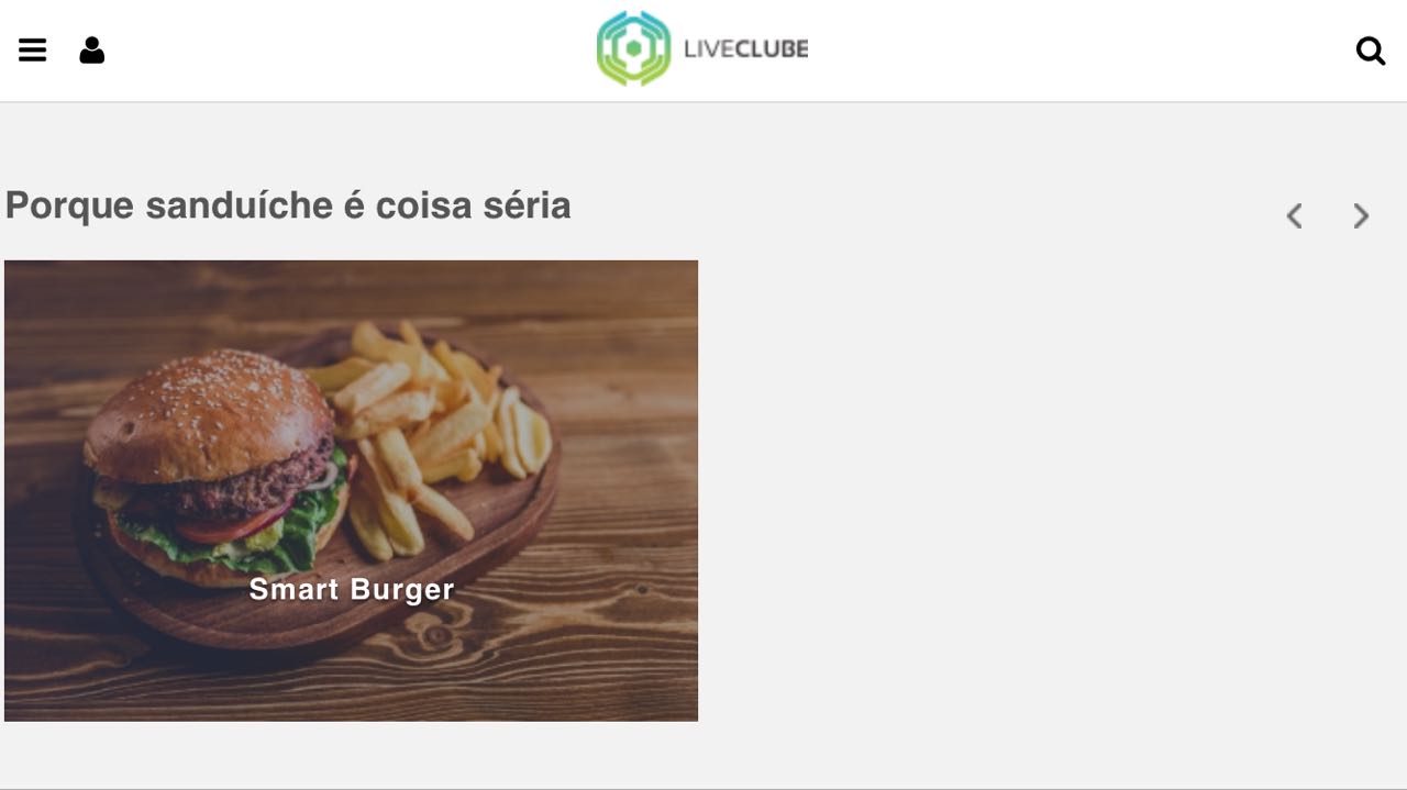
Hello kenmf, thanks for the help!! I didn’t answer before as I ended up disabling the Carousel for the mobile. I developed Carousel thinking about the PC and it is working very well, then I will do all the media querys to work on any PC screen. But I believe that the best solution for Cellular and tablet is to create a differentiated Carousel for them, what do you think? The page follows with the link with Carousel: http://app.liveclube.com/sao-paulo-sp/gastronomy
– Tiago Miguel Pereira