0
Hello,
I’m using freamework Materialize to create an administrative panel for a system I’m creating in PHP, but I know very little about front-end. I would like help to adjust the leftbar to fit across the screen if there is not enough content for this.
I tried applying position Fixed or Absolute in CSS and it kind of works, but there are some problems like: pagecontent ignores the leftbar and is overlaid and also in case the screen is small, the leftbar does not display the scroll bar. I know I’m doing it the wrong way and that’s why I’d like your help.
I put the project code in Jsfiddle for ease: https://jsfiddle.net/88ctckn2/5/
@Edit
I’ll explain again, I guess I wasn’t clear enough earlier.
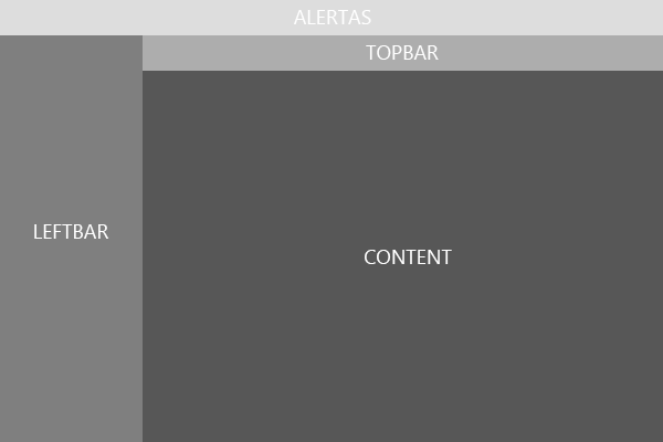
If you compare the image below with the project in Jsfiddle, you will see that it is very similar. The difference is that the leftbar does not occupy all the space on the screen in terms of height (height). It only occupies the size that its content allows it to occupy. If you add more content, it gets bigger. I wanted it to look like the image below, from the beginning to the end of the screen.
I think I’m still not clear enough, but just compare the project in Jsfiddle and the image below and you’ll see the differences. I want it to look like the image below.
https://jsfiddle.net/88ctckn2/5/
Thank you!
Clay, I understood little of your doubt and when I opened the fiddle I understood even less.. Try to simulate an image of the problem and how you want it to look because the way it looks I find it difficult to get any answer.
– Bsalvo
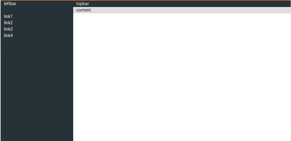
@I updated the question and added an image of how I want it to look. Thank you!
– Clayderson Ferreira