0
I am adjusting the mobile version of a page, using the bootstrap I defined my Divs with the classes col-Md-4 (desktop version) col-Xs-6 (mobile version). In the desktop version is working normal with three columns as accurate, already in the mobile version (of two columns) the Divs are being put on by each other.
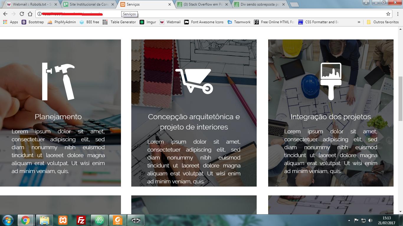

The code goes something like this:
.blocos
          {
            width: 100%;
            height: 100%;
            .icone
            {
              margin-top: 20%;
              @media screen and (max-width: $smartphone)
              {
                width: 80px;
                display: block;
                float: none;
                margin-left: auto;
                margin-right: auto;
                margin-top: 0;
                img
                {
                  margin-top: 30%;
                }
              }
            }
.col-xs-6
          {
            @media screen and (max-width: $smartphone)
            {
              height: 200px;
              margin-top: 0;
              margin-bottom: 15px;
              top: 0;
            }
          }
          .col-md-4
          {
            background-position: top center;
            background-repeat: no-repeat;
            background-size: cover;
            height: 500px;
            margin-top: 30px;
            max-width: 425px;
            @media screen and (max-width: $smartphone)
            {
              height: 200px;
            }
          }
          .middle
          {
            margin-left: 35px;
            @media screen and (max-width: $smartphone)
            {
              margin-left: 0;
            }
          }
          .right
          {
            float:right;
            @media screen and (max-width: $smartphone)
            {
              float: none;
            }
          }
<div class="row blocos">
<div class="col-md-4 col-xs-6">
<!--Conteudo.....-->
</div>
<div class="col-md-4 col-xs-6">
<!--Conteudo.....-->
</div>
<div class="col-md-4 col-xs-6">
<!--Conteudo.....-->
</div>
<div class="col-md-4 col-xs-6">
<!--Conteudo.....-->
</div>
</div>
stay tuned to flexbox compatibility, for me it is the best layout development method, but leaves something to be desired in compatibility, so I use it along with angular material that provides them as directives without worrying about prefixing between browsers
– Felipe Duarte