2
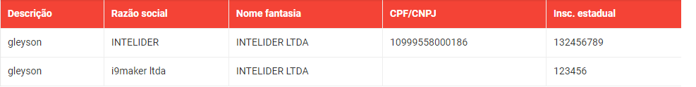
I have an html table:
When I resize the page to a smaller resolution I would like it to be only 2 columns and when I return for a larger resolution I will have the 5 columns. Bootstrap. Could be in javascript too.
2
I have an html table:
When I resize the page to a smaller resolution I would like it to be only 2 columns and when I return for a larger resolution I will have the 5 columns. Bootstrap. Could be in javascript too.
4
There are bootstrap classes for this behavior. In your case, I suggest combining the classes .visible-md-block and .visible-lg-block, add them to the elements you want to hide in a resolution in the smallest.
Follow the list of classes and their respective behaviors: Bootstrap - Responsive Utilities.
The classes
.visible-xs,.visible-sm,.visible-md, and.visible-lgare obsolete from the version 3.2.0.
Or you can use media queries for this, I advise creating a new class and working on it, avoiding conflicts with bootstrap:
@media screen and (max-width:768px){
  .classe-nova{
     display:none;
   }
}
1
You really wanted to do it with bootstrap or JavaScript? Only with CSS pure you can do it. Follow example:
@media screen and (max-width: 442px) {
  table th:nth-child(3) {
    display: none;
  }
}
@media screen and (max-width: 442px) {
  table th:nth-child(4) {
    display: none;
  }
}
@media screen and (max-width: 442px) {
  table th:nth-child(5) {
    display: none;
  }
}
@media screen and (min-width: 442px) {
  table td:nth-child(3) {
     display: inline;
  }
}
@media screen and (min-width: 442px) {
  table td:nth-child(4) {
    display: inline;
  }
}
@media screen and (min-width: 442px) {
  table td:nth-child(5) {
     display: inline;
  }
}
<table>
<td>
Coluna 1
</td>
<td>
Coluna 2
</td>
<td>
Coluna 3
</td>
<td>
Coluna 4
</td>
<td>
Coluna 5
</td>
</table>In this example, when the screen resolution is less than or equal to 442px width, the last 3 columns will be hidden, and when the resolution is greater than 442px the last 3 columns will be displayed.
Follow also example using Javascript:
$( window ).resize(function() {
var largura = $(window).width();
if (largura < 442){
$('table td:nth-child(3)').css("display", "none");
$('table td:nth-child(4)').css("display", "none");
$('table td:nth-child(5)').css("display", "none");
}
else{
$('table td:nth-child(3)').css("display", "inline");
$('table td:nth-child(4)').css("display", "inline");
$('table td:nth-child(5)').css("display", "inline");
}
});<script src="https://ajax.googleapis.com/ajax/libs/jquery/3.2.1/jquery.min.js"></script>
<table>
  <td>
    Coluna 1
  </td>
  <td>
    Coluna 2
  </td>
  <td>
    Coluna 3
  </td>
  <td>
    Coluna 4
  </td>
  <td>
    Coluna 5
  </td>
</table>Browser other questions tagged javascript bootstrap
You are not signed in. Login or sign up in order to post.
Just a note on the use of the word: «depreciated» in English is «depreciated» and not «deprecated». The word «deprecated» that would be correct to refer to this would be translated as «obsolete», «disapproved», «censured»
– Guilherme Nascimento