Non-responsive footer

Asked

Viewed 273 times

1

inserir a descrição da imagem aquiinserir a descrição da imagem aqui
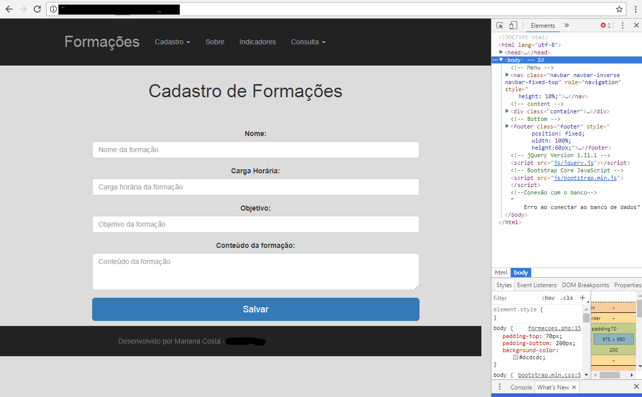
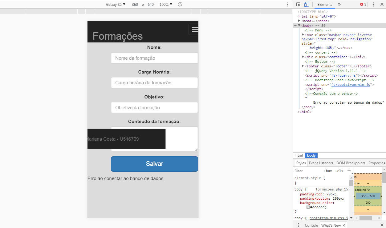
I’m making a responsive web system using some bootstrap elements. The whole system is responsive except for the footer that in addition to leaving the fixed position at the bottom of the screen still decreases the size.

Follow the html and css code of the footer:

<footer class="footer">
            <div class="container">
                <span class="text-muted" style="
                    position: absolute;
                    bottom: 0;
                    width: 120%;
                    height: 60px;
                    line-height: 60px;
                    background-color: #222222;
                    margin-left: -214px;
                    text-align: center;">
                    <font>
                        <font> Desenvolvido por ****** - *****</font>
                    </font>
                </span>
            </div>
        </footer> 

Note: HTML and CSS are together to prevent headaches.

  • Why the style is in span and not in footer?

  • It was generated by that google editor that appears when you press Ctrl+shift+i, I just kept.

  • Is it like this in the project or just in the question? If so in the project try to move this style to the footer.

  • I commented a photo with the project.

3 answers

1

Good morning Mariana, so from what I understand of your code you want a responsive and fixed footer at the bottom of the correct page? try to put the style properties: width: 100%, height: 60px, position: Fixed; all in the footer tag.

  • So, apparently there’s some grid at the bottom preventing the footer from getting down.

  • It is even fixed, but in the middle of the screen.

  • has the possibility of you putting in codepen or some similar?

  • I’ll put a photo of the result.

1

I took the position Absolute, the margin, gave a width: 100% and added a float left, so it is responsive on any device:

       <footer class="footer">
            <div class="container">
                <span class="text-muted" style="
                    width: 100%;
                    height: 60px;
                    line-height: 60px;
                    background-color: #222222;
                    text-align: center;
                    float: left;
                    ">
                    <font>
                        <font> Desenvolvido por ****** - *****</font>
                    </font>
                </span>
            </div>
        </footer>
  • It was on top of a possible invisible grid. I’ll put the full code, maybe it’ll help.

0

I MANAGED TO SOLVE THE PROBLEM.

<footer class="footer" style="
        position: fixed;
        width: 100%;
        height:60px;">
        <div class="container-flex rodape">
            <span class="text-muted" style="
                position: fixed;
                bottom: 0;
                width: 120%;
                height: 60px;
                line-height: 60px;
                background-color: #222222;
                margin-left: -214px;
                text-align: center;">
                <font>
                    <font> Desenvolvido por ****** - *******</font>
                </font>
            </span>
        </div>
    </footer>

I only traded Absolute for Fixed in position style within span.

  • But the footer should stay fixed on the screen scroll or fixed only at the bottom of the page?

  • 1

    Worse, well remembered. Then ignore this answer that is wrong. The footer should be fixed at the bottom of the page.

  • I’ll run some tests and get back to you.

  • Okay, thank you.

Browser other questions tagged

You are not signed in. Login or sign up in order to post.