Hide text when it does not fit inside the div

Asked

Viewed 3,465 times

1

Well I have a div with the following class c-txt, note that when the text does not fit inside it, the text is summarized with three points (...).

I need to do this with the div txt to avoid breaking the buttons.

Someone knows how to do it?

I tried to do so:

.container-footer .txt {
    float: left;
    margin-top: 15px;
    display: inline-block;
    white-space: nowrap;
   overflow: hidden !important;
   text-overflow: ellipsis;
}

But the 3 points do not appear. Follow my code.

An alternative could be to use jQuery?

.container {
    left: 0;
    right: 0;
    margin: 10px auto 10px auto;
    width: 95%;
    border-radius: 4px;
    background: #FFFFFF;
}
.container table {
    width: 100%;
    margin: 0 auto;
}
.container .linha {
    border-top: 1px solid #D7D7D7;
}
.container-head {
    width: 100%;
    color: #FFFFFF;
    border-radius: 4px 4px 0 0;
    height: 65px;
    background: #000;
    line-height: 65px;
    display: flex;
}
.container-head .c-ico {
    width: 5%;
    min-width: 60px;
}
.container-head .c-ico .material-icons {
    padding: 20px;
}
.container-head .c-txt {
    width: 75%;
    display: inline-block;
    white-space: nowrap;
    overflow: hidden !important;
    text-overflow: ellipsis;
}
.container-head .c-bt {
    width: 20%;
    min-width: 140px;
}
.container-head .c-bt button {
    margin-top: 12px;
    margin-right: 20px;
    border: 0;
    width: 100px;
    height: 42px;
    cursor: pointer;
    border-radius: 4px;
    color: #FFFFFF;
    float: right;
}
.container-head .c-menu {
    width: 20%;
    min-width: 100px;
}
.container-head .c-menu .overflow-menu {
    z-index: 1;
    margin-top: 20px;
    max-width: 24px;
    float: right;
    margin-right: 40px;
}
.container-head .c-menu .overflow-menu ul {
    margin-top: -5px;
}
.container-body {
    padding: 20px;
}
.container-body .notification {
    margin-left: -20px;
    margin-right: -20px;
}
.container-body .row {
    margin-left: 0px;
    margin-right: 0px;
}
.container-body .tab-content {
    margin-left: -15px;
    margin-right: -15px;
}
.container-body .tabs {
    margin-left: -20px;
    margin-right: -20px;
}
.container-body-scroll {
    overflow: auto;
    height: 319px;
    text-align: left;
}
.container-footer {
    border-top: 1px solid #D7D7D7;
    height: 50px;
    padding-left: 10px;
    padding-right: 10px;
}
.container-footer button {
    margin-top: 7px;
    border: 0;
    height: 35px;
    min-width: 36px;
    cursor: pointer;
    border-radius: 4px;
    color: #FFFFFF;
    float: right;
}
.container-footer .txt {
    float: left;
    margin-top: 15px;
    
}
/* Mobile */
@media only screen and (max-width: 900px) {

    .container.w50 {
        width: 80%;
    }
}
@media only screen and (max-width: 600px) {

    .container.w50 {
        width: 95%;
    }
}
<!-- Container Button -->
        <div class="container">

            <!-- Container Head -->
            <div class="container-head">
                <div class="c-ico"></div>
                <div class="c-txt">TÍTULO CONTAINER BUTTON orem ipsum dolor sit amet, consectetur adipiscing elit. Vestibulum gravida et elit et mattis. </div>
                <div class="c-bt">
                    <button type='submit'>FINALIZAR</button>
                </div>
            </div>
            <!-- Container Footer -->
            <div class="container-footer">
                <div class="txt">
                    TEXTO 1 orem ipsum dolor sit amet, consectetur adipiscing elit. Vestibulum gravida et elit et mattis. orem ipsum dolor sit.
                </div>
                <button type='button'>OK</button>
            </div>
            <div class="container-footer">
                <div class="txt">
                    TEXTO 1
                </div>
                <button type='button' class="bg-green-2-houve">OK</button>
            </div>
            <div class="container-footer">
                <div class="txt">
                    TEXTO 1
                </div>
                <button type='button' class="bg-red-2-houve">OK</button>
            </div>
            <div class="container-footer">
                <div class="txt">
                    TEXTO 1
                </div>
                <button type='button' class="bg-blue-2-houve">OK</button>
            </div>
            <div class="container-footer">
                <div class="txt">
                    TEXTO 1
                </div>
                <button type='button' class="bg-yellow-2-houve">OK</button>
            </div>
        </div>

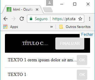
  • @Guilhermenascimento this possible duplicate does not address the root of the problem. The author of the question already makes use of text-overflow: Ellipsis; The solution, is to emphasize the use of white-space: nowrap; together, what in no post this was said.

  • @Leocaracciolo both responses show the use of white-space: nowrap;, if it is to emphasize every detail that people forget would have to reopen about 10,000 closed questions and just for the record the question has not been closed, maybe it is not dup even, so it is written "possible duplicate".

  • @Guilhermenascimento, without this white-space: nowrap; the text-overflow: Ellipsis does not work at all, this detail, I believe, could never be forgotten! I will even stress this in my reply

3 answers

1

Modified stretch :

.container-footer . txt{

white-space: nowrap;

overflow: Hidden;

text-overflow: Ellipsis;

}

No white-space: nowrap; which is the property that defines the behavior of line breaks, the property text-overflow: Ellipsis does not work. white-space: nowrap - don’t let line break at all.

This CSS property text-overflow: ellipsis; does not force a burst to occur. For this to happen, it is necessary that the author uses some additional properties in the element, such as setting the overflow property to Hidden. Read more here

I also had to change the top margin of the button to margin-top: -26px;

.container {
left: 0;
right: 0;
margin: 10px auto 10px auto;
width: 95%;
border-radius: 4px;
background: #FFFFFF;
}
.container table {
width: 100%;
margin: 0 auto;
}
.container .linha {
border-top: 1px solid #D7D7D7;
}
.container-head {
width: 100%;
color: #FFFFFF;
border-radius: 4px 4px 0 0;
height: 65px;
background: #000;
line-height: 65px;
display: flex;
}
.container-head .c-ico {
width: 5%;
min-width: 60px;
}
.container-head .c-ico .material-icons {
padding: 20px;
}
.container-head .c-txt {
width: 75%;
display: inline-block;
white-space: nowrap;
overflow: hidden !important;
text-overflow: ellipsis;
}
.container-head .c-bt {
width: 20%;
min-width: 140px;
}
.container-head .c-bt button {
margin-top: 12px;
margin-right: 20px;
border: 0;
width: 100px;
height: 42px;
cursor: pointer;
border-radius: 4px;
color: #FFFFFF;
float: right;
}
.container-head .c-menu {
width: 20%;
min-width: 100px;
}
.container-head .c-menu .overflow-menu {
z-index: 1;
margin-top: 20px;
max-width: 24px;
float: right;
margin-right: 40px;
}
.container-head .c-menu .overflow-menu ul {
margin-top: -5px;
}
.container-body {
padding: 20px;
}
.container-body .notification {
margin-left: -20px;
margin-right: -20px;
}
.container-body .row {
margin-left: 0px;
margin-right: 0px;
}
.container-body .tab-content {
margin-left: -15px;
margin-right: -15px;
}
.container-body .tabs {
margin-left: -20px;
margin-right: -20px;
}
.container-body-scroll {
overflow: auto;
height: 319px;
text-align: left;
}
.container-footer {
border-top: 1px solid #D7D7D7;
height: 50px;
padding-left: 10px;
padding-right: 10px;
}
.container-footer button {
margin-top: -26px;
border: 0;
height: 35px;
min-width: 36px;
cursor: pointer;
border-radius: 4px;
color: #FFFFFF;
float: right;
}

.container-footer .txt{
white-space: nowrap; 
overflow: hidden;
text-overflow: ellipsis; 
margin-top: 15px;
width: 90%;
}

/* Mobile */
@media only screen and (max-width: 900px) {

.container.w50 {
    width: 80%;
}
}
@media only screen and (max-width: 600px) {

.container.w50 {
    width: 95%;
}
}
 <div class="container">

            <!-- Container Head -->
            <div class="container-head">
                <div class="c-ico"></div>
                <div class="c-txt">TÍTULO CONTAINER BUTTON orem ipsum dolor sit amet, consectetur adipiscing elit. Vestibulum gravida et elit et mattis. </div>
                <div class="c-bt">
                    <button type='submit'>FINALIZAR</button>
                </div>
            </div>
            <!-- Container Footer -->
            <div class="container-footer">
                <div class="txt">
                    TEXTO 1 orem ipsum dolor sit amet, consectetur adipiscing elit. Vestibulum gravida et elit et mattis. orem ipsum dolor sit.
                </div>
                <button type='button'>OK</button>
            </div>
            <div class="container-footer">
                <div class="txt">
                    TEXTO 1
                </div>
                <button type='button' class="bg-green-2-houve">OK</button>
            </div>
            <div class="container-footer">
                <div class="txt">
                    TEXTO 1
                </div>
                <button type='button' class="bg-red-2-houve">OK</button>
            </div>
            <div class="container-footer">
                <div class="txt">
                    TEXTO 1
                </div>
                <button type='button' class="bg-blue-2-houve">OK</button>
            </div>
            <div class="container-footer">
                <div class="txt">
                    TEXTO 1
                </div>
                <button type='button' class="bg-yellow-2-houve">OK</button>
            </div>
</div>

Example of how it looks with screen reduced in width

tela reduzida na largura

  • Good is almost that, the problem is that the text is on the button. The three points have to appear before the button.

  • Uai, simple, see there in the edited answer cloquei width: 90%; but vc adjust to your will.

  • It was cool, but when the button is bigger and the screen is too small the text still overlap the button, is there any way to make a calculation? With jQuery or css. Somehow for it to change the width for less than 90% if it does not fit.

  • Already tried to reduce more, to 80%?

  • Yes, but if I write a larger text on the button it will get bigger, and the text overlap.

  • Better ask another question posting the new situation so that this does not get confused.

  • If you can put the link to another question, so I can follow.

  • @Léocunha so far did not see the author ask a new question with the new situation. If I find the new question I warn you

  • Okay, thanks @Leocaracciolo.

  • @He arrived at a solution in this same question, did not open another no

  • @Leocaracciolo, thank you, I just didn’t know how he solved it. rs

Show 6 more comments

1

All that remained was to specify the size of the div (.container-footer . txt")

puts it like this:

.container-footer .txt {
 float: left;
 margin-top: 15px;
 width: 75%;
 display: inline-block;
 white-space: nowrap;
 overflow: hidden !important;
 text-overflow: ellipsis;
 }
  • the size of the div does not matter, what matters is when resizes the browser window, here will appear the .... when the width of the screen is less than that of the text

  • Léo Cunha, its shape was good, but if the button is bigger it ends up occurring a line break.

0

Well I’m answering my own question, because based on the previous answers I managed to get the result I wanted.

.container {
    left: 0;
    right: 0;
    margin: 10px auto 10px auto;
    width: 95%;
    border-radius: 4px;
    background: #FFFFFF;
}
.container table {
    width: 100%;
    margin: 0 auto;
}
.container .linha {
    border-top: 1px solid #D7D7D7;
}
.container-head {
    width: 100%;
    color: #FFFFFF;
    border-radius: 4px 4px 0 0;
    height: 65px;
    background: #000;
    line-height: 65px;
    display: flex;
}
.container-head .c-ico {
    width: 5%;
    min-width: 60px;
}
.container-head .c-ico .material-icons {
    padding: 20px;
}
.container-head .c-txt, .container-footer .c-txt {
    width: 75%;
    display: inline-block;
    white-space: nowrap;
    overflow: hidden !important;
    text-overflow: ellipsis;
}
.container-head .c-bt, .container-footer .c-bt {
    width: 20%;
    min-width: 140px;
}
.container-head .c-bt button {
    margin-top: 12px;
    margin-right: 20px;
    border: 0;
    width: 100px;
    height: 42px;
    cursor: pointer;
    border-radius: 4px;
    color: #FFFFFF;
    float: right;
}
.container-head .c-menu {
    width: 20%;
    min-width: 100px;
}
.container-head .c-menu .overflow-menu {
    z-index: 1;
    margin-top: 20px;
    max-width: 24px;
    float: right;
    margin-right: 40px;
}
.container-head .c-menu .overflow-menu ul {
    margin-top: -5px;
}
.container-body {
    padding: 20px;
}
.container-body .notification {
    margin-left: -20px;
    margin-right: -20px;
}
.container-body .row {
    margin-left: 0px;
    margin-right: 0px;
}
.container-body .tab-content {
    margin-left: -15px;
    margin-right: -15px;
}
.container-body .tabs {
    margin-left: -20px;
    margin-right: -20px;
}
.container-body-scroll {
    overflow: auto;
    height: 319px;
    text-align: left;
}
.container-footer {
    border-top: 1px solid #D7D7D7;
    height: 50px;
    padding-left: 10px;
    padding-right: 10px;
    line-height: 50px;
    display: flex;
}
.container-footer .c-txt {
    width: 80%;
}
.container-footer button {
    margin-top: 7px;
    border: 0;
    height: 35px;
    min-width: 36px;
    max-width: 130px;
    cursor: pointer;
    border-radius: 4px;
    color: #FFFFFF;
    float: right;
}
/* Mobile */
@media only screen and (max-width: 900px) {

    .container.w50 {
        width: 80%;
    }
}
@media only screen and (max-width: 600px) {

    .container.w50 {
        width: 95%;
    }
}
 <!-- Container Head -->
            <div class="container-head">
                <div class="c-ico"></div>
                <div class="c-txt">TÍTULO CONTAINER BUTTON</div>
                <div class="c-bt">
                    <button type='submit'>FINALIZAR</button>
                </div>
            </div>
            <!-- Container Footer -->
            <div class="container-footer">
                <div class="c-txt">TEXTO 1 f s fg dsg dfgdsg fgds g dsg sd g dfsg dfs g dfsgds</div>
                <div class="c-bt">
                    <button type='submit'>OdfsgdsfK</button>
                </div>
            </div>
            <div class="container-footer">
                <div class="c-txt">TEXTO 1</div>
                <div class="c-bt">
                    <button type='submit'>OK</button>
                </div>
            </div>
            <div class="container-footer">
                <div class="c-txt">TEXTO 1</div>
                <div class="c-bt">
                    <button type='submit'>OK</button>
                </div>
            </div>
            <div class="container-footer">
                <div class="c-txt">TEXTO 1</div>
                <div class="c-bt">
                    <button type='submit'>OK</button>
                </div>
            </div>
            <div class="container-footer">
                <div class="c-txt">TEXTO 1</div>
                <div class="c-bt">
                    <button type='submit'>OK</button>
                </div>
            </div>
        </div>

Browser other questions tagged

You are not signed in. Login or sign up in order to post.