0
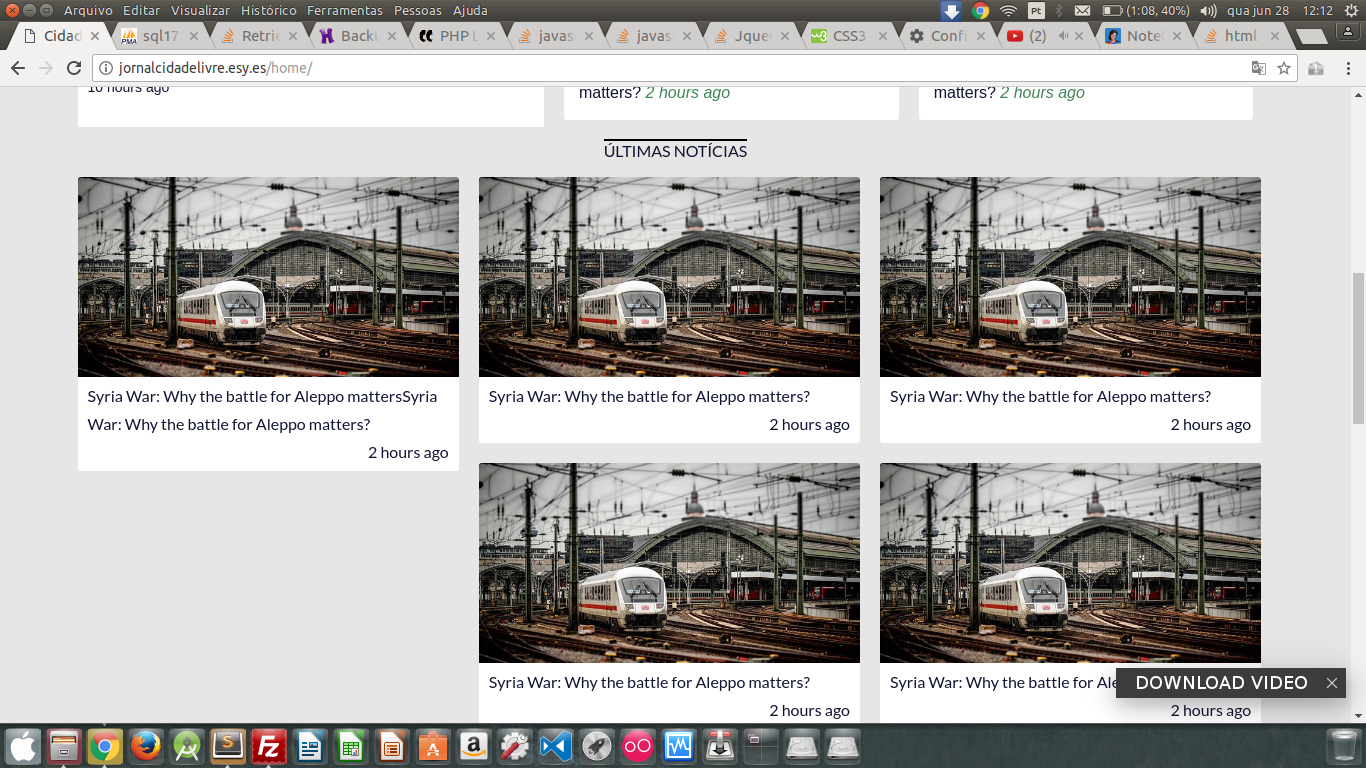
I have a list of items (ul), and each item occupies 33% of the screen, thus forming a horizontal list of 3 columns. When there is no more space in the horizontal, it forms a new line, something very simple, is perfect when all the items have the same height, but when the heights are different, the layout "breaks". Follow the image and code:
.news-line {
  display: flex;
  flex-direction: column;
}

.news-line .news-line_title {
  text-align: center;
  font-family: 'Lato', sans-serif;
  text-transform: uppercase;
}

.news-line .news-line_title span {
  border-top: 2px solid #000;
}

.news-line .news-wrapper ul {
  list-style-type: none;
}

.news-line .news-wrapper ul li {
  margin: 0;
  width: 33.33%;
  float: left;
}

.news-line .news-wrapper ul li .box {
  background-color: #FFF;
  border-radius: 3px;
  overflow: hidden;
  margin: 10px;
}

.news-line .news-wrapper ul li .box .image {
  background: url('http://grafreez.com/wp-content/temp_demos/river/img/media-7.jpg') no-repeat;
  background-repeat: no-repeat;
  background-size: cover;
  height: 200px;
}

.news-line .news-wrapper ul li .box .content {
  padding: 5px 10px;
  line-height: 28px;
  font-family: 'Lato', sans-serif;
  display: inline-block;
}

.news-line .news-wrapper ul li .box .content .date {
  margin-left: 30px;
  float: right;
}

.news-line .more-news {
  display: flex;
  text-align: center;
  font-family: 'Lato', sans-serif;
  text-transform: uppercase;
}

.news-line .more-news a {
  width: 100%;
  background-color: #FFF;
  padding: 10px 0;
  margin-bottom: 15px;
}
<div class="news-line">
<div class="news-line_title"><span>Últimas Notícias</span></div>
<div class="news-wrapper">
<ul>
<li>
<div class="box">
<div class="image"></div>
<div class="content">
<span class="title">Syria War: Why the battle for Aleppo mattersSyria War: Why the battle for Aleppo matters?</span>
<span class="date">2 hours ago</span>
</div>
</div>
</li>
<li>
<div class="box">
<div class="image"></div>
<div class="content">
<span class="title">Syria War: Why the battle for Aleppo matters?</span>
<span class="date">2 hours ago</span>
</div>
</div>
</li>
<li>
<div class="box">
<div class="image"></div>
<div class="content">
<span class="title">Syria War: Why the battle for Aleppo matters?</span>
<span class="date">2 hours ago</span>
</div>
</div>
</li>
<li>
<div class="box">
<div class="image"></div>
<div class="content">
<span class="title">Syria War: Why the battle for Aleppo matters?</span>
<span class="date">2 hours ago</span>
</div>
</div>
</li>
<li>
<div class="box">
<div class="image"></div>
<div class="content">
<span class="title">Syria War: Why the battle for Aleppo matters?</span>
<span class="date">2 hours ago</span>
</div>
</div>
</li>
<li>
<div class="box">
<div class="image"></div>
<div class="content">
<span class="title">Syria War: Why the battle for Aleppo matters?</span>
<br/>
<span class="date">2 hours ago</span>
</div>
</div>
</li>
</ul>
</div>
<div class="more-news"><a href="#">Ver todos</a></div>
</div>