Position caption above div

Asked

Viewed 340 times

7

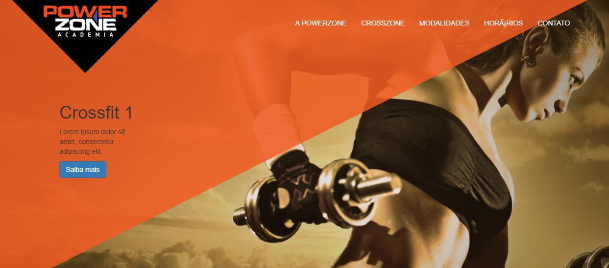
I am using the bootstrap Carousel with caption. Between the slide image and the caption there is a div with the image of an orange triangle. I need the caption to be above the triangle. I’ve used z-index but I can’t position this caption in the front.

inserir a descrição da imagem aqui

HTML:

<!DOCTYPE html>
<html lang="{{ config('app.locale') }}">
<head>
<meta charset="utf-8">
<meta http-equiv="X-UA-Compatible" content="IE=edge">
<meta name="viewport" content="width=device-width, initial-scale=1">
<title>@yield('title')</title>

<!-- Styles -->
<link href="{{ asset('assets/css/bootstrap.min.css') }}" rel="stylesheet">
<link href="{{ asset('assets/css/style.css') }}" rel="stylesheet">

</head>
<body>
<header>    
    <img class="triangulo" src="{{ asset('storage/triangulo.png') }}">
    <div class="container">
        <nav class="navbar navbar-default navbar-fixed-top">
            <div class="container">
                <!-- Brand and toggle get grouped for better mobile display -->
                <div class="navbar-header">
                    <button type="button" class="navbar-toggle collapsed" data-toggle="collapse" data-target="#bs-example-navbar-collapse-1" aria-expanded="false">
                        <span class="sr-only">Toggle navigation</span>
                        <span class="icon-bar"></span>
                        <span class="icon-bar"></span>
                        <span class="icon-bar"></span>
                    </button>
                    <img class="img-responsive logo" src="{{ asset('storage/logo.png') }}">
                </div>

                <!-- Collect the nav links, forms, and other content for toggling -->
                <div class="collapse navbar-collapse" id="bs-example-navbar-collapse-1">
                    <ul class="nav navbar-nav navbar-right">
                        <li><a href="#">A Powerzone</a></li>
                        <li><a href="#">Crosszone</a></li>
                        <li><a href="#">Modalidades</a></li>
                        <li><a href="#">Horários</a></li>
                        <li><a href="#">Contato</a></li>
                    </ul>
                </div><!-- /.navbar-collapse -->
            </div><!-- /.container-fluid -->
        </nav>
    </div>
</header>
<main>
    <div id="carousel-example-generic" class="carousel slide" data-ride="carousel">
    <!-- Indicators -->
    <ol class="carousel-indicators">
        <li data-target="#carousel-example-generic" data-slide-to="0" class="active"></li>
        <li data-target="#carousel-example-generic" data-slide-to="1"></li>
    </ol>

    <!-- Wrapper for slides -->
    <div class="carousel-inner" role="listbox">
        <div class="item active">
            <div class="carousel-caption">
                <div class="container-caption">
                    <h1>Crossfit 1</h1>
                    <p>Lorem ipsum dolor sit amet, consectetur adipiscing elit.</p>
                    <button class="btn btn-primary">Saiba mais</button>
                </div>
            </div>
        </div>
        <div class="item">
            <div class="carousel-caption">
                <div class="container-caption">
                    <h1>Crossfit 2</h1>
                    <p>Lorem ipsum dolor sit amet, consectetur adipiscing elit.</p>
                    <button class="btn btn-primary">Saiba mais</button>
                </div>
            </div>
        </div>
    </div>
    </div>
</main>
<footer>

</footer>
<script src="{{ asset('assets/js/jquery.min.js') }}"></script>
<script src="{{ asset('assets/js/bootstrap.min.js') }}"></script>
</body>
</html>

CSS:

.triangulo {
position: absolute;
top: 0;
left: 0;
z-index: 10;
width: 80%;
height: 90%;
opacity: 0.85;
}

.logo {
max-width: 75%;
}

@media (min-width: 768px) {
.triangulo {
    position: absolute;
    top: 0;
    left: 0;
    z-index: 10;
    width: 95%;
    height: auto;
    opacity: 0.85;
}

.logo {
    max-width: 100%;
}
}

/*=============Menu=============*/

.navbar-default {
border: none;
background-color: transparent;
z-index: 20;
}

.navbar-default .navbar-nav>li>a {
color: #ffffff;
text-transform: uppercase;
}

.navbar-right {
margin-top: 2%;
}

.navbar-toggle {
border: none;
}

.navbar-default .navbar-toggle .icon-bar {
background-color: #D6521E;
width: 25px;
height: 3px;
}

.navbar-default .navbar-toggle:focus, .navbar-default .navbar-toggle:hover {
background-color: transparent;
}

.navbar-default .navbar-collapse, .navbar-default .navbar-form {
background-color: #000000;
}

@media (min-width: 768px) {
.navbar-default .navbar-collapse, .navbar-default .navbar-form {
    background-color: transparent;
}
}

/*=============Slide=============*/

.carousel-inner {
height: 500px;
}

@media (min-width: 768px) {
.carousel-inner {
    height: 780px;
}
}

.item {
width: 100%;
height: 100%;
}

.item:nth-child(1) {
background: url("../../storage/img1.jpg") no-repeat center center;  
background-size: cover;
}

.item:nth-child(2) {
background: url("../../storage/img1.jpg") no-repeat center center;  
background-size: cover;
}

@media (min-width: 768px) {
.item:nth-child(1) {
    background: url("../../storage/img1.jpg") no-repeat center center;  
    background-size: 1920px 780px;
}

.item:nth-child(2) {
    background: url("../../storage/img1.jpg") no-repeat center center;  
    background-size: 1920px 780px;
}
}

.carousel-caption {
    top: 30%;
    z-index: 20 !important;
}

@media (min-width: 768px) {
.container-caption {
    width: 30%; 
    height: 100%;
}

.carousel-caption h1 {
    text-align: left;
}

.carousel-caption p {
    text-align: left;
}

.carousel-caption button {
    margin-left: -74%;
}
}

Complete design: https://drive.google.com/file/d/0B-A6QRqdIHcxRjVGeXRVU1pOX2c/view?usp=sharing

3 answers

4


I made an example that is working, I used jQuery to do a trick and meet the need since the conventional methods of z-index do not work, it is not the most elegant, but it works.

See the image below: inserir a descrição da imagem aqui

Follow the link to the fonts:

https://drive.google.com/open?id=0B5n5L1FCCMEUZmtHeEs3NGRLaUk

See if he answers you!

Below follows how the CSS code looked:

#exibirCap {
    top: 30%;
    left: 15%;
    width: 550px;
    position: absolute;
    z-index: 100000;
}

.triangulo {
    position: absolute;
    top: 0;
    left: 0;
    width: 80%;
    z-index: 10;
    height: 90%;
    opacity: 0.85;
}

.logo {
    max-width: 75%;
}

@media (min-width: 768px) {
.triangulo {
    position: absolute;
    top: 0;
    left: 0;
    width: 95%;
    height: auto;
    opacity: 0.85;
}

.logo {
    max-width: 100%;
}
}

/*=============Menu=============*/

.navbar-default {
    border: none;
    background-color: transparent;
}

.navbar-default .navbar-nav>li>a {
    color: #ffffff;
    text-transform: uppercase;
}

.navbar-right {
    margin-top: 2%;
}

.navbar-toggle {
    border: none;
}

.navbar-default .navbar-toggle .icon-bar {
    background-color: #D6521E;
    width: 25px;
    height: 3px;
}

.navbar-default .navbar-toggle:focus, .navbar-default .navbar-toggle:hover {
    background-color: transparent;
}

.navbar-default .navbar-collapse, .navbar-default .navbar-form {
    background-color: #000000;
}

@media (min-width: 768px) {
.navbar-default .navbar-collapse, .navbar-default .navbar-form {
    background-color: transparent;
}
}

/*=============Slide=============*/

.carousel-inner {
    height: 500px;
}

@media (min-width: 768px) {
    .carousel-inner {
    height: 780px;
}
}

.item {
    width: 100%;
    height: 100%;
}

.item {
    /*background: url('../img/img1.jpg') no-repeat center center;  
    background-size: cover;*/
}

.item:nth-child(2) {
    /*background: url('../img/img1.jpg') no-repeat center center;  
    background-size: cover;*/
}

@media (min-width: 768px) {
    .item {
    /*background: url('../img/img1.jpg') no-repeat center center;  
    background-size: 1920px 780px;*/
}

.item:nth-child(2) {
   /* background: url('../img/img1.jpg') no-repeat center center;  
    background-size: 1920px 780px;*/
}
}

.carousel-caption {
    top: 30%;
}

@media (min-width: 768px) {
.container-caption {
    width: 30%; 
    height: 100%;
}

.carousel-caption h1 {
    text-align: left;
}

.carousel-caption p {
    text-align: left;
}

.carousel-caption button {
    margin-left: -74%;
}
}

And how did the HTML file

<!DOCTYPE html>
<html lang="{{ config('app.locale') }}">
<head>
    <meta charset="utf-8">
    <meta http-equiv="X-UA-Compatible" content="IE=edge">
    <meta name="viewport" content="width=device-width, initial-scale=1">

    <link rel="stylesheet" type="text/css" href="css/bootstrap.min.css">
    <link rel="stylesheet" type="text/css" href="css/style.css">

</head>
<body>
    <header>    
        <img class="triangulo" src="img/triangulo.png">
        <div class="container">
            <nav class="navbar navbar-default navbar-fixed-top">
                <div class="container">
                    <div class="navbar-header">
                        <button type="button" class="navbar-toggle collapsed" data-toggle="collapse" data-target="#bs-example-navbar-collapse-1" aria-expanded="false">
                            <span class="sr-only">Toggle navigation</span>
                            <span class="icon-bar"></span>
                            <span class="icon-bar"></span>
                            <span class="icon-bar"></span>
                        </button>
                        <img class="img-responsive logo" src="img/logo.png">
                    </div>

                    <div class="collapse navbar-collapse" id="bs-example-navbar-collapse-1">
                        <ul class="nav navbar-nav navbar-right">
                            <li><a href="#">A Powerzone</a></li>
                            <li><a href="#">Crosszone</a></li>
                            <li><a href="#">Modalidades</a></li>
                            <li><a href="#">Horários</a></li>
                            <li><a href="#">Contato</a></li>
                        </ul>
                    </div><!-- /.navbar-collapse -->
                </div><!-- /.container-fluid -->
            </nav>
        </div>
    </header>
    <main>
        <div id="exibirCap">
        </div>
        <div id="carousel-example-generic" class="carousel slide" data-ride="carousel">
            <ol class="carousel-indicators">
                <li data-target="#carousel-example-generic" data-slide-to="0" class="active"></li>
                <li data-target="#carousel-example-generic" data-slide-to="1"></li>
            </ol>
            <div class="carousel-inner" role="listbox">
                <div class="item active">
                    <div class="carousel-caption ocultar">
                        <div class="container-caption">
                            <h1>Crossfit 1</h1>
                            <p>Lorem ipsum dolor sit amet, consectetur adipiscing elit.</p>
                            <button class="btn btn-primary">Saiba mais</button>
                        </div>
                    </div>
                    <img src="img/img1.jpg">
                </div>
                <div class="item">
                    <div class="carousel-caption ocultar">
                        <div class="container-caption">
                            <h1>Crossfit 2</h1>
                            <p>Lorem ipsum dolor sit amet, consectetur adipiscing elit.</p>
                            <button class="btn btn-primary">Saiba mais</button>
                        </div>
                    </div>
                    <img src="img/img1.jpg" >
                </div>
            </div>
        </div>
    </main>
    <footer>
    </footer>

    <script>
        setInterval(
            function(){
             $(".ocultar").hide();
             $('#exibirCap').html('');
             $('.active .carousel-caption .container-caption').clone().appendTo('#exibirCap');
             $('#exibirCap').show();
            }, 100);
    </script>

    <script src="js/jquery.min.js"></script>
    <script src="js/bootstrap.min.js"></script>
</body>
</html>
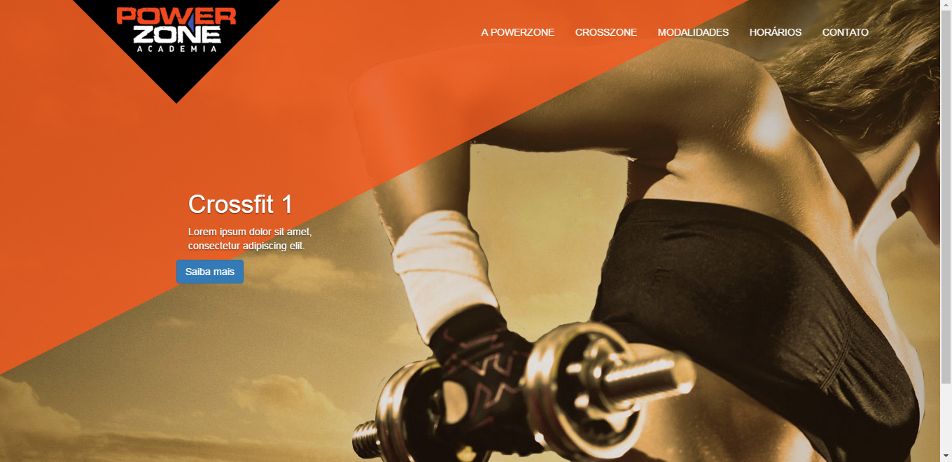
  • I put it the way it said, the caption went forward but the background image of the slide was also leaving the orange triangle behind the two. I need the triangle between the slide image and the caption.

  • @Marcelo, I made an edition in my reply and put an example image, see if it meets you.

  • Your image is what I need. I made the changes you mentioned, but in mine the triangle goes to the bottom. https://drive.google.com/file/d/0B-A6QRqdIHcxY2lheVA0RjhBMVE/view?usp=sharing

  • @Marcelo one thing I did was remove all the other z-index that were in his css and leave only those 2 there.

  • Can you put your HTML and CSS as an answer? Because I took the other z-index and it’s still the same.

  • @Marcelo put HTML and CSS in my answer, I had to put boostrap from CDN to not need to import. See if you can play

  • I could not play. I even extracted the files from inside the Windows I am using and put only the necessary files. Follow the link with the whole project, if you can take a look at what I’m doing wrong thank you. https://drive.google.com/file/d/0B-A6QRqdIHcxRjVGeXRVU1pOX2c/view?usp=sharing

  • @Marcelo Now with the full source I was able to understand your need, as the z-index is relative to your content level I don’t know there is a way to solve this problem, you would need to separate the background and your content with something in the "middle" right. There is an example in https://stackoverflow.com/questions/7490146/z-index-relative-or-absolute that explains the difference between levels. But by the tests and research I did this does not seem possible. : ( If I find a solution again post here!

  • So I need to separate the image from the slide from the caption and in the middle of the two place the orange triangle. I thought you got it from the image you posted. I tried to see something using jquery but tb did not get a positive result.

  • @Marcelo made a new example, adjusted my answer.

  • It worked friend, that was right. A doubt, the contents of the div displaCap need not exist correct?

  • @Marcelo this, it is born empty because it always fetch from active caption, it is not necessary to exist.

  • If you want to answer the code in case someone has the same problem can use if the files are no longer available.

Show 9 more comments

3

Try to put the HTML:

<!DOCTYPE html>
    <html lang="{{ config('app.locale') }}">
    <head>
    <meta charset="utf-8">
    <meta http-equiv="X-UA-Compatible" content="IE=edge">
    <meta name="viewport" content="width=device-width, initial-scale=1">
    <title>@yield('title')</title>

    <!-- Styles -->
    <link href="{{ asset('assets/css/bootstrap.min.css') }}" rel="stylesheet">
    <link href="{{ asset('assets/css/style.css') }}" rel="stylesheet">

    </head>
    <body>
    <header>    
        <img class="triangulo" src="{{ asset('storage/triangulo.png') }}">
        <div class="container">
            <nav class="navbar navbar-default navbar-fixed-top">
                <div class="container">
                    <!-- Brand and toggle get grouped for better mobile display -->
                    <div class="navbar-header">
                        <button type="button" class="navbar-toggle collapsed" data-toggle="collapse" data-target="#bs-example-navbar-collapse-1" aria-expanded="false">
                            <span class="sr-only">Toggle navigation</span>
                            <span class="icon-bar"></span>
                            <span class="icon-bar"></span>
                            <span class="icon-bar"></span>
                        </button>
                        <img class="img-responsive logo" src="{{ asset('storage/logo.png') }}">
                    </div>

                    <!-- Collect the nav links, forms, and other content for toggling -->
                    <div class="collapse navbar-collapse" id="bs-example-navbar-collapse-1">
                        <ul class="nav navbar-nav navbar-right">
                            <li><a href="#">A Powerzone</a></li>
                            <li><a href="#">Crosszone</a></li>
                            <li><a href="#">Modalidades</a></li>
                            <li><a href="#">Horários</a></li>
                            <li><a href="#">Contato</a></li>
                        </ul>
                    </div><!-- /.navbar-collapse -->
                </div><!-- /.container-fluid -->
            </nav>
        </div>
    </header>
<!-- Indicators -->
    <ol class="carousel-indicators">
        <li data-target="#carousel-example-generic" data-slide-to="0" class="active"></li>
        <li data-target="#carousel-example-generic" data-slide-to="1"></li>
    </ol>
    <main>
        <div id="carousel-example-generic" class="carousel slide" data-ride="carousel">
        <!-- Indicators -->
        <ol class="carousel-indicators">
            <li data-target="#carousel-example-generic" data-slide-to="0" class="active"></li>
            <li data-target="#carousel-example-generic" data-slide-to="1"></li>
        </ol>

        <!-- Wrapper for slides -->
        <div class="carousel-inner" role="listbox">
            <div class="item active">
                <div class="carousel-caption">
                    <div class="container-caption">
                        <h1>Crossfit 1</h1>
                        <p>Lorem ipsum dolor sit amet, consectetur adipiscing elit.</p>
                        <button class="btn btn-primary">Saiba mais</button>
                    </div>
                </div>
            </div>
            <div class="item">
                <div class="carousel-caption">
                    <div class="container-caption">
                        <h1>Crossfit 2</h1>
                        <p>Lorem ipsum dolor sit amet, consectetur adipiscing elit.</p>
                        <button class="btn btn-primary">Saiba mais</button>
                    </div>
                </div>
            </div>
        </div>
        </div>
    </main>
    <footer>

    </footer>
    <script src="{{ asset('assets/js/jquery.min.js') }}"></script>
    <script src="{{ asset('assets/js/bootstrap.min.js') }}"></script>
    </body>
    </html>

I think it’ll work that way!

  • There has been no change, the caption is still under the triangle div

  • Sorry I’ll try to improve!

  • No problem, I managed to solve with jquery

  • good then!

1

I don’t know if it’s been resolved yet, but I managed to do it with a few changes.

The Result:

inserir a descrição da imagem aqui

Follow the changes:

HTML

Remove this line from your HTML:

<img class="triangulo" src="img/triangulo.png">

CSS

Remove the following parts of your CSS:

#carousel-example-generic{
    z-index: 10000;
}

.triangulo {
    position: absolute;
    top: 0;
    left: 0;
    width: 80%;
    z-index: 9000;
    height: 90%;
    opacity: 0.85;
}

Include the following parts in your CSS:

header {
    position: relative;
    z-index: 100000;
}

.item::before {
    content: "";
    background-image: url('../img/triangulo.png');
    background-size: contain;
    background-repeat: no-repeat;
    position: absolute;
    top: 0;
    left: 0;
    width: 80%;
    z-index: 9000;
    height: 90%;
    opacity: 0.85;
}

.carousel-caption {
    z-index: 10000;
}
  • The triangle was fixed on the slide image, it would have q always be on the page. But the answer of W. Mengue with jquery met me perfectly. Thank you.

Browser other questions tagged

You are not signed in. Login or sign up in order to post.