Position image relative to another even changing resolution

Asked

Viewed 365 times

1

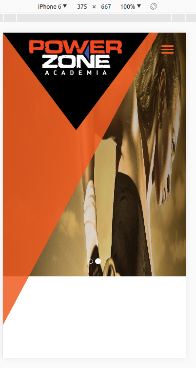
I have the logo and a black triangle background. How to position the logo forever stay in the center of the triangle even changing the resolution?

inserir a descrição da imagem aqui

inserir a descrição da imagem aqui

<img class="img-responsive triangulo-laranja" src="{{ asset('storage/triangulo.fw.png') }}">
<div class="img-responsive triangulo-logo">
    <img class="img-responsive logo" src="{{ asset('storage/logo.png') }}">
</div>

.triangulo-laranja {
position: absolute;
top: 0;
left: 0;
z-index: 997;
width: 85%;
height: 90%;
opacity: 0.85;
}

.triangulo-logo {
background-image: url('../../storage/triangulo-logo.fw.png');
position: absolute;
top: 0;
left: 8%;
z-index: 998;
width: 600px;
height: 200px;
}

.logo {
position: relative; 
top: 0;
left: 50%;
margin-left: -95px;
z-index: 999;
}
  • Perhaps you already thought that, but in any case... it would not be more interesting to add the logo to the image?

  • Yes, I did, but for design reasons I’m trying to do the positioning with separate images.

  • I understood, I imagined this, Marcelo by chance you could not create a snippet(Ctrl+M in the question edition), only with the part that interests us, showing the problem actually happening, would be better p/ help you.

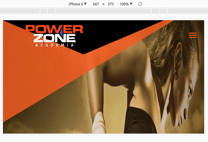
  • At first it is correct, the logo is centered on the triangle. When changing the orientation (in case iphone 6 the logo is not centered on the triangle.

1 answer

1


First, the problem is occurring because you are using position: Absolute on both elements. By his explanation to an earlier answer this black triangle is also an image as well as the logo.

A possible solution would be to create a div encompassing the logo and place the black triangle as a background image in this div that is encompassing your logo. For example:

/*---- Código HTML ----*/

<div class="divlogo">
    <img class="logoimg" src="./img/logo.png" />
</div>

/*---- Código CSS ----*/

.divlogo{
   display: block;
   position: absolute;
   top: 0;
   left: 0;
   z-index: 998;
   width: 80%; 
   height: 30%;
   text-align: center;
   background-image: url("./img/tringulo-preto.png");
   background-size: 100%; /*Caso 100% não lhe agrade pode usar Cover*/
}

.logoimg{
   display: block;
   width: 50%;
   position: relative;
   z-index: 999;
}

Observing: Adjust the element size values according to your need. I hope this answer will help you.

  • Your solution is almost 100%. The logo is centered within the triangle independent of changing the resolution. I’m using bootstrap but now I can’t put the img-Responsive class in the triangle and I had to set width and height for it, so it doesn’t fit when I open it in mobile. I put the current code in the question.

  • This is happening because you used pixel sizes in the class. trigangulo-soon use percentage so it will always adapt, if not to your liking may be making a media screen to adjust the desired resolution.

Browser other questions tagged

You are not signed in. Login or sign up in order to post.