HTML button as selection for questions

Asked

Viewed 702 times

0

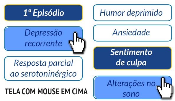
The user will access a screen in HTML, where will have some questions and each question will have 3 or 4 options of answers in button format.

When he clicks on the button, the button changes color. In blue, it turns red. And so on, at the end the screen will be all marked with the client’s options.

EXAMPLE OF THE FIRST SCREEN

inserir a descrição da imagem aqui

EXAMPLE WITH MOUSE OVER BUTTON

inserir a descrição da imagem aqui

EXAMPLE AFTER CLICKED, IT SHOULD BE IN RED COLOR, I.E., VISUALLY SHOWING WHICH CUSTOMER’S SELECTED OPTION.inserir a descrição da imagem aqui

  • 1

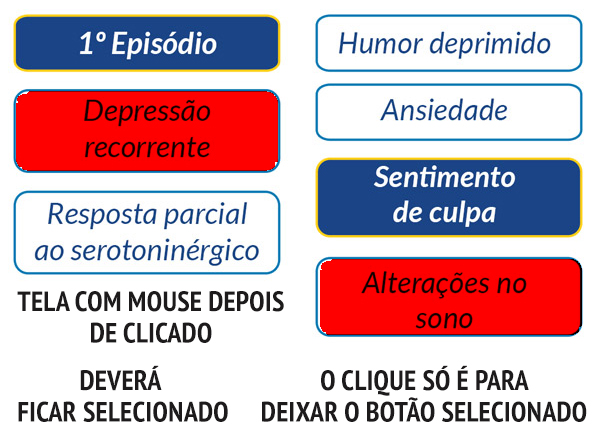
    What is your doubt ?

  • Is there any code being worked to share?

  • No, my question is, how do I leave the button marked with the red color after that was clicked? I know that in the normal button, where you link I could do so 'a:link........ COLOR BLUE, a:visited... COLOR RED, a:Hover.... COLOR RED, a:active.... COLOR RED' but this button is not to lead anywhere, it is just to stay selected in that color.

  • Share your HTML. Ideal is to see how you created the buttons to tell how to change.

2 answers

1

#ck-button {
    margin:0px;
    background-color:#EFEFEF;
    border-radius:4px;
    border:1px solid #D0D0D0;
  
    overflow:auto;
    float:left;
}

#ck-button label {
    float:left;
    width:4.0em;
}

#ck-button label span {
    text-align:center;
    padding:3px 0px;
    display:block;
    border-radius:4px;
}

#ck-button label input {
    position:absolute;
    top:-20px;
    
}
input:checked +span{
    background-color:#911;
    color:#fff;
}
 #ck-button label:hover   {
    background-color:lightgray;
}
#ck-button label:hover #o1 + span {
    background-color:blue;
}
#ck-button label:hover #o2 + span {
    background-color:orange;
}
#ck-button label:hover #o3 + span {
    background-color:green;
}
      <div id="ck-button"><label><input type="checkbox" name="sta_choice" id=all value="All" checked><span>All</span></label></div>
      <div id="ck-button"><label><input type="checkbox" name="sta_choice"  value="All" ><span>All2</span></label></div>
      <div id="ck-button"><label><input type="checkbox" name="sta_choice" id="o1" value="Cold" onclick=handleClick1(this.val);><span class="o1">Cold</span></label></div>                               
      <div id="ck-button"><label><input type="checkbox" name="sta_choice" id="o2" value="Warm" onclick="handleClick1(this.val);"><span>Warm</span></label></div>                                
      <div id="ck-button"><label><input type="checkbox" name="sta_choice" id="o3" value="Active" onclick="handleClick1(this.val);"><span>Active</span></label></div>

I believe that’s exactly what you seek.

  • Perfect Gustavo, exactly that!!!

  • This is exactly what it is, but I noticed that it doesn’t expand when I put large texts, like this text: "Partial response to serotonergic". Have some form of we define the width individually by input (Checkbox)?

0


I tried to make it as simple as possible. Next time, try to post the code you’re working on, like Leon Freire said, to speed up our side :)

Here it is:

* {
  -webkit-box-sizing: border-box;
  -moz-box-sizing: border-box;
  box-sizing: border-box;
}

/* Faça como quiser, calango */
label {
  width: 50%;
  padding: 0 4px;
  margin-bottom: 8px;
  float: left;
  text-align: center;
  cursor: pointer;
}

/* Esconde a caixa de seleção */
/* (Creio que opacity:0 e display:none também funcionem) */
label input[type=checkbox] {
  position: absolute;
  clip: rect(0,0,0,0);
  /* Sim, tive que ver como é no Bootstrap :p */
}

/* Padrão dos itens */
label span {
  display: block;
  background-color: #fff;
  color: #1b4486;
  padding: 8px;
  font-size: 20px;
  border: 2px solid #1b4486;
}

/* Quando mouse passa por cima */
label:hover span {
  background-color: #639dff;
  color: #1b4486;
  box-shadow: 1px 1px 5px rgba(255,255,255,.4) inset;
}

/* Quando item selecionado */
label input[type=checkbox]:checked + span {
  background-color: #1b4486;
  border-color: #ffcc0f;
  color: #fff;
}

/* Quando mouse passa por cima de item selecionado */
label:hover input[type=checkbox]:checked + span {
  background-color: #d44950;
  border-color: #ffcc0f;
}
<label>
  <input type="checkbox">
  <span>Opção 1</span>
</label>
<label>
  <input type="checkbox">
  <span>Opção 2</span>
</label>
<label>
  <input type="checkbox">
  <span>Opção 3</span>
</label>
<label>
  <input type="checkbox">
  <span>Opção 4</span>
</label>
<label>
  <input type="checkbox">
  <span>Opção 5</span>
</label>
<label>
  <input type="checkbox">
  <span>Opção 6</span>
</label>

  • PERFECT, NOW YES!!! Thanks Vitor Adriano

Browser other questions tagged

You are not signed in. Login or sign up in order to post.