0
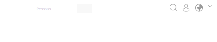
Hello. I need to make a menu with icons to get to the right of the Header. The icons are divs with background-image, and the measurements are relative and in percentage (%). The idea is that the icons grow as the resolution. I have a search box to the left of the menu with the property display: inline-block, and its container with text-align: center to leave the search field always at the center. The problem is that when I declare the float: right to the icon menu, the icons do not grow according to the declared percentage. When I shoot the float: right, Yes, the icons grow according to the measures in percentage, but it is not to the right of the screen. Follow the image and the codes:
/* Container do Comp. SearchBox */

.header__boxSearch {
	height: 30px;
    width: 19.53125%;
    min-width: 180px;
    margin-top: 10px;
    margin-left: auto;
    margin-right: auto;
    display: block;
}

/* SearchBox */

.boxSearch {
    height: 100%;
    width: 100%;
}

    .boxSearch__input {
        height: 100%;
        width: 75%;
        float: left;
        border-radius: 2px 0 0 2px;
        border: 1px solid #dbdbdb;
    }

    .boxSearch__btn {
        background-color: #f8f8f8;
        padding-top: 2px;
        width: 25%;
        height: 100%;
        border: 1px solid #dbdbdb;
        border-left: none;
        border-radius: 0 2px 2px 0;
        cursor: pointer;
    }

/* Container do menu icon e icones */

.iconsHeader {
    width: 15.13671872%;
    margin-top: -30px;
    margin-bottom: 10px;
    min-width: 170px;
    float: right;
}

    div[class*="navIcon"] {
        width: 2.44140625%;
        min-width: 25px;
        min-height: 25px;
        padding-bottom: 2.44140625%;
        margin-left: 9.765625%;
        float: left;
        background-repeat: no-repeat;
        background-size: cover;
        cursor: pointer;
    }

    .navIcon--Feed {
        background-image: url(../img/feed.png);
    }

    .navIcon--Profile {
        background-image: url(../img/perfil.png);
    }

    .navIcon--Notification {
        background-image: url(../img/notificacao.png);
    }

    .iconOut {
        width: 1.46484375%;
        min-width: 15px;
        min-height: 15px;
        padding-bottom: 1.46484375%;
        margin-left: 9.765625%;
        float: left;
        background-image: url(../img/sair.png);
        background-size: cover;
        background-repeat: no-repeat;
        cursor: pointer;
    }
<!-- SearchBox -->
<div class="header__boxSearch">
<div class="boxSearch">
<input type="text" class="boxSearch__input" placeholder="Pessoas..."/>
<button class="boxSearch__btn">
</button>
</div>
</div>
<!-- Menu de icones -->
<div class="iconsHeader">
<div class="navIcon--Feed">
</div>
<div class="navIcon--Profile">
</div>
<div class="navIcon--Notification">
</div>
<div class="iconOut">
</div>
</div>
Does anyone know???!
– Lucas Trino
I cannot answer you 100% of this, but I believe that since the parent IVF does not vary, the daughter Ivs will not have size variation based on %. If you put in each of your icons, a unit-based width and height size
vw, I believe they will vary their sizes.– Leon Freire
@Leonfreire. Thank you, I will research on. However, I’m having trouble with the float and percentages. Elsewhere in the code, where parent Ivds have the float property, daughter Ivs do not normally respond to values in %, or perhaps the measure is relative to values other than widht, perhaps to the parent’s font-size. I don’t know...
– Lucas Trino
@Leonfreire, it worked super well. Thank you very much! You would know me if vw are widely supported, and the calculation to convert px to vw. Thanks in advance.
– Lucas Trino
Oops! I’m glad it worked out then!
vwis widely supported except for IE which has been supported only since version 11. But what happens is that it is a unit based on the width of the screen.vwmeans Viewport Width, ie, is basically a percentage of the screen size. There is also thevh, which, as you can guess, works the same way, only based on height (Viewport Height).– Leon Freire