1
I have 3 images, they are aligned neatly, but from the resolution of the print below they begin to be displayed one below the other even having space to be displayed, at most, one next to the other and the third below. I don’t know if I made myself clear, but I’m trying to pursue a behavior like this template here: http://www.uipasta.com/wordpress-preview/rolling/
As mine is:
HTML:
<section class="container" id="portfolio">
<div class="row">
<div class="col-md-12 text-center">
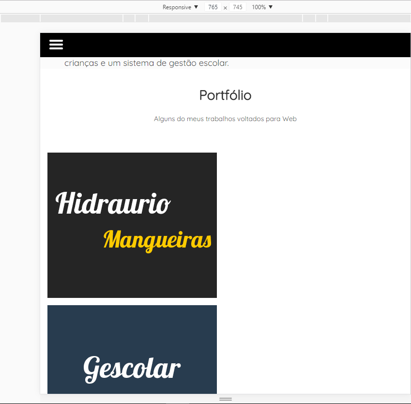
<h1 class="">Portfólio</h1>
<h3 class="subtitle">Alguns do meus trabalhos voltados para Web</h3>
</div>
</div>
<div class="row ">
<div class="col-md-4 col-sm-4 col-xs-12">
<figure>
<img src="img/hidrau.png" alt="Hidraurio Mangueiras Hidraulicas">
<figcaption>
<a href="http://hidrauriomangueiras.com.br" target="_blank"><button >Visitar</button></a>
<a href="https://github.com/tiagosilveiraa/hidraurio" target="_blank"><button >Github</button></a>
</figcaption>
</figure>
</div>
<div class="col-md-4 col-sm-4 col-xs-12">
<figure>
<img src="img/gescolar.png" alt="Sistema de Gestão Escolar">
<figcaption>
<a href="http://tiagotestes.esy.es/Gescolar" target="_blank"><button >Visitar</button></a>
<a href="https://github.com/tiagosilveiraa/gescolar" target="_blank"><button >Github</button></a>
</figcaption>
</figure>
</div>
</div>
</section>
Tiago put the excerpt of your code also to get a easier help, what you need to do there is to put the class in those three items that when you get below 800px these elements are with width:100%; (that would be col-Xs-12). You only need to check now if your classes will not conflict with this.
– Ítalo Drago
Opa @italoDrago, I put the code and tried the col-Xs-12 but continued the same thing :/
– Tiago Silveira
your image is at width:100%? because if it won’t take up all the space because of the figcaption tag that Oce placed. Change the class col-Sm-4 by col-Sm-6 also, that there the structure in general is equal to the example sent.
– Ítalo Drago
@italodrago, put the col-Sm-6 and solved part of the "problem" now if I add a col-Xs-somemnúmero, it no longer shows the elements one below the other, if I do not put any col-Xs it solves only until a certain resolution.
– Tiago Silveira