Creation of tables through div

Asked

Viewed 348 times

1

I would like to create a table structure that can have a variable number of columns, for example, an hour may have only 3 columns and at another time may have 5 or 6 columns, this number is not limited, these number of columns will not change once after the screen is loaded.

I’m having trouble aligning them and leaving CSS in a way that suits the amount of columns I have, for example, Bosque das Flores and Cond Grego, has to be below the column Condominium and so on.

Follow my code below:

.content-body {
    display: table-cell;
    position: relative;
    vertical-align: top;
    padding: 40px;
}
    .rowCustom {
        display: -moz-flex;
        display: -webkit-flex;
        display:            flex;
        -webkit-flex-direction:     row;
        -moz-flex-direction:     row;
        flex-direction:     row;
        display:            -webkit-flex;
        display:            -moz-flex;
        table-layout:       fixed;
        width:              95%;
        margin:             0 auto;
        white-space:        nowrap;
      }
      
      .rowCustom div {
        -webkit-flex: 1 1 auto;
        -moz-flex: 1 1 auto;
        flex: 1 1 auto;
        display:            inline-block;
      }

      .column {
        margin:             0 auto;
        padding:            5px;
        text-align:         center;
      }

    .item{  
        display: inline-block;  
        border: 1px solid #ccc;  
        padding: 5px 10px;  
        text-decoration: none;  
        color: #666;      
        font-family: 'Open Sans',sans-serif;  
        font-size: 14px;  
        font-weight :600;  
        border-radius: 5px;  
        -webkit-border-radius: 5px;  
        -moz-border-radius: 5px;  
    } 
<link href="https://rawgit.com/twbs/bootstrap/master/dist/css/bootstrap.css" rel="stylesheet"/>
<section role="main" class="content-body">    
    <div class="rowCustom">
        <div class="column">
            Condominio
        </div>
        <div class="column">
            Predio
        </div>
        <div class="column">
            Andar
        </div>
        <div class="column">
            Apartamento
        </div>
        <div class="column">
            Comodo
        </div>
    </div>

    <div class="rowCustom">
        <div class="column">
            <div class="item">Bosque das flores</div> 
        </div>
        <div class="column">
        </div>
        <div class="column">
        </div>
        <div class="column">
        </div>
        <div class="column">
        </div>
    </div>

    <div class="rowCustom">
        <div class="column">
        </div>
        <div class="column">
            <div class="item">Orquidea</div>       
        </div>
        <div class="column">
        </div>
        <div class="column">
        </div>
        <div class="column">
        </div>
    </div>

    <div class="rowCustom">
        <div class="column">
        </div>
        <div class="column">            
        </div>
        <div class="column">
        <div class="item">1º Andar</div> 
        </div>
        <div class="column">
        </div>
        <div class="column">
        </div>
    </div>

    <div class="rowCustom">
        <div class="column">
        </div>
        <div class="column">
        </div>
        <div class="column">
            <div class="item">2º Andar</div> 
        </div>
        <div class="column">
        </div>
        <div class="column">
        </div>
    </div>

    <div class="rowCustom">
        <div class="column">
        </div>
        <div class="column">
            <div class="item">Rosa</div> 
        </div>
        <div class="column">
        </div>
        <div class="column">
        </div>
        <div class="column">
        </div>
    </div>

    <div class="rowCustom">
        <div class="column">
            <div class="item">Cond Grego</div> 
        </div>
        <div class="column">
        </div>
        <div class="column">
        </div>
        <div class="column">
        </div>
        <div class="column">
        </div>
    </div>

    <div class="rowCustom">
        <div class="column">
        </div>
        <div class="column">
            <div class="item">Apolo</div> 
        </div>
        <div class="column">
        </div>
        <div class="column">
        </div>
        <div class="column">
        </div>
    </div>
</section>

Follows the fiddle

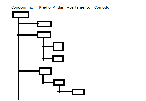
My structure works as follows, in the first row are the columns, and in the next rows are the values, only one of the columns will be filled in each row, each of these rows can have children, which will be added to the row just below and in the subsequent column, the main problem is in aligning the contents of the rows with those of the columns.

If possible, it would be nice for there to be a line connecting the lines with their respective children, e.g.: Bosque das Flores to Orquidea and the Pink, another calling Orquidea to first floor and the 2nd floor and so on.

Here’s an image, made in Paint, of how I hope it looks more or less. inserir a descrição da imagem aqui

  • Can I ask why not use a table?

  • @Aline because I wanted something similar to a treeview and I do not know if with Tables this would be very good, so I had the idea to use div

  • Tested the js? Here it worked cool.

1 answer

1

$(document).ready(function () {
        $(".column").css("width", $("#geral").outerWidth() / $(".content-body>.rowCustom:first>div").length);
    });

If using jquery, don’t forget the lib reference.

CSS:

.column {
        margin: 0 auto;
        padding: 5px;
        text-align: center;
        border:1px solid #cecece;
    }

HTML:

<div id="geral">
    <link href="https://rawgit.com/twbs/bootstrap/master/dist/css/bootstrap.css" rel="stylesheet" />
    <section role="main" class="content-body">
        <div class="rowCustom">
            <div class="column">
                Condominio
            </div>
            <div class="column">
                Predio
            </div>
            <div class="column">
                Andar
            </div>
            <div class="column">
                Apartamento
            </div>
            <div class="column">
                Comodo
            </div>
        </div>

        <div class="rowCustom">
            <div class="column">
                <div class="item">Bosque das flores</div>
            </div>
            <div class="column">
            </div>
            <div class="column">
            </div>
            <div class="column">
            </div>
            <div class="column">
            </div>
        </div>

        <div class="rowCustom">
            <div class="column">
            </div>
            <div class="column">
                <div class="item">Orquidea</div>
            </div>
            <div class="column">
            </div>
            <div class="column">
            </div>
            <div class="column">
            </div>
        </div>

        <div class="rowCustom">
            <div class="column">
            </div>
            <div class="column">
            </div>
            <div class="column">
                <div class="item">1º Andar</div>
            </div>
            <div class="column">
            </div>
            <div class="column">
            </div>
        </div>

        <div class="rowCustom">
            <div class="column">
            </div>
            <div class="column">
            </div>
            <div class="column">
                <div class="item">2º Andar</div>
            </div>
            <div class="column">
            </div>
            <div class="column">
            </div>
        </div>

        <div class="rowCustom">
            <div class="column">
            </div>
            <div class="column">
                <div class="item">Rosa</div>
            </div>
            <div class="column">
            </div>
            <div class="column">
            </div>
            <div class="column">
            </div>
        </div>

        <div class="rowCustom">
            <div class="column">
                <div class="item">Cond Grego</div>
            </div>
            <div class="column">
            </div>
            <div class="column">
            </div>
            <div class="column">
            </div>
            <div class="column">
            </div>
        </div>

        <div class="rowCustom">
            <div class="column">
            </div>
            <div class="column">
                <div class="item">Apolo</div>
            </div>
            <div class="column">
            </div>
            <div class="column">
            </div>
            <div class="column">
            </div>
        </div>
    </section>
</div>
  • In case who would be $("#geral"), i don’t have this id inside my HTML

  • Sorry, it’s an external div to Section. only a div with that id. Which is 100% wide. Pulled?

  • The alignment stayed as I wanted, thank you very much, now you would also know how to make the lines connecting the elements as the img I put?

  • I can’t see the image. Locked the domain here. = x The "table" rows I added there in CSS. (=

  • The lines I mentioned are not the borders, I need a line linking with their respective children, ex: A line linking Bosque das Flores to Orquidea and Rosa, another one linking Orquidea to the 1st floor and the 2nd floor and so on. Follow the img link in Base64 https://pastebin.com/j1SPb5TU if you’d like to see

  • I don’t think I’m gonna be able to help you because I need to see what you’re waiting for and it’s not gonna happen now. = T

Show 1 more comment

Browser other questions tagged

You are not signed in. Login or sign up in order to post.