Create a Slideshow with Html and CSS only

Asked

Viewed 19,768 times

1

Modelo/Exemplo do Slide

<head>
<link rel="stylesheet" type="text/css" href="css/style.css">
<title>Projeto 01</title>

<script>
    var slideIndex = 1;
    showDivs(slideIndex);

    function plusDivs(n) {
      showDivs(slideIndex += n);
    }

    function currentDiv(n) {
      showDivs(slideIndex = n);
    }

    function showDivs(n) {
      var i;
      var x = document.getElementsByClassName("mySlides");
      var dots = document.getElementsByClassName("demo");
      if (n > x.length) {slideIndex = 1}    
      if (n < 1) {slideIndex = x.length}
      for (i = 0; i < x.length; i++) {
         x[i].style.display = "none";  
      }
      for (i = 0; i < dots.length; i++) {
         dots[i].className = dots[i].className.replace(" w3-white", "");
      }
      x[slideIndex-1].style.display = "block";  
      dots[slideIndex-1].className += " w3-white";
    }
</script>

<body>
<div id="container">
    <div class="topo">
        <ul>
          <li><a href="#">Home</a></li>
          <li><a href="#">News</a></li>
          <li><a href="#">Redes Sociais</a></li>
          <li><a href="#">Blog</a></li>
        </ul>
    </div>
    <div class="esquerda"></div>
    <div class="direita">
        <div class="w3-content w3-display-container">
          <img class="mySlides" src="img/01.png">
          <img class="mySlides" src="img/02.jpg">
          <img class="mySlides" src="img/03.jpg">
          <div class="w3-center w3-display-bottommiddle" style="width:100%">
            <div class="w3-left" onclick="plusDivs(-1)">&#10094;</div>
            <div class="w3-right" onclick="plusDivs(1)">&#10095;</div>
            <span class="w3-badge demo w3-border" onclick="currentDiv(1)"></span>
            <span class="w3-badge demo w3-border" onclick="currentDiv(2)"></span>
            <span class="w3-badge demo w3-border" onclick="currentDiv(3)"></span>
         </div>

CSS

#container {
    background: white;
    display: both;
}
.topo {
    height: 200px;
    background-color: teal;
    box-shadow: 0 0 08px;
    margin: 10px;
}
.topo p {
    color: #000; 
}
.topo ul {
    list-style-type: none;
    margin: 0;
    padding: 0;
    overflow: hidden;
    background-color: #333;
}
.topo li {
    float: left;
}
.topo li a {
    display: block;
    color: white;
    text-align: center;
    padding: 14px 16px;
    text-decoration: none;
}
.topo li a:hover {
    background-color: #111;
}
.conteudo {
    display: block;
    border-radius: 04px;
    box-shadow: 0 0px 05px 0;
    margin: auto;
    padding: 20px;
    width: 60%;
    height: 600px;
    background-color: orange;
    float: both;

}
.conteudo p {
    color: #000; 
}
.esquerda{
    width: 15%;
    height: 400px;
    background-color: ;
    border: 1px solid #000;
    margin: 30px;
    border-radius: 03px;
    float: left;
    }
.direita {
    width: 15%;
    height: 400px;
    background-color: ;
    border: 1px solid #000;
    margin: 30px;
    border-radius: 03px;
    float: right;
} 

#rodape p {
    text-align: center;
    color: black;
    font-size: 16px; 
}
.mySlides {display:none}
.w3-left, .w3-right, .w3-badge {cursor:pointer}
.w3-badge {height:13px;width:13px;padding:0}

I have little knowledge in the development area. I only know the basics in Html and CSS (I don’t know javascript or jquery). But still, I need to create a small slide for a project I’m developing.

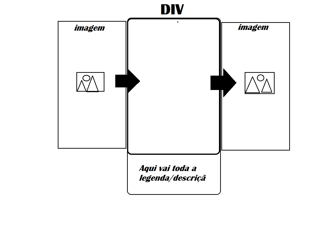
  • I need to add the images in a small side DIV, where it displays only one image and a caption/description just below NOT superimposing the image;
  • With Next and Previous button;
  • Caption/description needs to be updated along with image;
  • I need to know how to hide the images and make them appear in a certain time;
  • I’ve done research, but I’ve had no knowledge or understanding about;
  • Since it’s only about HTML and CSS, you don’t find much on the internet;
  • In a book I was reading CSS - from beginner to professional I read about Overflow and Animation. But I don’t know how to apply them;
  • And so far I don’t know how I should build the structure for it;
  • 2

    There’s a very good <br/> https://www.w3schools.com/howto/howto_js_slideshow.asp Works with pure CSS and javascript, and you don’t need to install plugins or jquery. What helps in performance.

1 answer

3

Creating a CSS-only slider without requiring Javascript to give us more control over events depending on the user’s interaction is a rather complex concept. But still possible to do.

Here are some plugins I found after doing a brief search:

Here below is the simplest way to create a simple CSS-only slider, which starts itself, using animations. (codepen)

*{
  -webkit-box-sizing: border-box;
  -moz-box-sizing: border-box;
  box-sizing: border-box;
}
body {
  background: #e9e1c1;
  margin: 0;
  font-family: monospace;
}
h2 {
  text-align: center;
}
a {color: #19838d;}

.container {
  margin: 50px auto;
  padding-bottom: 28%;
  width: 60%;
  overflow: hidden;
  border: 15px solid #fff;
  position: relative;
  display:block;
  margin: 40px auto 40px;
  box-shadow: 0 10px 10px #777;
}

.photoWrapper {
  position: absolute;
  animation: round 16s infinite;
  opacity: 0;
  top: 0;
  left: 0;
}
.photo {
  height:auto;
  width:100%;
}
p.photoDescr {
  background-color: #8e8e8e;
  margin: 0;
  padding: 5px;
}

@keyframes round {
  25% {
    opacity: 1;
  }
  40% {
    opacity: 0;
  }
}
.photoWrapper:nth-child(1) {
  animation-delay: 0s;
}

.photoWrapper:nth-child(2) {
  animation-delay: 4s;
}

.photoWrapper:nth-child(3) {
  animation-delay: 8s;
}

.photoWrapper:nth-child(4) {
  animation-delay: 12s;
}
@media (max-width: 728px) {
  .container {
    width: 90%;
    padding-bottom: 50%;
  }
}
<div class="container">
    <div class="photoWrapper">
        <img class='photo'  src="//c1.staticflickr.com/1/624/32968186751_a913f86f82_c.jpg" alt="" />
    </div>
    <div class="photoWrapper">
        <img class='photo'  src="//c1.staticflickr.com/3/2868/33027057984_13609393e8_c.jpg" alt="" />
    </div>
    <div class="photoWrapper">
        <img class='photo'  src="//c1.staticflickr.com/3/2913/33895858336_33c5124502_c.jpg" alt="" />
    </div>
    <div class="photoWrapper">
        <img class='photo'  src="//c1.staticflickr.com/3/2923/33100532164_31bac14009_c.jpg" alt="" />
    </div>
</div>

You can also see another more visual functional solution with buttons Prev, next etc exactly as you wanted without requiring the use of Javascript and where you can get an idea of how to work the CSS code to create such functionality: Cssdeck - Pure css slider

* {
    margin: 0;
    padding: 0;
    /*transition*/
    -webkit-transition: all 1s ease;
    -moz-transition: all 1s ease;
    -o-transition: all 1s ease;
    transition: all 1s ease;
}
body {
    background: -webkit-radial-gradient(center, circle, #f0f0f0, #74a9ad);
    background: -moz-radial-gradient(center, circle, #f0f0f0, #74a9ad);
    background: -ms-radial-gradient(center, circle, #f0f0f0, #74a9ad);
    background: -o-radial-gradient(center, circle, #f0f0f0, #74a9ad);
    background: radial-gradient(center, circle, #f0f0f0, #74a9ad);
    padding: 50px;
}
/* Slider */
.slider {
    height: 250px;
    left: 50%;
    margin: -125px -225px;
    position: absolute;
    top: 48%;
    width: 450px;
    /*box-shadow*/
    -webkit-box-shadow: 0 0 5px #000;
    -moz-box-shadow: 0 0 5px #000;
    box-shadow: 0 0 5px #000;
}
.slider .frames {
    height: 250px;
    position: relative;
}
.slider .frames .slide {
    height: 250px;
    list-style: none;
    position: absolute;
    width: 450px;
}
.slider .slide:target { z-index: 100 }
.slider .frames .slide img {
    height: 250px;
    width: 450px;
}
.slider .frames .slide nav a {
    background: hsla(0,0%,0%,.75);
    color: #fff;
    font-size: 16px;
    line-height: 50px;
    margin-top: -25px;
    opacity: 0;
    position: absolute;
    text-align: center;
    text-decoration: none;
    top: 50%;
    width: 50px;
    visibility: hidden;
    z-index: 10;
}
.slider:hover .frames .slide nav a {
    opacity: 1;
    visibility: visible;
}
.slider .frames .slide nav .prev {
    /*border-radius*/
    -webkit-border-radius: 0 25px 25px 0;
    -moz-border-radius: 0 25px 25px 0;
    border-radius: 0 25px 25px 0;
    left: 0;
}
.slider .frames .slide nav .next {
    /*border-radius*/
    -webkit-border-radius: 25px 0 0 25px;
    -moz-border-radius: 25px 0 0 25px;
    border-radius: 25px 0 0 25px;
    right: 0;
}
.slider .frames .slide nav a:hover { background: #000 }
.slider .quicknav {
    bottom: 0;
    font-size: 0;
    opacity: 0;
    position: absolute;
    text-align: center;
    width: 100%;
    z-index: 100;
}
.slider:hover .quicknav { opacity: .9 }
.slider .quicknav li { display: inline-block }
.slider .quicknav a {
    background: hsla(0,0%,100%,.9);
    border: 1px solid hsla(0,0%,0%,.9);
    /*border-radius*/
    -webkit-border-radius: 100%;
    -moz-border-radius: 100%;
    border-radius: 100%;
    display: block;
    height: 10px;
    margin: 10px 5px;
    text-decoration: none;
    width: 10px;
}
.slider .quicknav a:hover { background: hsla(0,0%,50%,.9) }
.slider #one:target ~ .quicknav a[href="#one"], .slider #two:target ~ .quicknav a[href="#two"], .slider #three:target ~ .quicknav a[href="#three"], .slider #four:target ~ .quicknav a[href="#four"], .slider #five:target ~ .quicknav a[href="#five"] {
    background: hsla(0,0%,0%,.9);
    border-color: hsla(0,0%,100%,.9);
    background: rgb(244,246,245);
    /*linear-gradient*/
    background: -webkit-gradient(linear,left top,left bottom,color-stop(rgba(244,246,245,1),0.01),color-stop(rgba(203,219,219,1),1),color-stop(rgba(216,216,216,1),1));
    background: -webkit-linear-gradient(top, rgba(244,246,245,1) 1%, rgba(203,219,219,1) 100%, rgba(216,216,216,1) 100%);
    background: -moz-linear-gradient(top, rgba(244,246,245,1) 1%, rgba(203,219,219,1) 100%, rgba(216,216,216,1) 100%);
    background: -o-linear-gradient(top, rgba(244,246,245,1) 1%, rgba(203,219,219,1) 100%, rgba(216,216,216,1) 100%);
    background: linear-gradient(top, rgba(244,246,245,1) 1%, rgba(203,219,219,1) 100%, rgba(216,216,216,1) 100%);
    background: -webkit-gradient(linear, left top, left bottom, color-stop(1%,rgba(244,246,245,1)), color-stop(100%,rgba(203,219,219,1)), color-stop(100%,rgba(216,216,216,1)));
    background: -webkit-linear-gradient(top, rgba(244,246,245,1) 1%,rgba(203,219,219,1) 100%,rgba(216,216,216,1) 100%);
    background: -moz-linear-gradient(top, rgba(244,246,245,1) 1%,rgba(203,219,219,1) 100%,rgba(216,216,216,1) 100%);
    background: -o-linear-gradient(top, rgba(244,246,245,1) 1%,rgba(203,219,219,1) 100%,rgba(216,216,216,1) 100%);
    background: linear-gradient(top, rgba(244,246,245,1) 1%,rgba(203,219,219,1) 100%,rgba(216,216,216,1) 100%);
    filter: progid:DXImageTransform.Microsoft.gradient( startColorstr='#f4f6f5', endColorstr='#d8d8d8',GradientType=0 );
    /*box-shadow*/
    -webkit-box-shadow: inset 0 0 3px #000,0 0 2px rgba(0,0,0,.5),0 2px 3px #666;
    -moz-box-shadow: inset 0 0 3px #000,0 0 2px rgba(0,0,0,.5),0 2px 3px #666;
    box-shadow: inset 0 0 3px #000,0 0 2px rgba(0,0,0,.5),0 2px 3px #666;
}
<div class="slider">
    <ul class="frames">
        <li id="one" class="slide">
            <img src="http://lorempixel.com/450/250/animals" alt="Slide 1">
            <nav>
                <a class="prev" href="#five">&larr;</a>
                <a class="next" href="#two">&rarr;</a>
            </nav>            
        </li>
        <li id="two" class="slide">
            <img src="http://lorempixel.com/450/250/sports" alt="Slide 2">
            <nav>
                <a class="prev" href="#one">&larr;</a>
                <a class="next" href="#three">&rarr;</a>
            </nav>            
        </li>
        <li id="three" class="slide">
            <img src="http://lorempixel.com/450/250/nature" alt="Slide 3">
            <nav>
                <a class="prev" href="#two">&larr;</a>
                <a class="next" href="#four">&rarr;</a>
            </nav>            
        </li>
        <li id="four" class="slide">
            <img src="http://www.lorempixel.com/450/250/food" alt="Slide 4">
            <nav>
                <a class="prev" href="#three">&larr;</a>
                <a class="next" href="#five">&rarr;</a>
            </nav>            
        </li>
        <li id="five" class="slide">
            <img src="http://lorempixel.com/450/250/animals" alt="Slide 5">
            <nav>
                <a class="prev" href="#four">&larr;</a>
                <a class="next" href="#one">&rarr;</a>
            </nav>            
        </li>
        <li class="quicknav">
            <ul>
                <li><a href="#one"></a></li>
                <li><a href="#two"></a></li>
                <li><a href="#three"></a></li>
                <li><a href="#four"></a></li>
                <li><a href="#five"></a></li>
            </ul>
        </li>
    </ul>
</div>

  • 1

    Wow!! My friend!!! Thank you very much, I will test all here.

  • Well, thank you very much. It worked well the slides; Now I need to figure out how to implement, the description the DIV and update it next to the image

  • An example of how to do it in the last example: jsFiddle demo

Browser other questions tagged

You are not signed in. Login or sign up in order to post.