Element with different end size than width and height definition in CSS?

Asked

Viewed 721 times

5

Code:

div {
  width: 300px;
  height: 100px;
  border: 1px solid red;
  padding: 50px;
}
<div>
  Contéudo da div.
</div>

  • I would like to understand why while inspecting the div that’s in the code by the browser she is with height:202px and widht:402px and not width:300px; and height:100px;?
  • In case I want to keep the values of width:300px; and height:100px;what should I do?

Look at:

inserir a descrição da imagem aqui

  • Would be a div internal? Is there any other element?

  • Remember that padding adds internal spacing to the element, while margim external. Both maintain the dimensions defined by width and height and add spacing. If used margim and inspect, you will see that the dimensions will be maintained.

  • @Andersoncarloswoss I understand about, I even have a question here about your inquiry :)

  • So I don’t know if I understand this question. You want the value set in padding is subtracted from width and height? If so, it will be necessary to do it manually by setting width: 200px, because with the padding: 50px, the total will be of 300px.

  • @Andersoncarloswoss I’ll edit, maybe I’m not expressing myself well.

  • @Andersoncarloswoss edited.:)

Show 1 more comment

5 answers

3


You’re adding 50px of padding on all sides of the element, so you’re adding this up to the size already set in the width and in the heightplus the 1px edges. To get around this problem with the padding you can use the property box-sizing:border-box

div {
   width:300px;
   height:100px;
   border:1px solid red;
   padding:50px;
   box-sizing:border-box;
}

That way your element will keep the padding but internal and will not increase the defined size of your element

2

The properties width and height define the contents area dimensions of the boxes created by the HTML elements. The final box dimensions (width x height) are the result of the sum of property values width, padding and border. So, in your example the size of div is the result of:

height = 100 + 50(padding-top) + 50(padding-bottom) + 1(border-top) + 1(border-bottom) = 202

width= 300 + 50(padding-left) + 50(padding-right) + 1(border-left) + 1(border-right) = 402

The estate box-sizing changes the way the Box Model is calculated by incorporating the values of padding and border the width of the box created by the HTML element. So you don’t need to do calculations to get to the full width and height dimensions of the box, because they’re exactly the ones you stated in your CSS rule.

div {
width:300px;
height:100px;
border:1px solid red;
padding:50px;
-webkit-box-sizing: border-box;
-moz-box-sizing: border-box;
box-sizing: border-box;
}
<div>
Contéudo da div.
</div>

  • And if I want it with the sizes I set in CSS?

  • Jessica, compliment your answer please she is correct but missing.

  • 1

    I edited the answer, I hope it’s clear.

2

The size increase of any element on a WEB page is due to the use of the padding, the padding is nothing more than the internal space of the element, ie when it applies a padding of 50px, the element will be increased by 50px para top, rigth, bottom e left.

There are two ways to maintain the element ratio when adding a padding, I’ll be quoting them below:

First

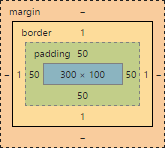
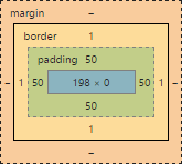
Choose a final value for my div 300px por 100px defining the internal spacing, taking into account that the spacing will increase on all sides the main element, ie if the element is 300 wide, so it will be worth 400, because 50 top and 50 right base 400, the same is valid for the height, then we must subtract 50 from the value we desire, in this case we want a div com 300px e 100px, will look like this.

div.d1 {
    width: 200px;
    height: 0px;
    /*É necessário por o height como 0px, pois se deixa vazio, ele assumirá um valor automático, e estragará o trabalho, eu deixei 0px 
 pois ele assume 50 de padding, o que já soma 100px da original*/
    
    padding: 50px;
    border: 1px solid black;
}
div.d2 {
    width: 300px;
    height: 100px;
    box-sizing: border-box;
    padding: 50px;
    border: 1px solid red;
}
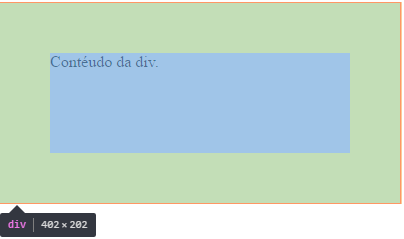
<div class="d1">Ajsutando manualmente.</div>
<br>
<div class="d2"> Com Border-Box </div>
<br>
    

According to

box-sizing: border-box;which is a style applied to the elements, maintaining the original ratio of each, thus not readjusting its size with the padding.

Observing: It is noteworthy that the border: 1px solid black, consumes 1px on each side of the element, ie the width becomes 302px;

  • Felix, your Ids don’t match what you say.

  • @Marconi - Check now

  • That’s right @Félix. Thanks for the adjustments :)

2

Because when inspecting the div that is in the code by the browser it is with height:202px and widht:402px and not width:300px; and height:100px;?

This occurs because of the standard area calculation model, called box Sizing, which is additive - that is, the final size is the sum of dimensions + padding + border + margin:

inserir a descrição da imagem aqui

In case I want to keep the values of width:300px; and height:100px; what should I do?

You need to change the model to border-box, which will force the recalculation of the internal area of the element so discounting the padding when the border. Example below:

inserir a descrição da imagem aqui

div {
width:300px;
height:100px;
border:1px solid red;
padding:50px;
box-sizing: border-box;
}
<div>
Contéudo da div.
</div>

  • 1

    Sensational, I posted the question because I think a lot of people don’t know @Onosendai. I’m thinking of even offering a reward here, because I don’t think the question was well considered, I think I should improve the title to make it more comprehensive? :)

  • 1

    Always a pleasure @Marconi! 'Element with different end size than the width and height definition in CSS' or something similar, that mentions the concepts that the body of your question displays, maybe makes your goal clearer.

  • Thanks for helping with the title, I was not sure what to put to make more comprehensive. I’ll offer a reward on that question as soon as possible. :)

  • 1

    Excellent! + 1 @Onosendai

1

You can use the property border-box of the CSS, as below:

div {
  width: 300px;
  height: 100px;
  border: 1px solid red;
  padding: 50px;
  -webkit-box-sizing: border-box;
  -moz-box-sizing: border-box;
  box-sizing: border-box;
}
<div>
  Contéudo da div.
</div>

It will cause the dimensions of the element to be maintained even when using other properties that would change its size, such as padding and border. Obviously this is valid for width only, for height will be adjusted according to the content.

Without using it, the browser will maintain the useful area (I don’t know if you have a more technical term) with the dimensions you defined and any property used that varies the size of the element will be added to the dimensions of the element. That is, the useful area of the element will be 300x100, adding 2 pixels in each because of the edge (302x102) and finally more 100px in each because of the padding, totaling 402x202, which are the values inspected.

  • That’s what I wanted to get at @Anderson, do you think the question is still hard to understand? Is there anything you can do to improve? I didn’t know it worked like this, so I decided to ask. I actually found it super interesting.

Browser other questions tagged

You are not signed in. Login or sign up in order to post.