1
Good morning... I am creating an email marketing and it is responsive, ie the td are with float left and when decreasing the size of it it will fall one under the other. My problem is... when I arrive at a screen size my contents inside the td stay in the left corner... and wanted it to stay in the middle, the image below you can understand better
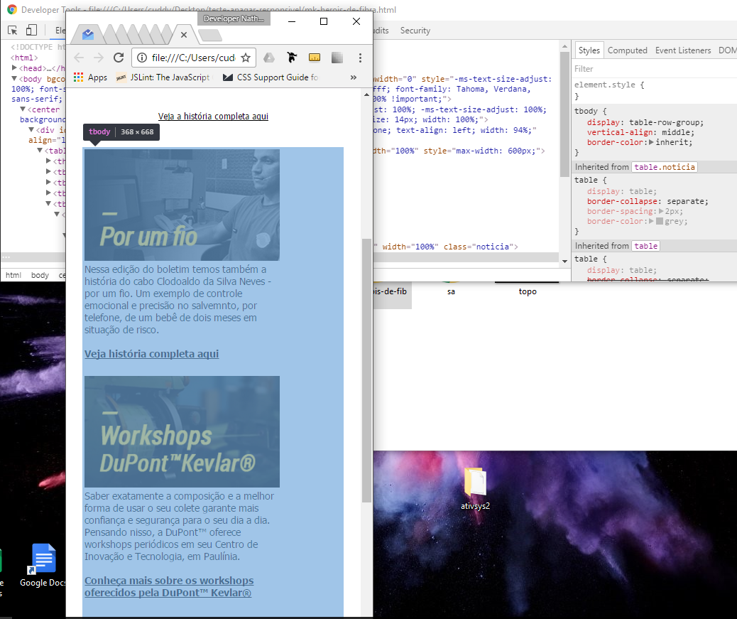
The content had to stay in the middle... and when it was desktop screen it can’t get centralized.
Detail: I have tried margin: auto and margin: 0 auto it didn’t work, I tried text-align: center also failed and I do not know what is missing... If someone can help me would be grateful.
Code below:
<!DOCTYPE html>
<html>
<head>
  <meta http-equiv="Content-Type" content="text/html; charset=utf-8">
  <style>
  /* bugfix iOS: remove o background da imagem depois que carregou, pra evitar bugs de renderizacao */
  img[src^="http"] {
    background: transparent;
  }
  </style>
</head>
<body bgcolor="#ffffff" topmargin="0" leftmargin="0" marginheight="0" marginwidth="0" style="-ms-text-size-adjust: 100%; font-size: 14px; -webkit-text-size-adjust: 100%; background-color: #ffffff; font-family: Tahoma, Verdana, sans-serif; text-align: center; -webkit-font-smoothing: antialiased; width: 100% !important;">
  <center style="-webkit-font-smoothing: antialiased; -webkit-text-size-adjust: 100%; -ms-text-size-adjust: 100%; background-color: #ffffff; font-family: Tahoma, Verdana, sans-serif; font-size: 14px; width: 100%;">
    <div id="principal" style="max-width: 600px; -webkit-text-size-adjust: none; text-align: left; width: 94%;" align="left">
      <table cellpadding="0" cellspacing="0" border="0" bgcolor="#ffffff" width="100%" style="max-width: 600px;">
        <thead>
          <tr id="logo" height="90">
            <td bgcolor="#000" width="1%"></td>
            <td bgcolor="#000" valign="middle" align="left">
              <a href="#" style="-webkit-text-size-adjust: none;">
                <img src="topo.png" alt="Herois de Fibra" width="100%" height="auto" border="0" style="color: #ffffff; font-size: 32px;"></a>
              </td>
              <td bgcolor="#000" width="1%"></td>
            </tr>
          </thead>

          <tr><td height="18" bgcolor="#ffffff" colspan="3"></td></tr>

          <tbody>
            <tr>
              <td bgcolor="#fff" width="3%"></td>
              <td bgcolor="#fff">
                <table cellpadding="0" cellspacing="0" border="0" bgcolor="#fff" width="100%">
                  <tr>
                    <td style="border-color: #fff; border-width: 10px 10px 20px; border-style: solid; text-align: left; -webkit-text-size-adjust: none;" align="left">
                      <img src="homem.png" alt="Olhar do povo, olhar da PM" width="100%" height="auto" border="0" style="color: #ffffff; font-size: 32px;">
                    </td>
                  </tr>
                  <tr>
                    <td class="conteudo" align="left" style="color: #000; font-size: 14px; border-color: #fff; border-width: 10px 10px 20px; border-style: solid;">
                      Uma nova edição do boletim <a href="#" style="color: #000;"><b>Heróis de Fibra</b></a> chega com a história do capitão Ricardo Nicotari-olhar do povo, olhar da PM. Juntos
                      com sua equipe ele desenvolveu um projeto premiado pelo Instituto Sou da Paz de policiamento comunitário na Zona Oeste de São Paulo.
                    </td>
                  </tr>
                  <tr><td height="30" bgcolor="#ffffff" colspan="3"></td></tr>
                  <tr>
                    <td class="conteudo" align="center">
                      <a href="#" style="color: #000; font-size: 12px;">Veja a história completa aqui</a>
                    </td>
                  </tr>
                </table>
              </td>
              <td bgcolor="#fff" width="3%"></td>
            </tr>
          </tbody>
          <tr><td height="18" bgcolor="#ffffff" colspan="3"></td></tr>
        </tr>


        <tr><td height="18" bgcolor="#ffffff" colspan="3"></td></tr>
        <tbody>
          <tr id="depoimentos">
            <td bgcolor="#fff" width="3%"></td>
            <td bgcolor="#fff">
              <table cellpadding="0" cellspacing="0" border="0" bgcolor="#fff" width="100%" class="noticia">
                <tr>
                  <td class="titulo" style="border-color: #fff; width: 275px; border-style: solid; font-family: Tahoma,Verdana,sans-serif; font-size: 14px; text-align: left; -webkit-text-size-adjust: none; float: left" align="center">
                    <img src="colun1.png" alt="Herois de Fibra" width="100%" height="auto" border="0" style="color: #ffffff; font-size: 32px;">
                    <br>
                    Nessa edição do boletim temos também a história do cabo Clodoaldo da Silva Neves - por um fio. Um exemplo de controle
                    emocional e precisão no salvemnto, por telefone, de um bebê de dois meses em situação de risco.
                    <br>
                    <br>
                    <a href="#" style="color: #000;"><b>Veja história completa aqui</b></a>
                    <br>
                    <br>
                  </td>
                  <td class="titulo" style="border-color: #fff; width: 275px; border-style: solid; font-family: Tahoma,Verdana,sans-serif; font-size: 14px; text-align: left; -webkit-text-size-adjust: none; float: left" align="center">
                    <img src="colun2.png" alt="Herois de Fibra" width="100%" height="auto" border="0" style="color: #ffffff; font-size:32px;" />
                    <br>
                    Saber exatamente a composição e a melhor forma de usar o seu colete garante mais confiança e segurança para o seu dia a dia.
                    Pensando nisso, a DuPont™ oferece workshops periódicos em seu Centro de Inovação e Tecnologia, em Paulínia.
                    <br>
                    <br>
                    <a href="#" style="color: #000;"><b>Conheça mais sobre os workshops oferecidos pela DuPont™ Kevlar®</b></a>
                  </td>
                </tr>
                <tr><td height="30" bgcolor="#ffffff" colspan="3"></td></tr>
              </table>
            </td>
            <td bgcolor="#fff" width="3%"></td>
          </tr>
        </tbody>

        <tr><td height="30" bgcolor="#ffffff" colspan="3"></td></tr>
        <tbody>
          <td bgcolor="#fff" width="3%"></td>
          <td bgcolor="#fff">
            <table cellpadding="0" cellspacing="0" border="0" bgcolor="#fff" width="100%" class="noticia">
              <tr>
                <td class="titulo" style="border-color: #fff; font-family: Tahoma,Verdana,sans-serif; font-size: 20px; text-align: left; -webkit-text-size-adjust: none;" align="left">
                  <img src="medalha.png" alt="Herois de Fibra" width="100%" height="auto" border="0" style="color: #ffffff; font-size: 32px;">
                </td>
              </tr>
              <tr>
                <td align="left" style="border-color: #fff; border-width: 10px 10px 20px; border-style: solid; font-size: 14px">
                  Está chegando a hora de condecorar os protagonistas das histórias escolhidas, os verdadeiros <a href="#" style="color: #000;"><b>Heróis de Fibra</b></a>. A Medalha Dupont™ Kevlar® será
                  construida mediante mobilização nas redes sociais, ou seja, com o compartilhamento das histórias publicadas no site. Participe!
                </td>
              </tr>
            </table>
          </td>
          <td bgcolor="#fff" width="3%"></td>
        </tbody>

        <tr><td height="30" bgcolor="#ffffff" colspan="3"></td></tr>
        <tfoot>
          <tr bgcolor="#ffffff">
            <td colspan="3" align="center">
              <img src="footer.png" style="width: 100%; height: auto;" />
            </td>
          </tr>
        </tfoot>
      </table>
    </div>
  </center>
</body>
</html>