0
People are making the site politicadascidades.com.br and when I change to the responsive design I come across this
This is the welcome screen in desktop version, the text is with align="center" and everything ok as requested. However in the responsive version the text was very weird and the image "Welcome" decreased as in the image below this.
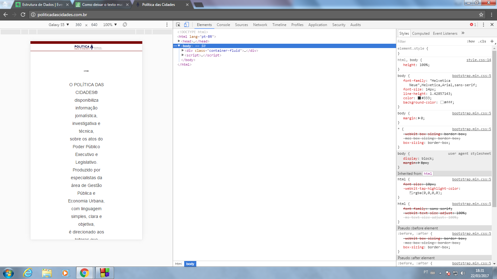
In the responsive version the text lost quality as you can see, someone could explain me the reason?
I don’t know if the F12 can but the site is politicadascidades.com.br
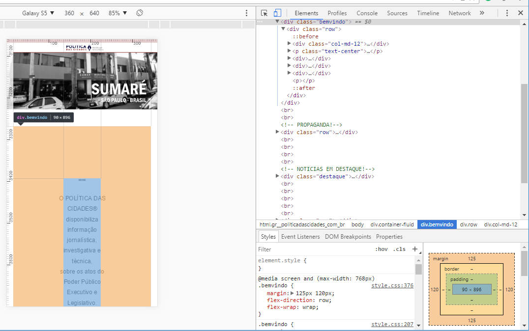
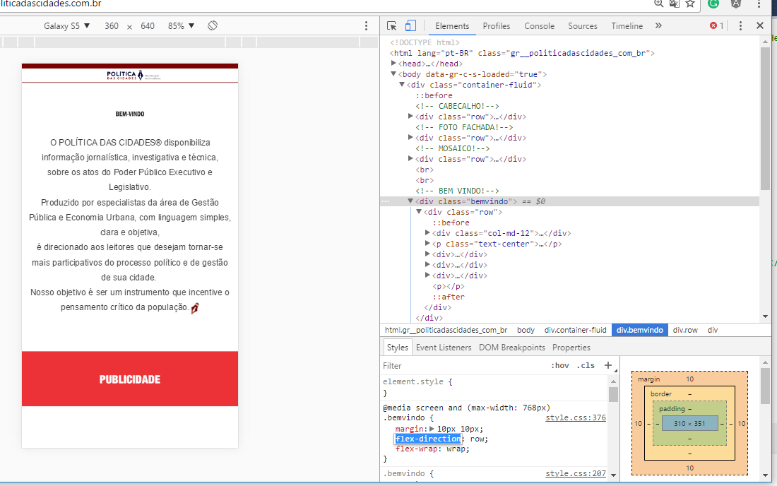
your problem is here... @media screen and (max-width: 768px) style.css:376 . Come { margin: 125px 120px; flex-Direction: Row; flex-wrap: wrap; }
– andrepaulo