div based on radius - border-Radius or other method?

Asked

Viewed 107 times

0

I need to create a div with the base in equal radius of the attached image. However I am not able to find the exact value in the border-Radius to equal the image, is there any other way to do this? Remembering that I need to leave responsive. inserir a descrição da imagem aqui

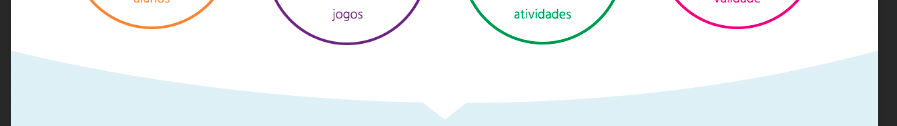
I’m doing some tests on fiddle with border-Radius but it’s hard to leave it the same. https://fiddle.jshell.net/163d0bs5/1/

Note: The arrow is not part of the doubt.

2 answers

0


I believe you can increase the width of the div, so that the edge radius is softer, but so that it does not spoil the layout, use overflow: hidden in the mother div.

.container {
  width: 100%;
  background-color: #e4f0f6;
  padding: 0;
  margin: 0;
  height: 100vh;
  overflow: hidden;
}

.test {
  width: 110%;
  margin: 0 -5%;
  text-align: center;
  background-color: #fff;
  padding: 40px 0;
  border-radius: 0 0 500% 500%;
}

.arrow {
  width: 0;
  height: 0;
  border-left: 20px solid transparent;
  border-right: 20px solid transparent;
  border-top: 20px solid white;
  margin: auto;
}
<div class="container">
  <div class="test">
    <h1>Teste com borda!</h1>
  </div>
  <div class="arrow"></div>
</div>

That’s what you need?

  • Hello, first of all thank you, is more or less that, the problem that I’m not getting equal to image, and also need to be responsive. It would be very primitive of me to use the image as bg? or as image even positioning at the base of div? vlw

  • What would "fix equal image"? It can be said that my example is responsive, slightly varying the curvature to different screen sizes, but depending on the case, it makes little difference.

  • Would position the background-image at the bottom of the div, or use an img with position Absolute and bottom 0, I will do more testing here with image and with border-Radius same.

  • I will use your method, I think I managed to reach a satisfactory condition. Thank you.

0

Another way to do it is by using the property radial-gradient() of background. Behold:

.container{
  width:100%;
  background-color:#e4f0f6;
  padding:0;
  margin:0;
  height:100vh;
}
.test{
  width:100%;
  text-align:center;
  padding:40px 0;
  border-radius: 0px 0px 50% 50% / 0 0 25% 25%;
  background: radial-gradient(ellipse at center,#fff 15%,#fff 0%,#fff 57%,rgba(0,0,0,0) 50%);
}
<div class="container">
  <div class="test">
    <h1>Teste com borda!</h1>
  </div>
</div>

  • 1

    But in my case it is only the base that has radius, trying to change the value of the border-Radius but it is difficult to arrive in the condition of the image. But I’ll try harder, thank you.

Browser other questions tagged

You are not signed in. Login or sign up in order to post.