Image breaking (HTML, CSS, responsiveness)

Asked

Viewed 487 times

0

Good morning,

My problem is this:

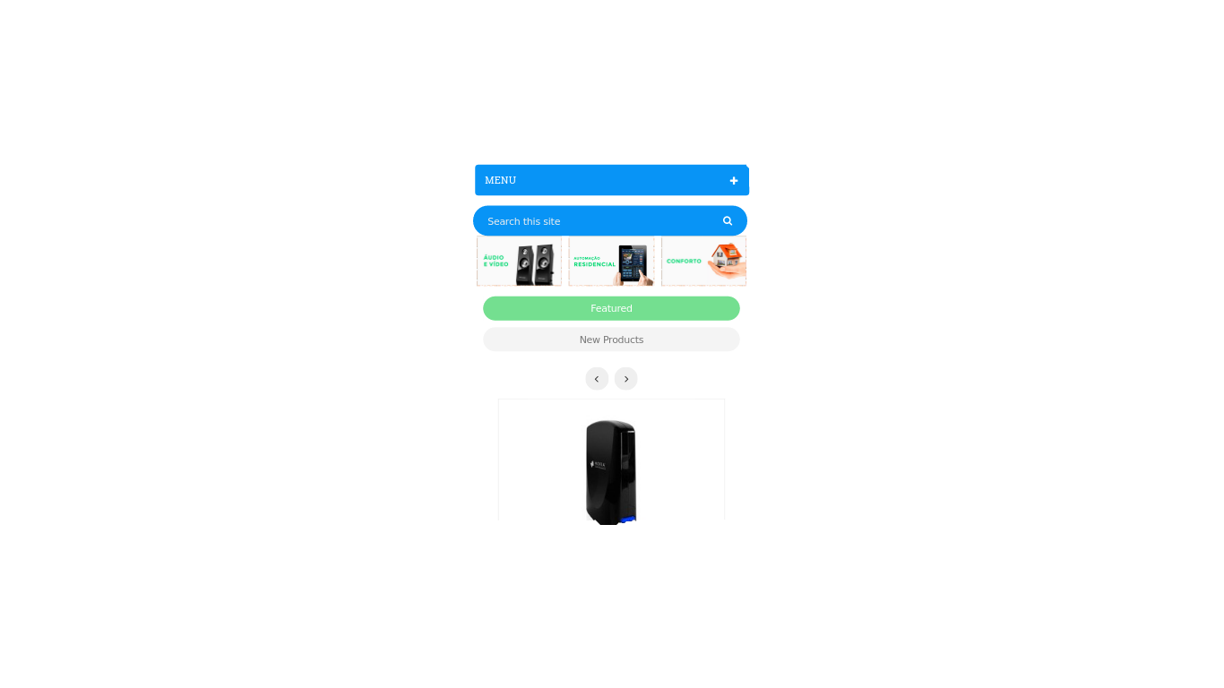
I’m using the Prestashop. I need those images of the print to be underneath each other, when it decreases the resolution or when it is accessed from a mobile device, so they are unreadable. I mean, it would just be letting them down on each other, I don’t know if media wanted to. Grateful for the help.

inserir a descrição da imagem aqui

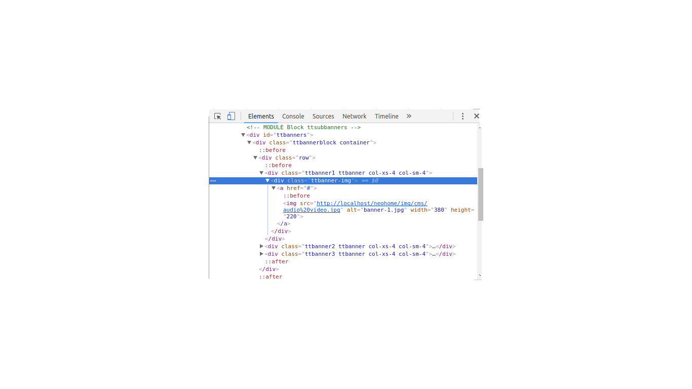
  • Put the code you’re using so we can help you.

  • Oops, I forgot that detail, thank you, and also say I’m using Prestashop.

1 answer

1


Change the div with the class "col-xs-4 col-sm-4" for "col-xs-12 col-sm-4". The bootstrap grid works from smaller to larger resolutions. If you put only col-Xs-4 this same grid size will be set for all resolutions as sm md lg. Putting the col-xs-12 the images were below each other in smaller resolutions and placing col-sm-4 the same grid as shown will be maintained for larger resolutions.

  • Thank you @matheuscla. I will test and get back to you, thank you very much.

  • It worked, I didn’t realize it man, haha. Thanks anyway.

Browser other questions tagged

You are not signed in. Login or sign up in order to post.