How to use Materialize side-Nav?

Asked

Viewed 4,771 times

2

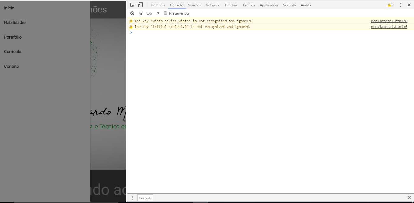
Good morning, I’m trying to make a responsive menu for my portfolio, I’m using the do materialize but when I put it fixed the side-Nav of the mobile version Uga, it gets all dark and not to click on the items, here is the image of how it looks when it is with the navbar-Fixed class

Side nav fixo

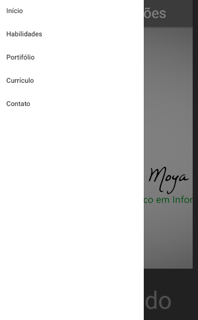
and here is an image to show how it works normally without putting it fixed

navbar não fixo

to make this menu I watched this video: 2.- Materialize Tutorial: NAVBAR from the Brajan Montes Perez channel on youtube, I have not put the pq link if there is no way to put the html code

my code here (removed the body)

menulateral

<link rel="stylesheet" href="css/materialize.min.css">
<link href="http://fonts.googleapis.com/icon?family=Material+Icons"     rel="stylesheet">
<meta name="viewport" content="width=device-width, initial-scale=1.0" />

<div class="row">

  <div class="navbar-fixed">
    <nav>
            <div class="nav-wrapper grey darken-1">
                <a href="#!" class="brand-logo">Eduardo Moya Simões</a>
                <a href="#" data-activates="mobile-demo" class="button-collapse"><i class="material-icons">menu</i></a>
                <ul class="right hide-on-med-and-down">
                    <li><a href="">Início</a></li>
                    <li><a href="">Habilidades</a></li>
                    <li><a href="">Portifólio</a></li>
                    <li><a href="">Currículo</a></li>
                    <li><a href="">Contato</a></li>
                </ul>
                <ul class="side-nav" id="mobile-demo">
                    <li><a href="">Início</a></li>
                    <li><a href="">Habilidades</a></li>
                    <li><a href="">Portifólio</a></li>
                    <li><a href="">Currículo</a></li>
                    <li><a href="">Contato</a></li>
                </ul>
            </div>
    </nav>
  </div>
   <script src="js/jquery-3.1.1.js"></script>
   <script src="js/materialize.min.js" ></script>
   <script type="text/javascript">
      $(document).ready(function(){
      $('.parallax').parallax();
    });
   </script>
   <script>
     $( document ).ready(function(){
     $(".button-collapse").sideNav();
   })
 </script>

6 answers

1

The same thing happened to me and I found out q is because of the class z-index .navbar-fixed. To resolve just insert into your css:

.navbar-fixed {
  z-index: 998;
}

0

I had to change the z-index in CSS to -1

.sidenav-overlay {
position: fixed;
top: 0;
left: 0;
right: 0;
opacity: 0;
height: 120vh;
background-color: rgba(0, 0, 0, 0);
z-index: -1;
display: none;

}

0

 <ul class="side-nav" id="mobile-demo">
    <li><a href="">Início</a></li>
    <li><a href="">Habilidades</a></li>
    <li><a href="">Portifólio</a></li>
    <li><a href="">Currículo</a></li>
    <li><a href="">Contato</a></li>
</ul>

You should just put the code below after the div with the class "navbar-Fixed":

  • Beginning
  • Skills
  • Portfolio
  • Resume
  • Contact
  • 0

    Here was bugging too, I decided taking the anchor of action from inside the Nav, mine was like this.

        <nav>
            <div class="nav-wrapper grey darken-1">
                <a href="#!" class="brand-logo">Eduardo Moya Simões</a>
                <ul class="right hide-on-med-and-down">
                    <li><a href="">Início</a></li>
                    <li><a href="">Habilidades</a></li>
                    <li><a href="">Portifólio</a></li>
                    <li><a href="">Currículo</a></li>
                    <li><a href="">Contato</a></li>
                </ul>
                <ul class="side-nav" id="mobile-demo">
                    <li><a href="">Início</a></li>
                    <li><a href="">Habilidades</a></li>
                    <li><a href="">Portifólio</a></li>
                    <li><a href="">Currículo</a></li>
                    <li><a href="">Contato</a></li>
                </ul>
            </div>
        </nav>  
        <a href="#" data-activates="mobile-demo" class="button-collapse"><i class="material-icons">menu</i></a>
    

    I do not know why this happens, but at least here solved, but then I had to reposition the anchor of the action

    0

    Why are using 2 ready(Function)??

    Try to do so:

    <script>
    $(document).ready(function(){
      $(".button-collapse").sideNav();
      $('.parallax').parallax();
    });
    </script>
    

    0

    You have to set a smaller z-index for the sidenav-overlay relative to the sidenav (Obs: the class name can change according to the materializecss version).

    Inspect the sidenav and write down your z-index, change your custom css, or even the materialize css itself, the sidenav-overlay z-index so it’s smaller than the sidenav itself.

    Browser other questions tagged

    You are not signed in. Login or sign up in order to post.