How to keep Ivs aligned on top of each other?

Asked

Viewed 2,044 times

6

- I am extremely new to the subject and do not know much, I am going from searches on the internet, videos and readings, I say this in case there is some code or unnecessary rule in my doubts

I would like some help in this situation:

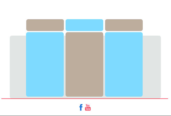
I’m training some layout for a website where I sketched on the Illustrator:

inserir a descrição da imagem aqui

When I went to start passing this to html and css I had problems aligning all the Divs on top of each other.

When on small screen the Ivs align, but when I stretch the browser screen each follows a different rule.

I had to join the two images to post, separated by the red bar:

inserir a descrição da imagem aqui

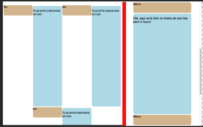
Well, the question is this:, How do I align these Ivs ?

  • In the middle of the project I wondered if this is the best way to draw this layout. The brown banners are just to put an identifier with an icone and generate link like for example Contact, About, portfolio, things like that.

  • When I put one div inside the other, in this case, the brown buttons inside the blue column, it worked, but I’d really like that spaced between them, effect I couldn’t do with one div inside the other.

  • A bonus question, I tried to make my " Container " look like the draft image, where the top of it is not in the size 100% leaving the buttons above it. When I did this everything went wrong, I came next using the position rules but when I lowered the browser screen the buttons entered inside the other Ivs, I tried to do by float and did not get well, the rules did not answer anything.

Thank you in advance!

/* Estilo das colunas */

/* CABEÇALHO */
#cabecalho {
    background-color: white;
    height: 11em;
    width: 100%;
}

#cabecalho > p {
    text-align: center;
    padding-top: 5em;
}

/* CONTAINER */
#container {
    display: flex;
    justify-content: center;
    flex-direction: row;
    flex-wrap: wrap;
}

/* COLUNAS */
.coluna {
    margin: 4px;
    width: 19em;
    height: 33em;
    background-color: lightblue;
    border-radius: 10px;
}

/* BOTÕES */
.botao {
    width: 19em;
    border-radius: 10px;
    height: 3.4em;
    background-color: tan;
}
<!DOCTYPE HTML>
<html>
<head>
	<title>Layout Menu.</title>
	<link rel="stylesheet" href="estilo.css">
	<link rel="stylesheet" href="normalize.css">
</head>
<body>
	<header id="cabecalho">
		<P> LOGO </P>
	</header>
	<div id="container">
		<section class="botao esquerdabotao">Menu</section>
		<section class="coluna esquerdacoluna">
			<p> Olá, aqui será feito os testes de escritas para o layout </p>
		</section>
		<section class="botao centralbotao">Menu</section>
		<section class="coluna centralcoluna">
			<p> Olá, aqui será feito os testes de escritas para o layout </p>
		</section>
		<section class="botao direitabotao">Menu</section>
		<section class="coluna direitacoluna">
			<p> Olá, aqui será feito os testes de escritas para o layout </p>
		</section>
	</div>
</body>
</html>

  • 1

    Face beforehand, give a read on this, flexbox, will help you solve most of these problems very quietly. https://css-tricks.com/snippets/css/a-guide-to-flexbox/

2 answers

3


As the friend said above the elements are rendered in the writing order of the HTML code. I used Flexbox to solve your "problem". Flexbox is a way to create layouts that don’t need to depend on HTML markup.

I used the order(Flexbox) property in the class .botão and in class .coluna. "The order property determines the order in which items are displayed in the container.", then I defined order: 1 menu, since you want them at the top and order: 2 for columns to be below the menu.

To learn more about Flexbox check out the links below.

  1. Flexbox
  2. Visual guide to Flexbox

/* Estilo das colunas */

/* CABEÇALHO */
#cabecalho {
    background-color: white;
    height: 11em;
    width: 100%;
}

#cabecalho > p {
    text-align: center;
    padding-top: 5em;
}

/* CONTAINER */
#container {
    display: flex;
    justify-content: center;
    flex-direction: row;
    flex-wrap: wrap;
}

/* COLUNAS */
.coluna {
    margin: 4px;
    width: 19em;
    height: 33em;
    background-color: lightblue;
    border-radius: 10px;
    order: 2;
}

/* BOTÕES */
.botao {
    width: 19em;
    border-radius: 10px;
    height: 3.4em;
    margin: 0 0.25em;
    background-color: tan;
    order: 1;
}
<div id="container">
		<section class="botao esquerdabotao">Menu</section>
		<section class="coluna esquerdacoluna">
			<p> Olá, aqui será feito os testes de escritas para o layout </p>
		</section>
		<section class="botao centralbotao">Menu</section>
		<section class="coluna centralcoluna">
			<p> Olá, aqui será feito os testes de escritas para o layout </p>
		</section>
		<section class="botao direitabotao">Menu</section>
		<section class="coluna direitacoluna">
			<p> Olá, aqui será feito os testes de escritas para o layout </p>
		</section>
	</div>

1

Understand the positioning behavior of the elements, by default they will follow the same writing directions, left to right, and when you reach the limit back to the beginning.

Observe the order of your elements:

#knob #column #knob #column

Should be:

#knob #knob #column #column

After that, define a width for his #container to accommodate 3 columns side by side (57em, since each column has 19em). You will already achieve the expected result like this.

#cabecalho {
    background-color: white;
    height: 11em;
    width: 100%;
}
#cabecalho > p {
    text-align: center;
    padding-top: 5em;
}
#container {
    display: flex;
    justify-content: center;
    flex-direction: row;
    flex-wrap: wrap;
    background: red;
    width: 57em;
}
.coluna {
    width: 19em;
    height: 33em;
    background-color: lightblue;
    border-radius: 10px;
}
.botao {
    width: 19em;
    border-radius: 10px;
    height: 3.4em;
    background-color: tan;
}
<!DOCTYPE HTML>
<html>
<head>
    <title>Layout Menu.</title>
    <link rel="stylesheet" href="estilo.css">
    <link rel="stylesheet" href="normalize.css">
</head>
<body>
    <header id="cabecalho">
        <P>LOGO</P>
    </header>
    <div id="container">
        <section class="botao esquerdabotao">Menu</section>
        <section class="botao centralbotao">Menu</section>
        <section class="botao direitabotao">Menu</section>

        <section class="coluna esquerdacoluna">
            <p>Olá, aqui será feito os testes de escritas para o layout</p>
        </section>

        <section class="coluna centralcoluna">
            <p>Olá, aqui será feito os testes de escritas para o layout</p>
        </section>

        <section class="coluna direitacoluna">
            <p>Olá, aqui será feito os testes de escritas para o layout</p>
        </section>
    </div>
</body>
</html>

Browser other questions tagged

You are not signed in. Login or sign up in order to post.