Different layout on other computers?

Asked

Viewed 1,000 times

3

I’m with a project and this project was all done from scratch on my PC, however when I took my project to another PC that had a monitor resolution totally different from mine, the images and certain texts I put were out of place.

Does anyone have a solution to this problem?

Some way that regardless of the resolution the images and texts appear in a certain way, I had to take a look if I had any solution to this problem and have only for Android(Different layout on another device) but I am working with Windows and as has a way for Android can have for Windows.

OBS:I have tried to put the image in different ways, implementing it in the HTML body with the tag "img" and by the CSS with the "background" thinking that my mistake was in the way to put the image but regardless of the way this problem was posed.

My HTML file:

<div id="image-rodape">
  <img src="imagens/rodape.png" />
  <p class="texto_rodape">By: Matheus Wallace &nbsp;&nbsp;&nbsp;&nbsp;&nbsp;&nbsp;&nbsp;&nbsp;&nbsp;&nbsp;&nbsp;&nbsp;&nbsp;&nbsp;&nbsp;&copy;Copyright,TIPI 02/EBEP Maceió. Todos os direitos reservados.</p>
</div>

My CSS file:

div#image-rodape img {
  position: absolute;
  display: block;
  top: 1235px;
  left: 390px;
  margin-bottom: 10px;
}

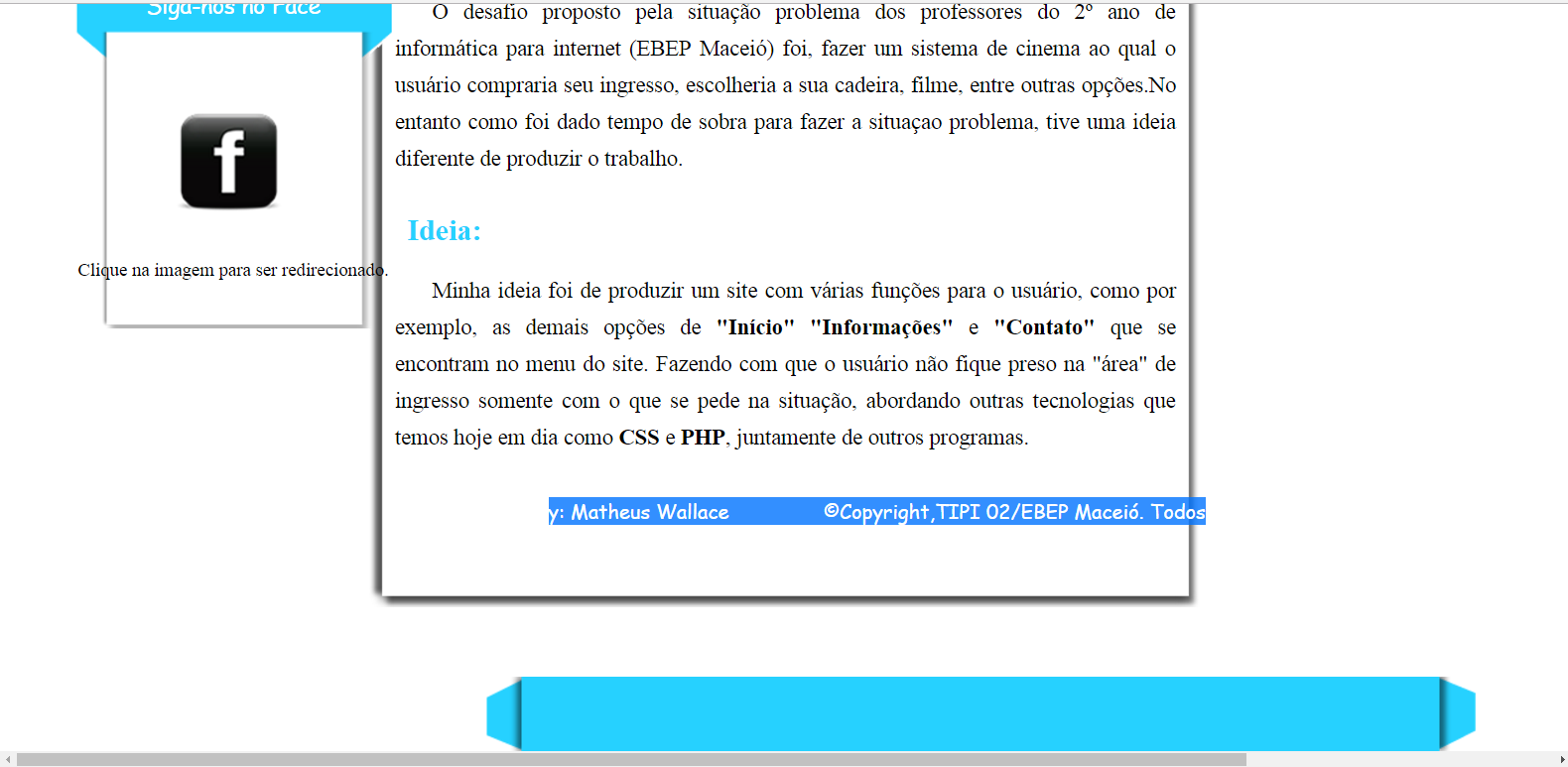
OBS2: I’m working on my layout with images, both in the menu part and in the sidebar, in my footer and the texts placed in them are all leaving the place when the resolution of the monitor is different.

Image on my PC:

inserir a descrição da imagem aqui

Image on another PC:

inserir a descrição da imagem aqui

  • 2

    You have to use Media Queries so that the behavior of the elements and the necessary changes in the CSS styles are made according to the size of each screen.

  • I had no idea of this Media Queries however I’m beginning to understand now, and from what I understand the Queries as you said they make changes to CSS files but on sites like stackoverflow the elements do not seem to change, open the stack site in a netbook I have and visually is added to feathers the horizontal and vertical scrollbars without causing the elements of the site suffer changes, in this case to get a result equal to that of this site can also be done only with Media Queries ?

  • This link can help you: http://answall.com/questions/112116/comor- tentar-deixarum-site-compatibiel-com-principais-browsers

  • 1

    This one tbm: http://answall.com/questions/104798/meu-site-fica-bagunçado-no-microsoft-edge-firefox-e-no-safari-comoresolver-es

  • You managed to solve your problems?

  • Since the friend said you need to use Media Queries I just took a quick look at the subject and that seems to be it, I’m going to have to take some time to study about, but I’m still not sure that will meet my needs and on the links you posted did not serve because according to the method that the staff spoke of Bootstrap do not need to use this method.

  • 1

    Try pure CSS (kind of confusing, but it works lul) Link

  • 1

    Instead of using pixel with Paramento, work with percentage, thus adapting the devices of various resolutions.

Show 3 more comments

2 answers

1


You can use CSS media queries. They’re great for giving layout responsiveness. I’d rather use them than frameworks.

Here is a basis for several types of screen with some observations I made:

/*

Aqui você coloca o CSS padrão de sempre

*/

.container {
    width: 100%;
} /* Esse será o tamanho padrao da classe container*/


/* A partir daqui são as media queries e as propriedades dos elementos que você colocar dentro das media queries
podem mudar quando a tela for esticada ou diminuída

/* Media Queries */ 
@media screen and (max-width: 83em) {
    .container{
        width: 80%;
    }   /*caso a viewport(janela do navegador) ou tamanho da tela for
        igual ou até 83em (vc também pode usar px se preferir) a classe .container só ocupará 80% da tela*/
}

@media screen and (max-width: 58em) { /*para telas menores ou do tamanho até 58em*/

}

@media screen and (max-width: 49.4375em) {/*para telas menores ou do tamanho até 49.4375em*/

}

@media screen and (max-width: 42.5em) {/*para telas menores ou do tamanho até 42.5em*/

}

@media screen and (max-height: 41.125em) {/*para telas menores ou do tamanho até 41.125em*/

}

@media screen and (max-width: 39.375em) {/*para telas menores ou do tamanho até 39.375em*/

}

@media screen and (max-width: 320px) {/*para telas menores ou do tamanho até 320px (aqui está um exemplo em px)*/

}

This example I put there fits almost any screen of any device. Media queries not only for size. They can change any property. It’s like the standard CSS, only the elements you put inside the media querie will have the properties set for it inside the media querie when the screen enters the size condition.

You can read more about here

Anyway, there are also frameworks like Bootstrap that can help you. But if you’re starting out, you’d better learn media queries before moving on to a framework.

1

Hello, the problem is not something a plugin or a linah of code will solve. The problem is in your HTML architecture and CSS settings. The most recommended to do is to follow the structure of some front-end framework, because it will give you all the architecture ready.

I recommend taking a look at Bootstrap: http://getbootstrap.com/

If you are not aware you can use some templates: https://startbootstrap.com/

  • (My opinion): Framework for those who are starting is not a good idea. It is always recommended the basics before to later manage to dominate the tool. If the AP does not know media query, will not know how to properly utilize the responsiveness of Bootstrap and understand the main philosophy of mobile first.

  • I agree with your opinion, but in my view it is easier to find study material and problem solving when using some good framework. Learning ends up being even quieter, because the problems that happen will be easier to be recognized and treated.

Browser other questions tagged

You are not signed in. Login or sign up in order to post.