2
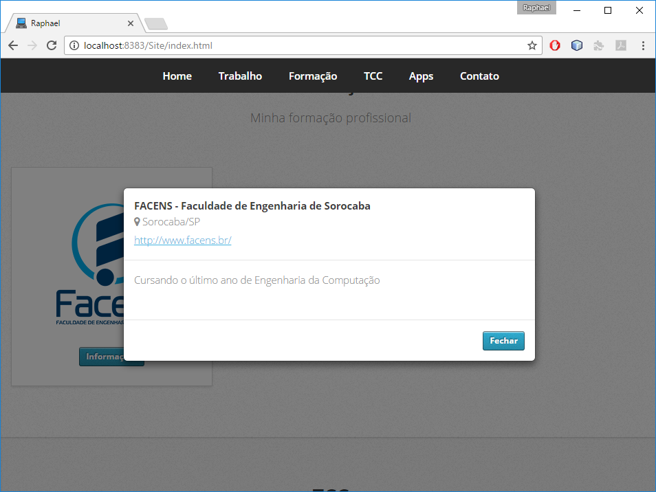
I have a modal bootstrap on my page HTML. When I open the modal in the computer browser, the modal appears as follows:
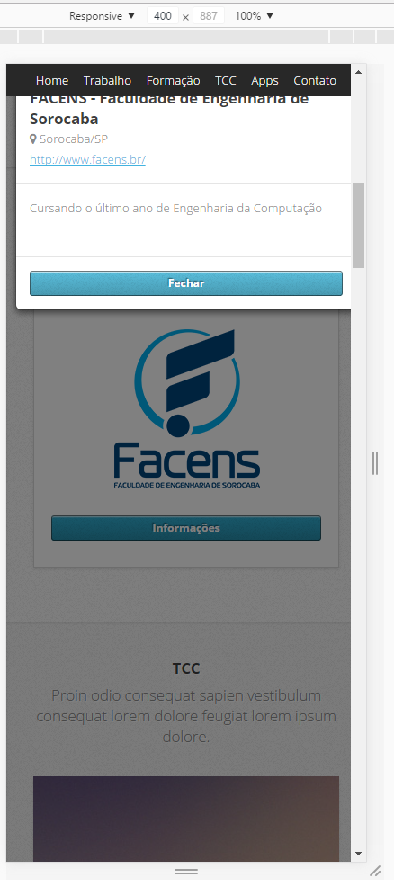
But when simulating the screen of a smartphone, the modal behind my menu nav:
Below follows the modal code:
<div id="modal-facens" class="modal fade" role="dialog">
    <div class="modal-dialog">
      <!-- Modal content-->
      <div class="modal-content">
        <div class="modal-header">
          <h4 class="modal-title">FACENS - Faculdade de Engenharia de Sorocaba</h4>
          <i class="fa fa-map-marker" aria-hidden="true"></i> Sorocaba/SP <br>
          <a href="http://www.facens.br/" target="_blank">http://www.facens.br/</a>
        </div>
        <div class="modal-body">
            <p>
                Cursando o último ano de Engenharia da Computação
            </p>
        </div>
        <div class="modal-footer">
          <button type="button" class="btn-info btn-sm" data-dismiss="modal">Fechar</button>
        </div>
      </div>
    </div>
</div>
I would like the modal to be centralized in any situation (computer or mobile). How can I do ?

It would be nice if you used Snippet with CSS together. But before you do that take a look at
display: table-cell;here for example: https://css-tricks.com/centering-in-the-unknown/– Thiago Santos