What is the difference between col-lg-* , col-Md-* and col-Sm-* in Bootstrap?

Asked

Viewed 46,967 times

20

It’s been a long time since I’ve used the Bootstrap I have worked with almost all versions. Normally to structure my applications I use the grid bootstrap, row to create lines and col- for columns.

I’d like to know :

  • The difference between col-lg-* , col-md-* and col-sm-*
  • Under what circumstances should they be used
  • In the case of inappropriate use of these elements that problems may arise ?

3 answers

27


In the Bootstrap documentation itself there is a comparative table between the grid classes.

inserir a descrição da imagem aqui

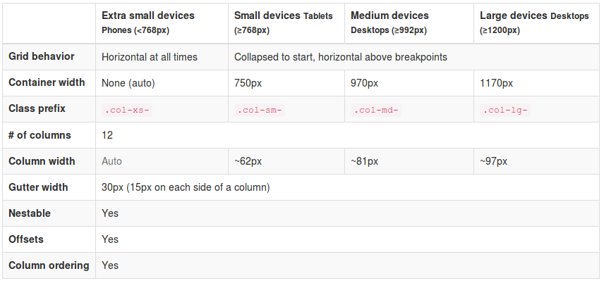
That is, the class .col-xs-* define the grid for devices with a screen width less than 768px. The class .col-sm-* sets for screens higher than 768px. The class .col-md-* sets for screens higher than 970px and class .col-lg-* for screens higher than 1200px. Its use is basically to define different grids for your element, based on the size of the display of your user.

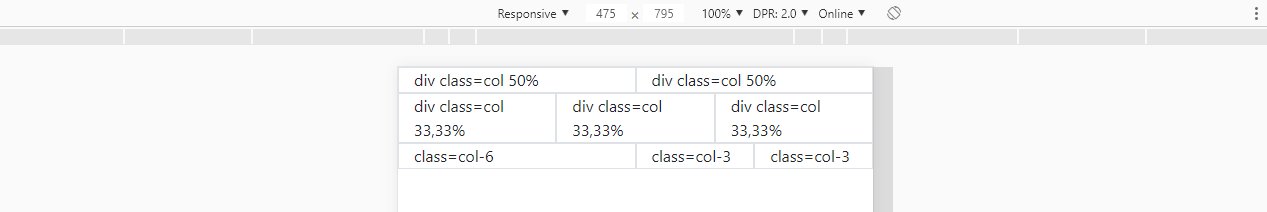
For example, you might want to display a sector of your site in two columns on monitors by setting the class .col-sm-6 for each. However, on small screen devices such as mobile, two columns may not be ideal, leaving content squeezed and small, with this you can define that on these devices, instead of two columns, this sector is in only one column, with the class .col-xs-12.

Basically you’re telling the browser: if the user screen has a width greater than or equal to 768px, display this div occupying 6 of the 12 columns of my grid. Already, if the width is less than 768px, display it occupying 12 of the 12 columns of the grid.

<div class="col-xs-12 col-sm-6">...</div>

It is a very useful feature especially when you have, for example, a list of products in a virtual store. You can define how many products appear per line in each display setting the column size.

<div class="col-xs-12 col-sm-4 col-md-3 col-lg-2">{Produto}</div>

Thus, would appear 1 product for extra small Devices, occupying 12 of 12 grid columns, 3 products in small Devices, occupying 4 of 12 columns, 4 products in medium Devices, occupying 3 of 12 columns and 6 products in large Devices, occupying 2 of 12 columns.

Personal note: The grid system is, as presented, the main functionality of Bootstrap implementing the philosophy Mobile First and responsiveness. If you have been using it for a long time and did not know this difference, I recommend studying the documentation a little more before continuing or seeking another method of study. (Take this as a positive review)

  • 1

    In addition, bootstrap 4 currently has one more argument to control the behavior of the grid system. Be, col-Xl-* for extra large Vices. Then the new arguments are: .col-* (extra small devices - < 576px), .col-sm-* (small devices >= 576px), .col-md-* (medium devices >= 768px), .col-lg-* (large devices >= 992px), .col-xl-* (xlarge devices >= 1200px).

6

Now with the official version of Bootstrap being the versão 4, I believe the answer deserves an update.

Follow the link to the official documentation of summer grid 4: https://getbootstrap.com/docs/4.0/layout/grid/

In the image below note that in red I checked the new grid fractionation templates, which now has the .col-xl- for screens larger than 1200px and with class col-, which can be used simply as class="col" to occupy 100% of the width if you don’t have another col at your side, or class="col-6" if you want it to be only 50% of the screen width.

inserir a descrição da imagem aqui

More details

The grid of version 3 was based on float:left to position the columns side by side. But in the version 4 the grid is done with display:flex which greatly facilitates vertical alignments and makes everything even more responsive.

The class col is defined in this way by the fact that container father to .row be like display:flex

.col {
    flex-basis: 0;
    flex-grow: 1; /* isso faz com que a largura fique "autimática" */
    max-width: 100%;
}

About the flex-grow: https://developer.mozilla.org/en-US/docs/Web/CSS/flex-grow

See this example below building the grid only with class="col", note that if you have 2 divs with class="col" each takes up 50% of the space. If you have 3 divs each assumes 1/3 of space.

<link rel="stylesheet" type="text/css" media="screen" href="https://maxcdn.bootstrapcdn.com/bootstrap/4.1.0/css/bootstrap.min.css" />

<div class="container">
  <div class="row">
<div class="col border">
  div class=col 50%
</div>
<div class="col border">
  div class=col 50%
</div>
  </div>
  <div class="row">
<div class="col border">
  div class=col 33,33%
</div>
<div class="col border">
  div class=col 33,33%
</div>
<div class="col border">
  div class=col 33,33%
</div>
  </div>
  <div class="row">
<div class="col-6 border">
  class=col-6
</div>
<div class="col-3 border">
  class=col-3
</div>
<div class="col-3 border">
  class=col-3
</div>
  </div>
</div>

When element has class col-n° means she’ll always be this wide independent of the width of the screen, then a div class="col-6" will always occupy 50% of the screen width, no matter if the screen has 200px or 2000px.

inserir a descrição da imagem aqui


OBS:

The rest of the grid behavior on version 4 is consistent with @Andersoncarloswoss' response and still follows these principles of fractionation as he explained in the other reply.

Whereas

That:

<div class="col-xs-12 col-sm-4 col-md-3 col-lg-2">{Produto}</div>

Now that’s it:

<div class="col-12 col-sm-4 col-md-3 col-lg-2">{Produto}</div>

As said, any col-xs- ceased to exist, and must now be replaced by col- number.

4

These are bootstrap attributes that will set the grid size, relative to the device size, are breakpoints :

col-xs-* extrasmall < 768 px

col-sm-* small >= 768 px

col-md-* medium >= 992 px

col-lg-* large >= 1200 px

Regarding the question :

Under what circumstances should they be used ?

Because it is layout, it is ample answer, but in general when you want a grid that adapts to these patterns breakpoints.

And the inappropriate use, the only problem is in its layout.

Browser other questions tagged

You are not signed in. Login or sign up in order to post.