Mysterious padding when using Scale CSS

Asked

Viewed 94 times

1

I have a problem. When using scale() in a CSS of mine to decrease the size of an image in media query, he’s creating a padding mysterious.

inserir a descrição da imagem aqui

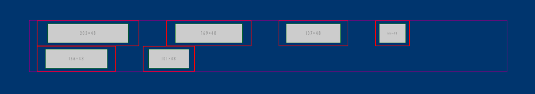
This padding is not set anywhere, if you see, it is the original image size. The image decreases, but the parent element retains the original size. He shouldn’t be around?

I made a codepen with the codes to view the codes and the application.

.container {
    border:1px solid purple;
}

.linha-03 {
    background:#00356e;
    padding:45px 0;
    margin-bottom:10px;
}

.linha-03 ul {
    list-style:none;
    padding:0;
    margin:0;
}

.linha-03 ul li {
    float:left;
    margin-right:55px;
    border:1px solid red;
}

.linha-03 ul li:last-child {
    margin:0;
}

.linha-03 ul li img {
    border:1px solid green;
}

@media (min-width:992px) and (max-width:1199px) {
    .linha-03 ul li img {
        transform:scale(0.8);
    }
}

@media (min-width:768px) and (max-width:991px) {
    .linha-03 ul li img {
        transform:scale(0.5);
    }
}
<div class="linha-03">
    <div class="container">
        <ul>
            <li><img src="http://placehold.it/203x48"></li>
            <li><img src="http://placehold.it/169x48"></li>
            <li><img src="http://placehold.it/137x48"></li>
            <li><img src="http://placehold.it/66x48"></li>
            <li><img src="http://placehold.it/156x48"></li>
            <li><img src="http://placehold.it/101x48"></li>
        </ul>
    </div>
</div>
<link rel='stylesheet' href='//maxcdn.bootstrapcdn.com/bootstrap/3.2.0/css/bootstrap.min.css'>

  • I believe it is the default padding of the browser, for example Chrome it has default margin of it the firefox no... you know? maybe it is that tries to put the padding: 0;

  • @Nathan, I tested this, obviously. No result. I tried to reset the padding, margin of all the elements above the image.

  • 1

    It’s not that he’s creating a mysterious padding. The point is that he’s padding the image, not the element that surrounds the image. Then he’ll do just that. He won’t keep up. But if you do the Scale on the father, it works.

1 answer

1


The effect of scale is not tired to the elements above it. That is, the parent elements of the object in which you are applying the scale will not be affected.

To not have to give scale in the main parent element you need, you may need to review the semantics of your code and opt for alternatives.

For example, the tag img accepted border. You can use it.

.container {
  border: 1px solid purple;
}
.linha-03 {
  background: #00356e;
  padding: 45px 0;
  margin-bottom: 10px;
}
.linha-03 ul {
  list-style: none;
  padding: 0;
  margin: 0;
}
.linha-03 ul li {
  float: left;
  margin-right: 55px;
}
.linha-03 ul li:last-child {
  margin: 0;
}
.linha-03 ul li img {
  border: 1px solid red;
}
@media (min-width: 992px) and (max-width: 1199px) {
  .linha-03 ul li img {
    transform: scale(0.8);
  }
}
@media (min-width: 768px) and (max-width: 991px) {
  .linha-03 ul li img {
    transform: scale(0.5);
  }
}
<div class="linha-03">
  <div class="container">
    <ul>
      <li>
        <img src="http://placehold.it/203x48">
      </li>
      <li>
        <img src="http://placehold.it/169x48">
      </li>
      <li>
        <img src="http://placehold.it/137x48">
      </li>
      <li>
        <img src="http://placehold.it/66x48">
      </li>
      <li>
        <img src="http://placehold.it/156x48">
      </li>
      <li>
        <img src="http://placehold.it/101x48">
      </li>
    </ul>
  </div>
</div>
<link rel='stylesheet' href='//maxcdn.bootstrapcdn.com/bootstrap/3.2.0/css/bootstrap.min.css'>

  • cool! Actually, the logic was that it was wrong. In this way, it healed the problem (in parts). Now tell me one thing: keeping Cale as you did, I tried to reset the margin, and it’s not working... it beats the margin measures?

  • No. It happens the same situation, the father is intact when changes the children through Cale. It has to decrease also.

  • I tried to decrease the whole UL, but the problem is always inheriting to the parent element. So, how does it look? hahah, I take the Scale to the body? rs

  • It would be nice to understand your idea.

  • Another negative. It’s hard today...

  • I will explain: I would like the 6 LI’s to fit in the container, adapting their sizes. I thought of using the Scale for flexibility. However, these problems started to appear. So, for each Mediaquery, I would like to make the images, li’s and ul’s adapt to each size. However, every time I try this, the parent element of what Cale used inherits this "ghostly padding" (I have already understood that it is not a padding, but the original size of the element).

  • Just use percentage on li. Do the math. Divide 100% by 6 and put in the percentage value. Then it adapts.

  • The Lis have different measurements, I thought that too, Diego.

Show 3 more comments

Browser other questions tagged

You are not signed in. Login or sign up in order to post.