1
I’m making a website and it doesn’t get properly responsive on some mobile models.
On an old cell phone (Galaxy and duos) the image I use doesn’t even appear, and the html page is very light.
Can you help me? How can I make my website work on a wider range of mobile phones?
Html code
<li class="form-line" data-type="control_radio" id="id_808">
<label class="form-label form-label-left form-label-auto" id="label_808" for="input_808"> </label>
<meta content='width=device-width, initial-scale=1.0' name='viewport'>
<div id="cid_808" class="form-input jf-required">
<div class="form-multiple-column" data-columncount="3" data-component="radio">
<ul class="payment-methods">
<li class="payment-method salada">
<span class="form-radio-item">
<span class="dragger-item"> </span>
<div id="f_salada_menu"></div>
<input type="radio" class="form-radio" id="input_808_0" name="q808_input808" value="Salada" />
<label id="label_input_808_0" for="input_808_0"> Salada </label>
</span>
</li>
<li class="payment-method lanche">
<span class="form-radio-item">
<span class="dragger-item"> </span>
<div id="f_lanche_menu"></div>
<input type="radio" class="form-radio" id="input_808_1" name="q808_input808" value="Lanche" />
<label id="label_input_808_1" for="input_808_1"> Lanche </label>
</span>
</li>
<li class="payment-method suco">
<span class="form-radio-item">
<span class="dragger-item"> </span>
<div id="f_suco_menu"></div>
<input type="radio" class="form-radio" id="input_808_2" name="q808_input808" value="Suco" />
<label id="label_input_808_2" for="input_808_2"> Suco </label>
</span>
</li>
</ul>
</div>
</div>
</li>
<style type="text/css">
body {
padding: 25px;
}
.payment-methods {
list-style: none;
margin: 0;
padding: 0;
}
.payment-methods:after {
content: "";
clear: both;
width:100px;
}
.payment-method {
border: 1px solid #ccc;
box-sizing: border-box;
float: left;
height: 70px;
position: relative;
width: 250px;
height:250px;
}
.payment-method label {
background: #fff no-repeat center center;
bottom: 1px;
cursor: pointer;
display: block;
font-size: 0;
left: 1px;
position: absolute;
right: 1px;
text-indent: 100%;
top: 1px;
white-space: nowrap;
}
.payment-method + .payment-method {
margin-left: 25px;
}
.lanche label {
background-image: url(http://i.imgur.com/TN8fMNT.jpg);
background-size:100%;
}
.salada label {
background-image: url(http://i.imgur.com/7f8QY1k.jpg);
background-size:100%;
}
.suco label {
background-image: url(http://i.imgur.com/TmPnN3u.png);
background-size:100%;
}
#salada_radio, #lanche_radio, #suco_radio{
display:none;
}
#f_salada_menu, #f_lanche_menu, #f_suco_menu{
display:none;
}
.payment-methods input:checked + label {
outline: 4px solid #21b4d0;
-webkit-filter: blur(0px); /* Safari 6.0 - 9.0 */
filter: blur(0px);
opacity: 1;
}
</style>
<style type="text/css">
/*AREA RESPONSIVA MOBILE*/
@media only screen and (max-width: 480px) {
.payment-method {
border: 1px solid #ccc;
box-sizing: border-box;
float: left;
height: 70px;
position: relative;
width: 33%;
height:250px;
}
.payment-method + .payment-method {
margin-left: 0px;
}
.lanche label {
background-image: url(http://i.imgur.com/TN8fMNT.jpg);
background-size:300%;
opacity: 0.4;
-webkit-filter: blur(5px); /* Safari 6.0 - 9.0 */
filter: blur(5px);
}
.salada label {
background-image: url(http://i.imgur.com/7f8QY1k.jpg);
background-size:300%;
opacity: 0.4;
-webkit-filter: blur(5px); /* Safari 6.0 - 9.0 */
filter: blur(2px);
}
.suco label {
background-image: url(http://i.imgur.com/TmPnN3u.png);
background-size:300%;
opacity: 0.4;
-webkit-filter: blur(5px); /* Safari 6.0 - 9.0 */
filter: blur(2px);
}
#f_salada_menu {
display:block;
width: 100%;
height: 100%;
background: #73B14E;
z-index:100;
}
#f_lanche_menu {
display:block;
width: 100%;
height: 100%;
background: #AB834F;
z-index:100;
}
#f_suco_menu {
display:block;
width: 100%;
height: 100%;
background: #CC6322;
z-index:100;
}
}
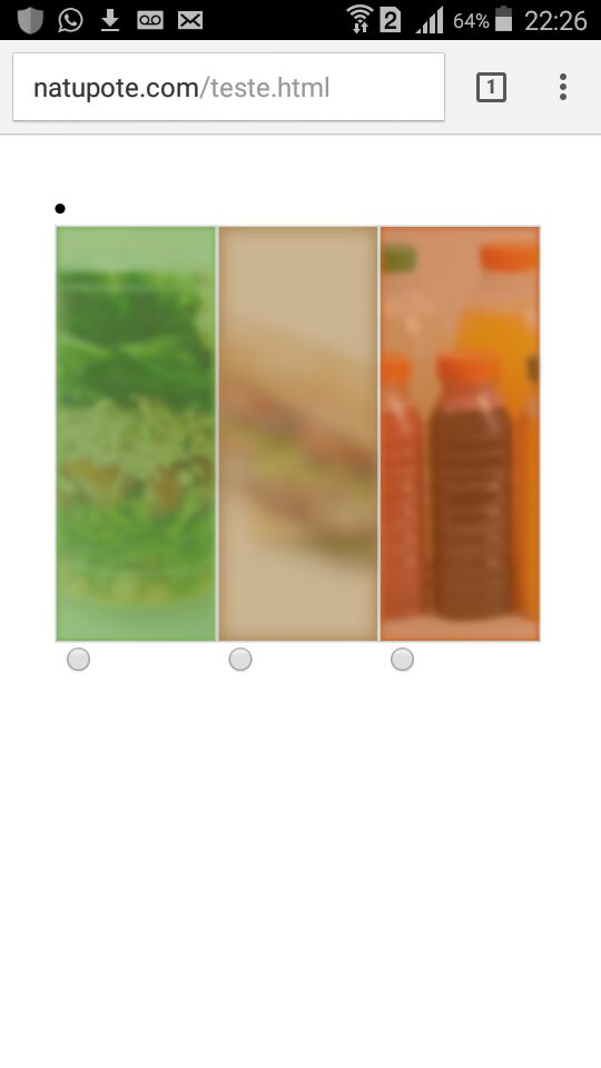
</style>The image below shows a mobile phone that opened the site correctly
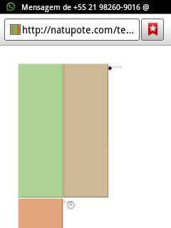
The image below shows an old cell phone (Samsung Galaxy duos y) that did not open the site correctly
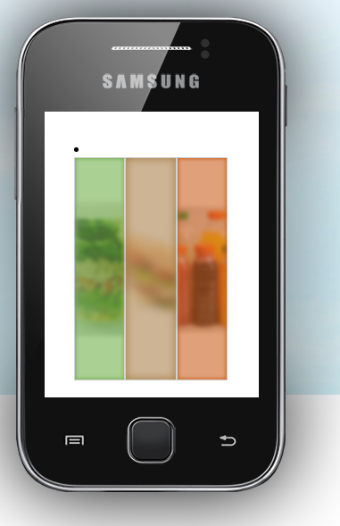
But in an online simulator this same cell phone (Galaxy duos y) had a different behavior than was tested in practice
See if this helps: http://answall.com/a/174743/42307.
– ShutUpMagda