0
I have the following panel:
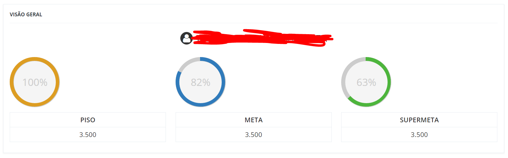
I’m trying to line up the charts inside the div from the class alinha-chart but without success. When I put one left: 33% and right: 33% it gets centered, but as expected, zoa on mobile. Could help me?
Follow my HTML code **edited:
<div class="portlet-body row">
    <div class="col-lg-12">
        <h3 class="nome-rv"><i class="fa fa-user"></i> <?=$_SESSION['
    </div>
    <div class="col-lg-4 col-sm-12">
        <table class="table table-bordered tabela-meta">
            <tbody>
                <tr>
                    <td class="grafico-situacao">
                        <div class="c100 p100 orange big">
                            <span>100%</span>
                            <div class="slice">
                                <div class="bar"></div>
                                <div class="fill"></div>
                            </div>
                        </div>
                    </td>
                </tr>
                <tr>
                    <td>PISO</td>
                </tr>
                <tr>
                    <td>3.500</td>
                </tr>
            </tbody>
        </table>
    </div>
    <div class="col-lg-4 col-sm-12">
        <table class="table table-bordered tabela-meta">
            <tbody>
                <tr>
                    <td class="grafico-situacao">
                        <div class="c100 p82 big">
                            <span>82%</span>
                            <div class="slice">
                                <div class="bar"></div>
                                <div class="fill"></div>
                            </div>
                        </div>
                    </td>
                </tr>
                <tr>
                    <td>META</td>
                </tr>
                <tr>
                    <td>3.500</td>
                </tr>
            </tbody>
        </table>
    </div>
    <div class="col-lg-4 col-sm-12">
        <table class="table table-bordered tabela-meta">
            <tbody>
                <tr>
                    <td class="grafico-situacao">
                        <div class="c100 p63 green big">
                            <span>63%</span>
                            <div class="slice">
                                <div class="bar"></div>
                                <div class="fill"></div>
                            </div>
                        </div>
                    </td>
                </tr>
                <tr>
                    <td>SUPERMETA</td>
                </tr>
                <tr>
                    <td>3.500</td>
                </tr>
            </tbody>
        </table>
    </div>
</div>
col-sm-12-> this guy indicates that on smaller screens todivwill take the whole line, I believe it is. (https://getbootstrap.com/examples/grid/) Take a look at this link and see if it helps.– rLinhares
yes @rLinhares, but would like to align the C100 div with the table, inside the bootstrap grid
– João Vitor
tries to put both the
c100as totablewithin a<div class="row">This will force line breaking (not due to screen size) and can avoid this buged alignment.– rLinhares
@Inhares without success
– João Vitor