Note that in addition to the name "tour" can be called step-by-step guide (step by step guide), search terms such as hightlight intro can also help
@Renan has specified the http://introjs.com, the use of it is practical, just use the attributes:
For example:
<div class="profile" data-step="1" data-intro="Aqui tem os dados do seu perfil">
..
</div>
<div class="notifications" data-step="2" data-intro="Aqui contem as notificações, também é exibido "pushs" informando sobre novas notifiações">
..
</div>
<div class="apps" data-step="3" data-intro="Aqui contem todos apps mais usados">
..
</div>
To start the tour you need to run the script introJs().start();, can do so:
document.getElementById("iniciar-tour").onclick = function() {
    introJs().start();
};
html:
<button id="iniciar-tour">Como usar</button>
Or on the onload:
window.onload = function () {
    introJs().start();
};
To download go to the https://github.com/usablica/intro.js/releases
Example:
window.onload = function () {
    introJs().start();
};
html, body {
    margin: 0;
    padding: 0;
}

.profile, .notifications, .apps {
    height: 26px;
    margin: 50px;
    background: #fc0;
}
<link href="https://cdnjs.cloudflare.com/ajax/libs/intro.js/2.3.0/introjs.min.css" rel="stylesheet"/>
<script src="https://cdnjs.cloudflare.com/ajax/libs/intro.js/2.3.0/intro.min.js"></script>
<div class="profile" data-step="1" data-intro="Aqui tem os dados do seu perfil">
...
</div>
<div class="notifications" data-step="2" data-intro="Aqui contem as notificações, também é exibido "pushs" informando sobre novas notificações">
...
</div>
<div class="apps" data-step="3" data-intro="Aqui contem todos apps mais usados">
...
</div>
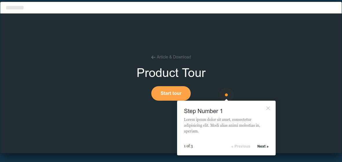
I think that’s what you need => It is possible to make a tooltip with pure CSS?
– rray
It’s not really @rray, because I had it stored somewhere and now I can’t find it and I don’t know how to explain it better.
– Raylan Soares
It’s like those tutorials that appear when you install a new game and will play for the first time, it will guide you through the interface and tals
– Raylan Soares
would be a Wizard?
– rray
I don’t think @rray, would have an example of this Wizard for me to see?
– Raylan Soares
What you want are those tours... see these examples: http://tympanus.net/codrops/2010/12/21/website-tour/ or http://revaxarts-themes.com/? t=tour
– NilsonUehara
That’s right @Nilsonuehara
– Raylan Soares
This feature is called "Tooltip". It is very popular and very simple to use, finally take a look at the following references for more information: https://jqueryui.com/tooltip/ http://www.w3schools.com/bootstrap/bootstrap_tooltip.asp
– Paulo Martins
If your project is using Bootstrap you can take a look at the documentation in Portuguese in the version 2.2 or on the official website of Bootstrap
– WMomesso
Well, there’s only one way to do that. You need to choose a tooltip and read its documentation about active tooltips by default or how to close a tooltip through its handle. Knowing these things mentioned makes it easy to create a step by step guide just by functions and events.
– Paulo Martins
Another option is Hopscotch, see http://linkedin.github.io/hopscotch/.
– Inkeliz
@Raylansoares This kind of thing is independent of you using PHP or anything else that is server side.
– Jéf Bueno
@Raylansoares took the tags [tag:Laravel] and [tag:php]. It may be things you’re using in your system, but doubt has nothing to do with it. Try to make better use of tags that are related to the problems you are having, and not about what you are using in your application.
– Wallace Maxters
I think the names next to what you need are: "Tour", "Wizard", "Tooltip" or "Popover". I’ve heard someone using the term "Gamification" too, but I don’t know if it’s right.
– Wallace Maxters
introjs
– Renan Gomes