0
Hello, I need a help to line up div.
As you can see in the image:
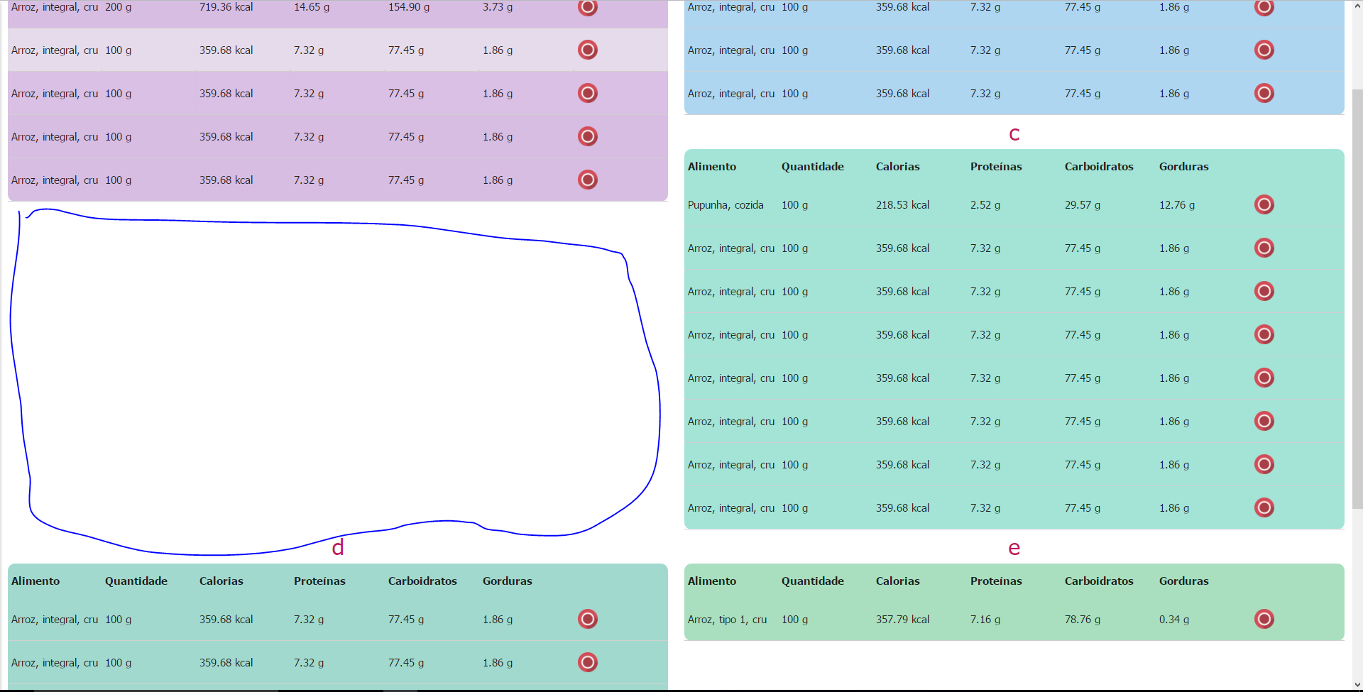
The div does not occupy this blank space, but wanted it to occupy this space,.
The tables are distributed this way:
Thank you in advance !
0
Hello, I need a help to line up div.
As you can see in the image:
The div does not occupy this blank space, but wanted it to occupy this space,.
The tables are distributed this way:
Thank you in advance !
2
MANSORY LAYOUT
What you’re trying to create is a mosaic, known in English as Mansory Layout, you may even prefer to use the library Mansory.js.
Considering the use of frameworks I would suggest the use of BOOTSTRAP4 or BULMA, both have their flexbox-based grid, including the Bulma has classes developed precisely for the creation of Mansory Layouts... if it is very harmful to your project to modify both the structure and everything else, you can create your own using FLEXBOX.
I made a JSFIDDLE with an example of the solution using flexbox css.
BOOTSTRAP
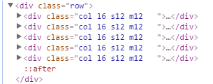
If you still prefer to use the Bootstrap 3, strongly advise the grouping of each row of tables within a tag <div class="row"></div>, is the simplest way to solve your problem, although it is not the perfect solution.
Hi Vinicius, thanks for the help,was very helpful to understand about flexbox.
But, how could I separate the columns if they are created dynamically ? ,Do you have any idea ? ,otherwise the way will be to use bootstrap even :),hugs!
If the question is just to separate the columns, vc can map how many tables would be in total, and divide by the number of columns you prefer
Browser other questions tagged html css materialize
You are not signed in. Login or sign up in order to post.
Instead of posting images, post your code. Only then can we help you.
– Randrade
Maybe, this question can also help you, even if not with the materialize
– Randrade
Hi @randrade, thanks for the help,I read all this topic calmly and did not find the solution, even being the same problem :/ , I avoided putting all the code so as not to occupy your time.Hugs.
– saidmrn
Well, it’s just the opposite. Images complicate understanding, even because we usually make a functional example. So doing this just with the images is a little tricky. But if you post your code, I’ll be happy to help.
– Randrade
@Randrade, thank you, I have made a codepen for further analysis: http://codepen.io/saidmrn/pen/JRxQva
– saidmrn
@I have exactly the same problem,I followed the solution presented by the answer but still have problems. When I set the box width to 30%, it is correct: http://i.imgur.com/vEZ0Onq.png but the table is small. When I set 40% width, the problem persists http://i.imgur.com/Vqnj1aq.png
– saidmrn
@Edit I managed to make them take up some space with Mansory, but it doesn’t take up the whole area on the right-hand side http://i.imgur.com/eySPl8s.png If I increase the width,how could I make him occupy the entire empty area next door ?
– saidmrn