0
I’m following a material from Caelum and I’m having difficulty making a responsive page.
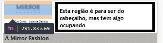
I wish she’d stay like this, but she’s showing up like this
.container{
  width: 96%;
}
header h1{
  text-align: center;
}
header h1 img{
  max-width: 50%;
}
.sacola{
  display: none;
}
.menu-opcoes{
  position: static;
  text-align: center;
}
.menu-opcoes ul li{
  display: inline-block;
  margin: 5px;
}
<head>
<meta charset="UTF-8">
<title>Sobre a Mirror Fashion</title>
<meta name="viewport" content="width=device-width">
<link rel="stylesheet" href="css/sobre.css">
<link rel="stylesheet" href="css/sobre-mobile.css" media="(max-width: 939px)">
</head>
<body>
<header class="container">
<h1><img src="img/logo.png" alt="Mirror Fashion"></h1>
<p class="sacola">Nenhum item na sacola de compras</p>
<nav class="menu-opcoes">
<ul>
<li><a href="#">Sua Conta</a></li>
<li><a href="#">Lista de Desejos</a></li>
<li><a href="#">Cartão Fidelidade</a></li>
<li><a href="#">Sobre</a></li>
<li><a href="#">Ajuda</a></li>
</ul>
</nav>
</header>
You wanted to align the content div in the center of the page?
– Leandro Simões
this, I created two pages with the same header, the other page worked, but this did not, when I will inspect in google Chrome, I do not know how to explain this white area
– Daniel Araújo
You can edit the question and put your html and css code?
– Leandro Simões
See if you put this here resolve: . container{ width: 96%; margin: 0 auto; }
– Leandro Simões
Unfortunately not
– Daniel Araújo
What a pity, but keep the margin: 0 auto; because he is responsible for leaving the content in the center of the page. Add the following css and see if you solve: html, body { width: 100%; margin: 0; padding: 0; }
– Leandro Simões
reset could influence? I tried this your last tip and it didn’t work
– Daniel Araújo
I don’t understand what you mean by reset. If you mean clearing some float, try to do this: . container:after { clear: Both; }
– Leandro Simões
in this project I created two html files and the two have the same header, in the index.html file the header resposivity worked, already in the other page not, is with this problem, the only difference in the header of this two files is the reset that I put in the index file
– Daniel Araújo
Unfortunately I think that only by running your project here on my machine I could identify the problem. If it’s no problem for you, send your project to me by email and I’ll analyze it better, otherwise, if you have how to put it on the air by and pass me the link, also da para eu ver.
– Leandro Simões
can I send you the github link? Any problems?
– Daniel Araújo
can yes, no problem
– Leandro Simões
https://github.com/Pakato14/projetoweb
– Daniel Araújo
Blz, I’ll take a look and tell you
– Leandro Simões
Right! I’ll be waiting
– Daniel Araújo
Which page is even in trouble?
– Leandro Simões
on.html, you can see when you inspect in mobile mode
– Daniel Araújo
Guy answered down here, I hope you understand. In case it helps, give an upvote on the answer to help. Thanks
– Leandro Simões