1
I’m developing a page that has a menu that should display different behaviors according to screen dimensions. I’ll try to display this through some images.
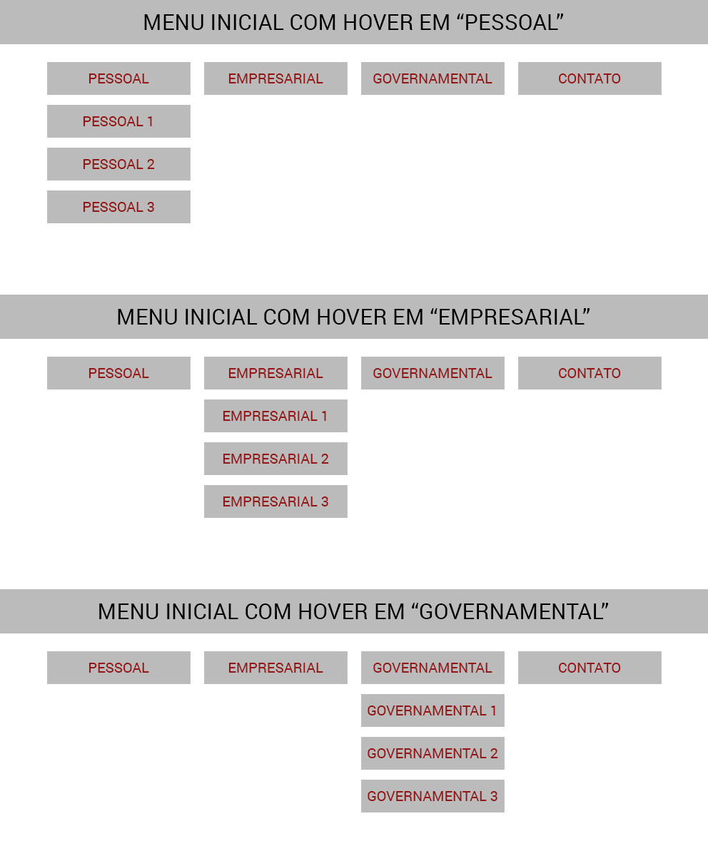
In the initial state of the menu (and with a screen dimension whose width is greater than 1000px) I must display the following structure:

The Personal, Business and Government links have sublinks that will be displayed through the pseudo-class :Hover, as you can see in the following image:
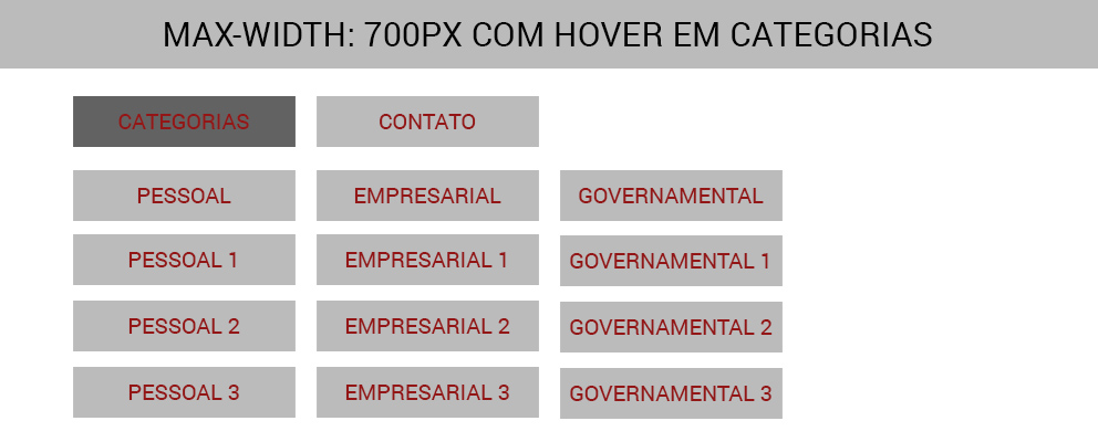
I don’t have a problem with this structure. The problem I face concerns the styles that should be loaded when the width of the screen is less than 700px. What happens is that instead of displaying the Personal, Business and Government items, I should display only one link called "Categories":

Hover in the "Categories" link should expand all the menus below, as shown in the image below:
My initial structure is as follows::
*{
	list-style: none;
}
nav{
	width: 100%;
}
nav ul li{
	float: left;
}
nav ul li a{
	padding: 10px;
}
nav ul li ul{
	display: none;
	position: absolute;
}
nav ul li ul li{
	float: left;
}
nav ul li ul li ul li{
	clear: left;
}
nav ul li ul li ul li a{
	color: #000;
}
nav ul li:hover ul{
	display: block;
}
<nav>
<ul>
<li>
<a href="#">CATEGORIAS</a>
<ul>
<li>
<a href="#">PESSOAL</a>
<ul>
<li><a href="#">Pessoal 1</a></li>
<li><a href="#">Pessoal 2</a></li>
<li><a href="#">Pessoal 3</a></li>
</ul>
</li>
<li>
<a href="#">EMPRESARIAL</a>
<ul>
<li><a href="#">Empresarial 1</a></li>
<li><a href="#">Empresarial 2</a></li>
<li><a href="#">Empresarial 3</a></li>
</ul>
</li>
<li>
<a href="#">GOVERNAMENTAL</a>
<ul>
<li><a href="#">Gov 1</a></li>
<li><a href="#">Gov 2</a></li>
<li><a href="#">Gov 3</a></li>
</ul>
</li>
</ul>
</li>
<li><a href="#">CONTATO</a></li>
</ul>
</nav>As you can see, the structure of the behavior that should be displayed when the width of the screen is less than 700px is basically ready. The thing is that I’m not able to hide the "Categories" link and still display your Personal, Business and Government sub-items on the left side of the Contact item, which is what I display in the first two images.
Can you help me? Thank you!!!