1
When I add the class "navbar-Fixed-top" it "eats" 50px of the page, use in navbar, links, to Divs and whenever a link is clicked the first 50px are below the navbar, what I want to do is to prevent these px from being below the navbar, when the link is clicked.
OBS: I already added the padding-top on the body, the problem is not with the first div right after the navbar, but with the others.
HTML from the navbar:
<nav id="nav" class="navbar navbar-default navbar-fixed-top">
    <div class="container">
        <div class="navbar-header">
            <button type="button" class="navbar-toggle collapsed" data-toggle="collapse" data-target="#menu" aria-expanded="false">
                <span class="sr-only"></span>
                <span class="icon-bar"></span>
                <span class="icon-bar"></span>
                <span class="icon-bar"></span>
            </button>
            <a class="navbar-brand" href="#">
                <img style="margin-top: -10px;" alt="Brand" class="img-responsive" src="">
            </a>
        </div>
        <div class="collapse navbar-collapse" id="menu">
            <ul class="nav navbar-nav navbar-right text-center">
                <li><a href="#quem-somos" class="scroll link-hover"><b>QUEM SOMOS</b></a></li>
                <li><a href="#contato" class="scroll link-hover"><b>CONTATO</b></a></li>
                <li><a href="#" class="link-hover"><b>LOGIN</b></a></li>
            </ul>
        </div>
    </div>
</nav>
HTML of #contact:
<div id="contato" class="bg-color text-white">
  <div class="container padding-divisors">
    <div class="col-lg-12 col-md-12 col-sm-12 col-xs-12 margin-bottom-titles">
      <h2 class="text-center">RECEBA MAIS INFORMAÇÕES</h2>
    </div>
    <form method="post" action="#">
      <div id="form-contato" class="col-lg-12 col-md-12 col-sm-12 col-xs-12">
        <div class="form-group">
          <label for="nome">Seu nome (obrigatótio)</label>
          <input required id="nome" name="nome" type="text" class="form-control">
        </div>
      </div>
    </form>
  </div>
</div>
Css:
body{
    background-color: whitesmoke !important;
    padding-top: 50px !important;
}
#nav{
    box-shadow: black 0 0 5px;
    opacity: 0.3;
}
Ex: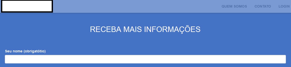
Here a part of the padding-top div#contact is under the navbar, my question is how to avoid this.
I appreciate the help!
Put your CSS, at least the top part.
– Diego
try to take out the padding, use a reset before adding the bootstrap :3
– Murilo Melo
If it doesn’t work, just putting your own CSS as @Diego commented
– Murilo Melo
Place the html of this snippet
– MagicHat