Stacking Blocks with Bootstrap

Asked

Viewed 343 times

2

I’m making a layout using bootstrap and came across a problem when stacking blocks to be responsive.

I have 5 blocks of different heights, divided into 3 columns:inserir a descrição da imagem aqui

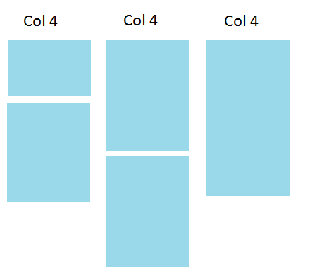
When arriving at a certain precise width the blocks are stacked, but the height of each "layer" is defined by the largest block of it:inserir a descrição da imagem aqui

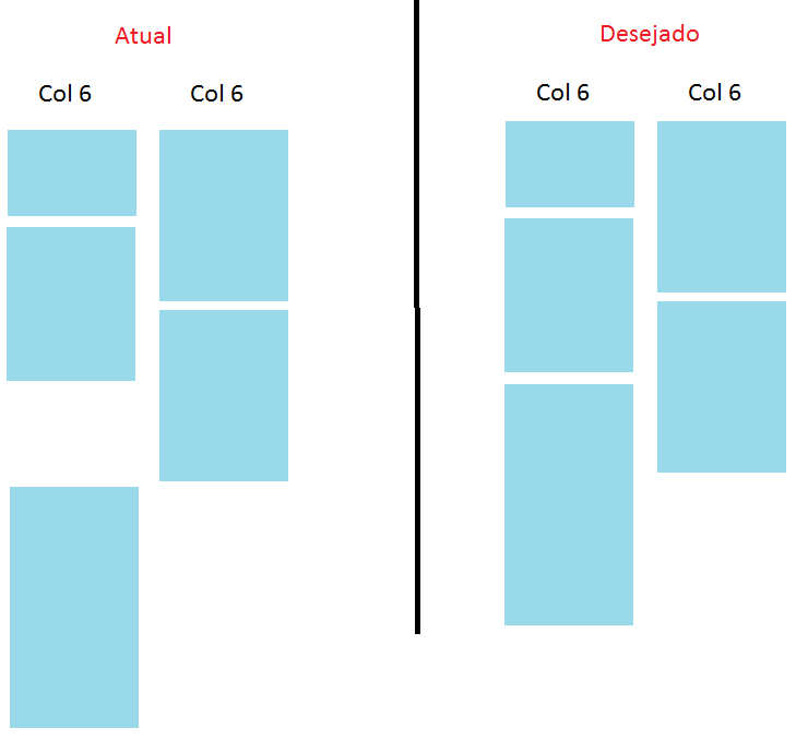
Someone would have a solution to this?

1 answer

2

Yes, there is a solution, but to get the desired effect, you will have to use a plugin called masonry.

Of one studied, it is very practical.

http://masonry.desandro.com/

$('.grid').masonry({
  // options...
  itemSelector: '.grid-item',
  columnWidth: 200
});
<div class="grid">
  <div class="grid-item"></div>
  <div class="grid-item"></div>
  ...
</div>

It would look something like this, the grid item would be your li. This plugin makes it according to the resolution of your screen it adapts and leaves automatically responsive.

Browser other questions tagged

You are not signed in. Login or sign up in order to post.