I believe that this, as expected, will depend a lot on your site. His proposal, the design in general, the code, which frameworks use, among others.
HTML & CSS (only)
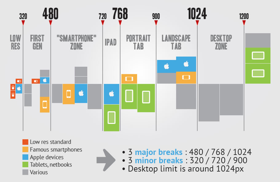
You can make a very simple, clean, responsive menu with only html and css. Of course, in that case you would definitely use a Media Queria and set breakpoints for mobile support. The breakpoints most famous are the gifts in this image:
This way you adapt the menu, and the rest of the site, without the need to create new layouts, or use javascript for this purpose.
Here is a simple example of this use:
* {
  margin: 0;
  padding: 0;
  border: 0;
  font-family: sans-serif;
  box-sizing: border-box;
}

body {
  font-size: 0;
  background-size: 300px 300px;
  height: auto;
}

.topBar {
  width: 100%;
  height: 100px;
  background: #fff;
  -webkit-box-shadow: 5px -2px 5px 2px rgba(0, 0, 0, 0.5);
  -moz-box-shadow: 5px -2px 5px 2px rgba(0, 0, 0, 0.5);
  box-shadow: 5px -2px 5px 2px rgba(0, 0, 0, 0.5);
  z-index: 100;
}

.topBar .content {
  width: 80%;
  max-width: 1200px;
  height: calc(100% - 8px);
  background: #fff;
  background-size: auto 8px;
  margin: auto;
  vertical-align: middle;
  display: -moz-flex;
  display: -webkit-flex;
  display: flex;
  align-items: center;
  justify-content: space-between;
}

.topBar .content .logo {
  width: 60px;
  height: 60px;
  background: url('https://upload.wikimedia.org/wikipedia/commons/a/ab/Logo_TV_2015.png') no-repeat;
  background-size: 60px 60px;
}

.topBar .content .menu ul {
  display: block;
}

.topBar .content .menu ul li {
  display: inline-block;
  list-style: none;
  font-size: 12pt;
  margin: 0 10px;
  padding: 0 10px;
  cursor: pointer;
  height: 50px;
  width: auto;
  line-height: 50px;
  -webkit-transition: border 0.1s ease;
  -moz-transition: border 0.1s ease;
  transition: border 0.1s ease;
  vertical-align: middle;
}

.topBar .content .menu .menu-icon {
  display: none;
  cursor: pointer;
  height: 100%;
  padding-top: 9px;
}
.topBar .content .menu .menu-icon span {
  display: block;
  width: 30px;
  height: 3px;
  background: #506967;
  margin: 2px 0;
}

.topBar .content .menu input {
  visibility: hidden;
}

.topBar .content .menu ul {
  top: 0;
  margin-top: -10px;
  padding-top: 0;
}

.topBar .content .menu label {
  display: block;
  width: auto;
  height: auto;
}

.topBar .content .menu ul li:hover {
  border-bottom: solid 3px #008c83;
}

@media screen and (max-width: 768px) {
  .topBar .content {
    position: relative;
  }
  .topBar .content .menu ul {
    width: 100%;
    background: #fff;
    position: absolute;
    top: 100%;
    height: 0;
    right: 0;
    z-index: 100;
    overflow: hidden;
    padding-bottom: 10px;
    -webkit-transition: height 0.2s ease;
    -moz-transition: height 0.2s ease;
    -o-transition: height 0.2s ease;
    transition: height 0.2s ease;
    -webkit-box-shadow: 0 0 0 0 rgba(0, 0, 0, 0);
    -moz-box-shadow: 0 0 0 0 rgba(0, 0, 0, 0);
    box-shadow: 0 0 0 0 rgba(0, 0, 0, 0);
  }
  .topBar .content .menu ul li {
    display: block;
    padding: 0 15px 15px 15px;
    margin-top: 15px;
    text-align: right;
  }
  .topBar .content .menu .menu-icon {
    display: block;
  }
  .topBar .content .menu input:checked + ul {
    display: block;
    height: 270px;
    -webkit-box-shadow: 0 3px 5px 1px rgba(0, 0, 0, 0.3);
    -moz-box-shadow: 0 3px 5px 1px rgba(0, 0, 0, 0.3);
    box-shadow: 0 3px 5px 1px rgba(0, 0, 0, 0.3);
  }
}
<div class="topBar">
  <div class="content">
    <a href="/">
      <div class="logo"></div>
    </a>
    <nav class="menu">
      <label for="menu-check">
        <div class="menu-icon">
          <span class="menu-icon-line"></span>
          <br>
          <span class="menu-icon-line"></span>
          <br>
          <span class="menu-icon-line"></span>
        </div>
      </label>
      <input type="checkbox" id="menu-check">
      <ul>
        <li>Assuntos</li>
        <li>Tutoriais</li>
        <li>Contato</li>
        <li>Sobre</li>
      </ul>
    </nav>
  </div>
</div>
Click the whole page and change the size of your window.
In the example, I use breakpoint:
@media screen and (max-width: 768px) { ...
From there the menu becomes retractable. A fairly common technique, but it is functional.
When analyzing the above code, you may notice the use of display: flex. Just the level of curiosity, at this link, you can see a complete guide of using this.
The other possibilities are very subjective, especially in relation to javascript implementation. You can use for effects and transitions with Jquery, or to add functions at the click of the menu icon, or for a simple function of clickout for the menu to disappear, as you can see in that matter.
I’ll leave this link, with several examples of responsive menus, there you have access to the link of each of them. It is good to "get inspired".
I hope I’ve helped.