GRID Bootstrap column size - Customized value

Asked

Viewed 670 times

1

Greetings!

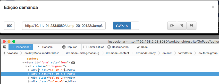
Could someone give me a light as to the image below ... The question X is that I need a middle ground in this alignment. If I put col-Md-1 cut the input if I put col-Md-2 gets very large.

I tried to use span but it worsens the situation with the bootsptrap-switch :( getting horizontal misalignment.

[]'s

Imagem

  • I believe that only manually adjusting your css

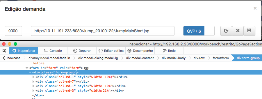
  • Put the same col-Md-1 and create another class to adjust the size.

  • Have you tried "col-Sm-1" or "col-Xs-1"?

2 answers

3

inserir a descrição da imagem aqui

Thanks to everyone but I ended up solving adding a stylezinho ... as it is a specific point became easier and simple this solution ..

0

The values of bootstrap column widths are defined in terms of percentage, as well as being responsive. If col-Md-1 has gotten too small, it’s probably your visualization that’s small. To improve width usage, use the container-Fluid class in the div that envelops the entire site to occupy as much area as possible.

Even so, it is preferable that you use a size of 12 columns for the label and another 12 for the input field. Makes it easier to view on small desktops.

Browser other questions tagged

You are not signed in. Login or sign up in order to post.