-1
Good morning, you guys!
I’m a beginner in the front-end area and it’s one of the first times I’m using Boostrap. This time, I need to deliver a work for the school and for that I developed a kind of "feed" divided into two columns, but I can’t make the columns break automatically.
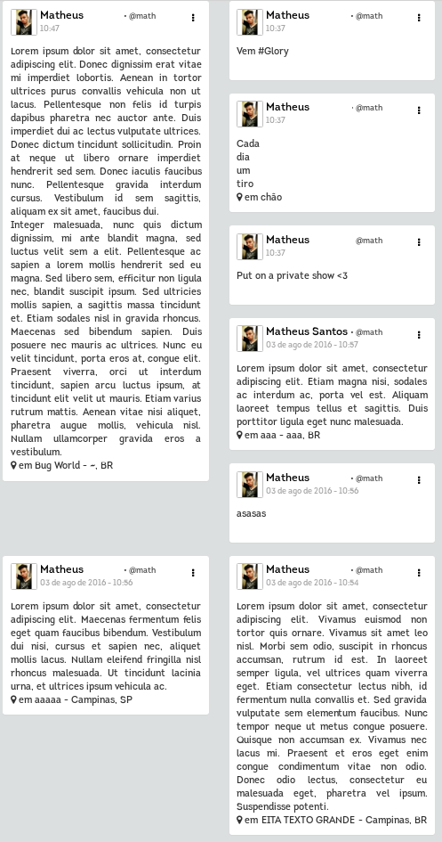
Items are arranged within a ol, and each li is inside a carrier that takes the information from the database. It follows the code snippet and the image of how it is shown:
<div id="feed">
<ol id="feed-lista">
<?php for($i = 0; $i < sizeof($posts); $i++){ ?>
<div class="col-sm-6">
<li class="feed-container panel">
<div class="feed-item">
<div class="dropdown">
[...itens do menu lateral...]
</div>
<img src="<?= $posts[$i]['foto_perfil'] ?>" class="feed-foto" alt="Foto de perfil de <?= $posts[$i]['nome'].' '.$posts[$i]['sobrenome']?>" />
<div class="feed-dados">
<a href="profile.php?username=<?= $posts[$i]['username'] ?>" >
<span class="feed-nome"><?= $posts[$i]['nome'].' '.$posts[$i]['sobrenome'] ?></span></a>
<span class="feed-username"> • <a class="feed-username" href="profile.php?username=<?= $posts[$i]['username'] ?> ">@<?= $posts[$i]['username'] ?></a></span>
<div class="feed-data">
[... código para tratamento da data ...]
</div>
</div>
<div class="feed-conteudo">
<div class="feed-texto">
<?= $posts[$i]['status']?>
</div>
<div class="feed-localizacao">
<i class="fa fa-map-marker" aria-hidden="true"></i> em <?= $posts[$i]['local']." - ". $posts[$i]['cidade'].", ".$posts[$i]['pais'] ?>
</div>
</div>
</div>
</li>
</div>
<?php } ?>
</ol>
</div>
The code above returns this:
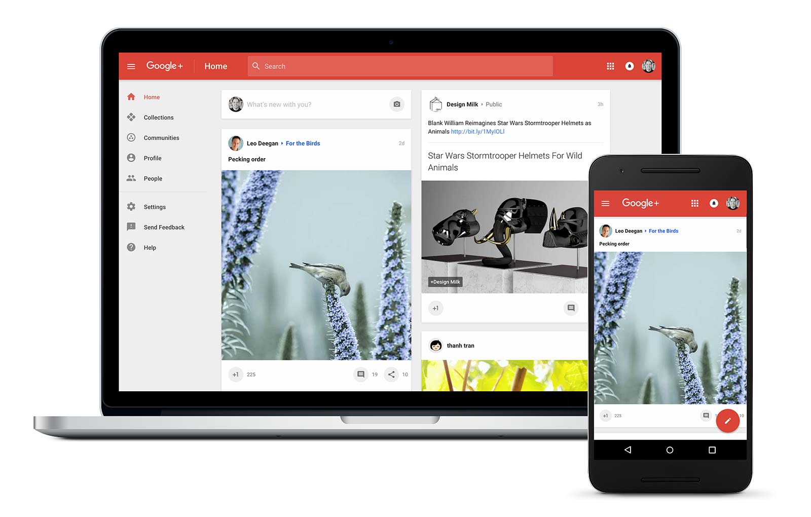
In the CSS itself, only formatting was used for the items within each li, but nothing regarding positioning. Can anyone help me? A better known example of how I would like it to stay (being generated dynamically) is the Google Plus feed:
Thank you all so much!
Is there no way to do it with Bootstrap anyway? Regardless of whether it is complicated or not, but it is because using plug-ins ends up discounting in the notes received.
– Matheus Santos
Well done like this, no, I believe you will not receive negative note for using this plugin, It is something more complex and is a top layout. With bootstrap you can leave all the same size, one height and leave all the same size hahaah. You can use a display table to center also if needed.
– concas
Using this way, how do I make the size of the columns responsive to the page size?
– Matheus Santos
You can height the Ivs and put the content in, then anything limits with php the letters or words. Responsiveness you can divide with the bootstrap Cols, where you divide for example class="col-lg-3 col-Md-4 col-Sm-6 col-Xs-12" This will make up to 1200 will be 4 parts, up from 991 until 1200 will be with 3 parts, 768 to 1024 in 2 parts and down 768 12 parts.
– concas
This won’t conflict with Masonry’s columnWidth?
– Matheus Santos
If you will use masonry there is different, try to read the documentation and look for something, but there is enough on the internet. Just look what you will find, and think a little too, it is very simple, may break your head at first, but then you will see how easy it is.
– concas