As you gave few details I will reply with a simple option. It may be that this option does not work for all cases, but it is an alternative since we do not have too many details.
Option 1: Using box-shadow. note that this is a property already very well accepted by browsers, even the oldest! It works from I9+ https://caniuse.com/#feat=css-boxshadow
Option 2: Using SVG. Note that the SVG is well accepted even by the IE from version 9 as you can check here https://caniuse.com/#feat=svg
image taken on IE11
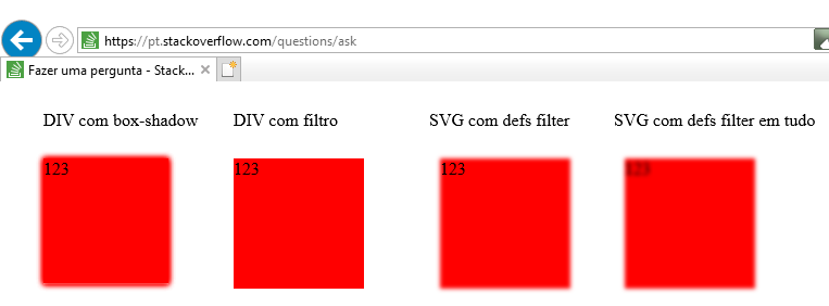
Follow the code referring to the image above.
The option with box-shadow was made nothing more than an element with several box-shadows superimposed. In older ies if it does not accept more than one box-shadow you can superimpose the whole element on each other with position:absolute
The SVG simply uses the Filter <feGaussianBlur in="SourceGraphic" stdDeviation="5" />. You can do as in the first example with the filter only in the rect or rect and in the text giving the impression that everything is with blur
body {
    margin: 10px 0 0 40px;
    display: flex;
}
.box {
    width: 115px;
    height: 115px;
    background-color: red;
    top: 10px;
    position: relative;
}
.box.bs {
    box-shadow:
    0px 0px 8px 0px red,
    0px 0px 8px 0px red,
    0px 0px 8px 0px red,
    0px 0px 8px 0px red
}

div {
    margin-right: 30px;
}
<div>
    <p>DIV com box-shadow</p>
    <div class="box bs" >123</div>
</div>

<div>
    <p>DIV com filtro</p>
    <div class="box" style="filter:blur(2px); width:120px; height: 120px">123</div>
</div>

<div>
    <p>SVG com defs filter</p>
    <svg height="140" width="140">
        <defs>
            <filter id="f1" >
                <feGaussianBlur in="SourceGraphic" stdDeviation="2" />
            </filter>
        </defs>
        <rect x="10" y="10" width="120" height="120"  fill="red" filter="url(#f1)" />
        <text x="10" y="25" fill="black">123</text>
    </svg>
</div>
<div>
    <p>SVG com defs filter em tudo</p>
    <svg height="140" width="140">
        <defs>
            <filter id="f1" >
                <feGaussianBlur in="SourceGraphic" stdDeviation="2" />
            </filter>
        </defs>
        <rect x="10" y="10" width="120" height="120"  fill="red" filter="url(#f1)" />
        <text filter="url(#f1)" x="10" y="25" fill="black">123</text>
    </svg>
</div>
Related: How to make the iCloud dynamic background effect?
– Jorge B.