Problems with positioning with columns in Bootstrap 3

Asked

Viewed 185 times

1

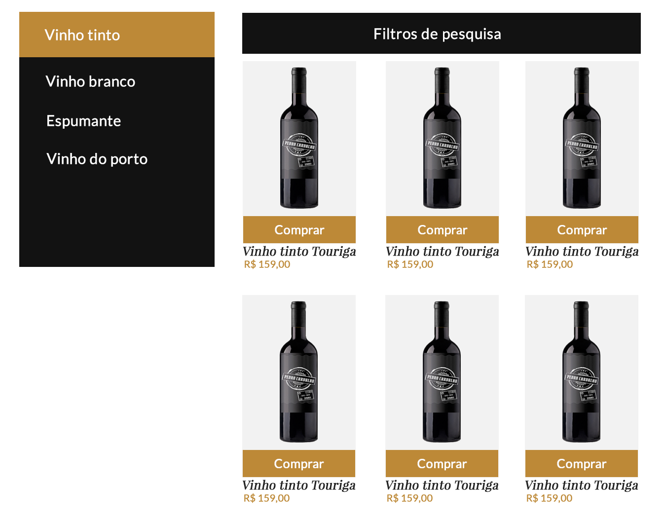
I’m having a positioning problem with the bootstrap grids I’m making a virtual store where the layout has to look like this:

inserir a descrição da imagem aqui

But with my coding he got like this:

inserir a descrição da imagem aqui

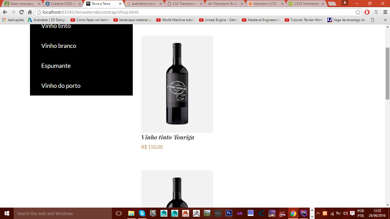
Notice that in this image the wines do not form the three columns and stay one below the other follows my code:

THE HTML:

<div class="container">
    <h1 class="text-center title-category">Os melhores vinhos você encontra aqui</h1>
    <div class="row">
        <div class="col-sm-4 categories">
            <ul class="list-unstyled filter-category">
                <li><a href="#" class="category">Vinho tinto</a></li>
                <li><a href="#" class="category">Vinho branco</a></li>
                <li><a href="#" class="category">Espumante</a></li>
                <li><a href="#" class="category">Vinho do porto</a></li>
            </ul>
        </div>
        <div class="col-sm-8">filtros</div>
        <div class="col-sm-8">
            <ul class="gallery list-unstyled">
                <li class="gallery-list">
                    <img src="images/vinho-gallary.png" class="wine-gallary"/>
                    <!--<div class="shop text-center">
                        <a href="#" class="hover-shop">comprar</a>
                    </div>-->
                    <div class="description">
                        <p class="description-wine">Vinho tinto Touriga</p>
                        <p class="price">R$ 150,00</p>
                    </div>
                </li>
            </ul>

            <ul class="gallery list-unstyled">
                <li class="gallery-list">
                    <img src="images/vinho-gallary.png" class="wine-gallary"/>
                    <div class="shop text-center">
                        <a href="#" class="hover-shop">comprar</a>
                    </div>
                    <div class="description">
                        <p class="description-wine">Vinho tinto Touriga</p>
                        <p class="price">R$ 150,00</p>
                    </div>
                </li>
            </ul>
        </div>
    </div>
</div>

THE CSS:

.title-category{
    font: italic 400 2em @font-family-serif;
}

.categories{
    font-size: 1.5em;


    .filter-category{
        background-color: @lightGray;

        .category{
            padding: 20px 40px;
            width: 100%;
            background-color: @black;
            display: block;
        }

        :hover{
            background-color: @gold;
        }
    }
}

.gallery{
    padding-top: 50px;

    .gallery-list{
        display: table;

        .wine-gallary{
            background-color: @gray;
            padding: 25px 85px;
            width: 100%;
        }

        .hover-shop{
            background-color: @gold;
            padding: 15px;
            width: 100%;
            display: block;
            font-size: 1.2em;
        }

        .description-wine{
            font: italic 400 1.5em @font-family-serif;
        }

        .price{
            color: @gold;
            font-size: 1.2em;
        }
    }
}

Note: I’m using Less the page is all correct only the part of the wines that this "zuada" worth remembering that in the mobile version they have to stay at the bottom of the same one.

2 answers

3


Before anything, try to take a closer look at this link: http://getbootstrap.com/css/#grid it shows how to work with the bootstrap structure, by bootstrap itself. Next, try this structure below: ...

<div class="row">
	<div class="col-sm-4 categories">
		<ul class="list-unstyled filter-category">
			<li><a href="#" class="category">Vinho tinto</a></li>
			<li><a href="#" class="category">Vinho branco</a></li>
			<li><a href="#" class="category">Espumante</a></li>
			<li><a href="#" class="category">Vinho do porto</a></li>
		</ul>
	</div>
	<div class="col-sm-8">
		<div> ... filtros aqui ....</div>
		<ul>
			<li> ... lista com produtos ....</li>
		</ul>
	</div>
</div>

Now I’ve managed to post here uhauha

2

All indicates that the problem is in the column sizes of your grid. Width without should total 12, if you pass there will be line break.

<div class="container">
    <div class="row">
        <div class="col-sm-4 categories">...</div>
        <div class="col-sm-8">...</div>
        <div class="col-sm-8">...</div>
   </div>
</div>

Adding up the widths of the columns col-sm-N: 4 + 8 + 8 = 20 As it is more than 12, there will be line break and the layout will not be as expected.

Setting for something like this should work.

<div class="container">
    <div class="row">
        <div class="col-sm-2 categories">...</div>
        <div class="col-sm-5">...</div>
        <div class="col-sm-5">...</div>
   </div>
</div>

Browser other questions tagged

You are not signed in. Login or sign up in order to post.