How to maintain the aspect ratio of an image within a fixed size CSS div?

Asked

Viewed 2,709 times

1

I’m having a hard time creating an image that stays inside a div, maintaining its proportions. But the div has a standard size and cannot exceed this limit size.

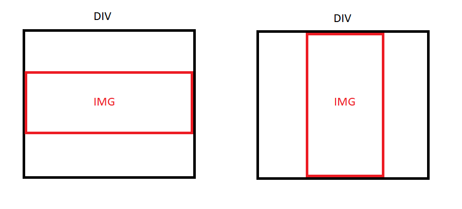
Below I leave an image that illustrates what is my intention:

inserir a descrição da imagem aqui

Below is the css code I made, the image continues in its patterns, but is not limited in the div, often exceeding the desired size that fits on the screen:

  #div{
      padding-top: 20px;
      padding-bottom: 20px;
      width: 50%;
      height: auto ;
    }
  #imagem{
      width: auto;
      height: auto;
      top: 5%;
      left: 26%;
    }

Maybe the code is meaningless because I’m programming web for a short time.

1 answer

1


Good afternoon. You should leave the image responsive, so that it can adapt to the container (parent element), the div in question. Use the max-width property: 100%; on the image. Max-width will prevent the image from exceeding the maximum size of the parent element. Remember to use some type of positioning in the parent div (float for example), if it is as Static (default value), the internal elements were not restricted to it.

Example:

#imagem {
   max-width: 100%;
   float: left;
}

#div {
   float: left;
   width: 50%; /* 50% do tamanho do elemento pai */
}

If you need the margin use padding in the parent div.

Browser other questions tagged

You are not signed in. Login or sign up in order to post.