0
I’m having the following problem I’m ultilizing bootstrap in version 3 need my page to look like this template:
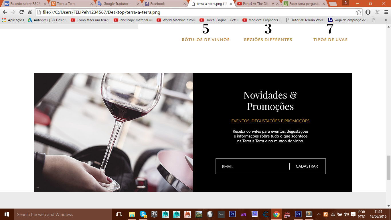 but when I redeem my images they look like this:
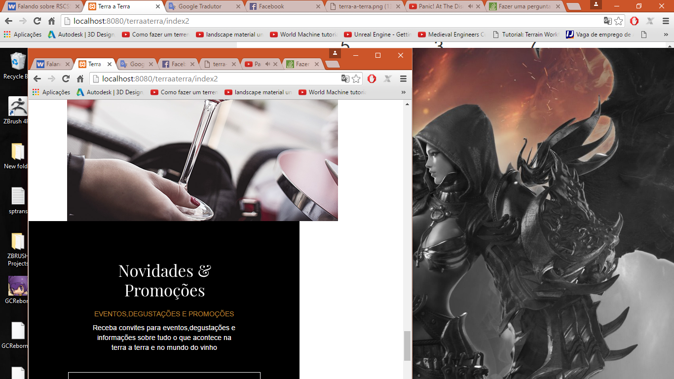
I would like the black image to be below the image of the wine glass but to take 100% wide both the top and bottom realize that when I redeem they are crooked and do not follow the pattern I want to follow my codes:
the HTML:
 <div class="row container-fluid text-center general">
       <div class=" col-sm-5 col-sm-offset-1 banner-wine">
          <img src="images/taca.png" alt="novidades de vinhos pedro carvalho" />
       </div>
       <div class=" col-sm-6 bg-cadastro">
         <img src="images/novidades.png">
         <h3>eventos,degustações e promoções</h3>
         <p>Receba convites para eventos,degustações e informações sobre
         tudo o que acontece na terra a terra e no mundo do vinho</p>
         <form>
            <input type="text" id="email" name="email" placeholder="e-mail">
            <button>cadastrar</button>
          </form>
       </div>
     </div>
the CSS: banner-Wine{ max-width: 100%; }
.bg-cadastro{
    background-color: @colorButtonDark;
    width: 549px;
    max-width: 100%;
    height: 407px;
    max-height: 480px;
    padding-top: 80px;
    h3{
        color: @colorHovers;
        .fontInfos(1em);
    }p{
        width: 300px;
        max-width: 80%;
        margin: 0 auto;
        color: @colorLinks;
    }
}

    form {
        border: 1px solid @colorLinks;
        padding: 15px;
        margin: 40px auto;
        width: 390px;
        max-width: 100%;
        #email{
            border: none;
            outline: none;
            margin-right: 50px;
            background-color: transparent;
        }button{
            background-color: transparent;
            border: none;
            outline: none;
            color: @colorLinks;
            .fonts(1em);
            text-transform: uppercase;
        }:before{
            content: '|';
            padding-right: 30px;
        }::-webkit-input-placeholder {
           color: @colorLinks;
           text-transform: uppercase;
        }:-moz-placeholder {
           color: @colorLinks;
           text-transform: uppercase;
        }
    }
NOTE: remembering that I am also ultilizando Less
From a class to the image called
img-responsive– Miguel
@Miguel face this class helped me a little but she messed up what she had done and kind of dislodged the image that was together in the background-color as it was in the first image of the post
– Felipe Henrique
I think this is from the off-set that has
– Miguel
it still hasn’t worked
– Felipe Henrique
Do not try to create the structure of your page in hand, the bootstrap grids are just there to help you in this painful task!
– Adriano Luz