0
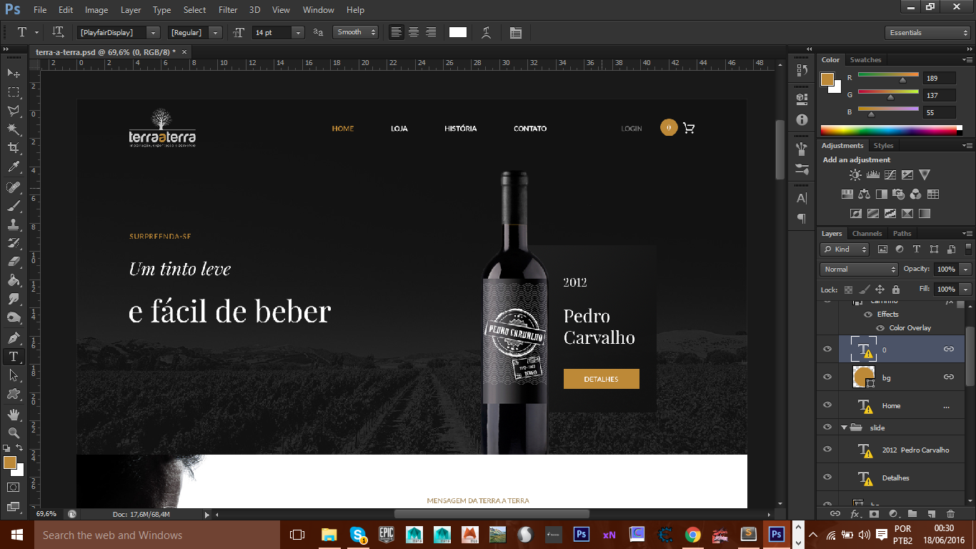
I’m having grid problems in my html with bootstrap it should look like this
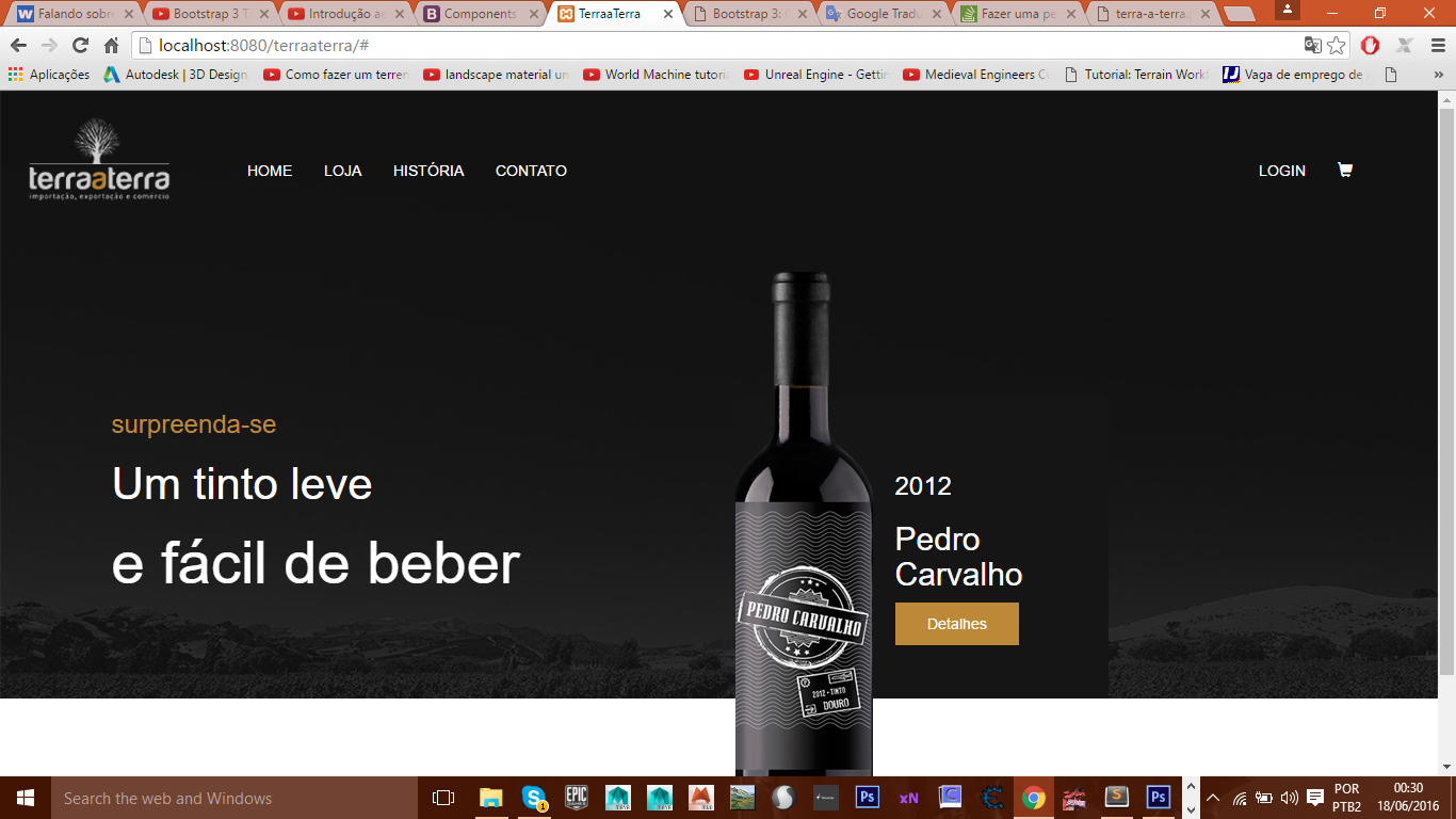
 but in my browser it looks like this:
notice that on my banner that is inside the tag <header> this one with height:auto; just to be able to take the redemption of my page but I do not know where I am missing follow my code :
THE HTML:
<header>
      <div class="container">
         <div class="row">
            <div class="col-md-6">
              <div class="text-left">
                <h3>surpreenda-se</h3>
                <h2>Um tinto leve</h2>
                <h1>e fácil de beber</h1>
              </div>
            </div>

            <div class="col-md-6">
              <img src="images/vinho.png" alt="vinho pedro carvalho">
                <div class="box-right">
                  <div class="text-right">
                    <h3>2012</h3>
                    <h2>Pedro Carvalho</h2>
                    <button type="button">Detalhes</button>
                  </div>
                </div>
            </div>
         </div>
      </div>
    </header>
THE CSS:
/*variaveis*/
@colorLinks: #fff;
@colorHovers: #bd8937;
@colorTexts: #333;
@colorBox: #161515;

/*Functions*/
.radius(@corner: 50px){
    border-radius:@corner ;
    -webkit-border-radius:@corner;
    -moz-border-radius:@corner;
    -o-border-radius:@corner;
}


header{
    background-image: url(../images/background.png);
    width: 100%;
    height: auto;
}


.content-general{
    margin-left: 150px;
}

.text-left{
    color: @colorLinks;
    margin-top: 130px;
}

.text-left h3{
    color: @colorHovers;
}

.text-left h2{
    font-size: 3em
}

.text-left h1{
    font-size: 4em;
}

.box-right{
    color: @colorLinks;
    text-align: left;
    background-color: @colorBox;
    padding: 50px;
    width: 350px;
    margin-top: -450px;
}

.box-right button{
    background-color: @colorHovers;
    padding: 10px 30px;
    border: none;
}

.text-right{
    text-align: left;
    margin-left: 100px;
}
NOTE: I would also like to center my two columns in the center of the screen without having to use the margin-left tried to use the text-align:center and the margin:0 auto but it didn’t work
I’m using version 3
– Felipe Henrique
At first only one idea to use col-Sm is more recommended. But let’s get this straight. 1 - If you want to center text, take class="text-left" and class="text-right" and change to class="text-center". 2 - Now you want to give a distance from the right or left margin col. In the first column <div class="col-Md-5 col-Md-offset-1"> and in the second <div class="col-Md-5">
– Pedro Franco
Cool friend worked out only that the problem is that I am not able to leave equal the layout of the first image as Voce can see the bavkground ends exactly at the end of the wine image do not know why
– Felipe Henrique
Use the background-size: cover or background-size command: 100% 100%; in css
– Pedro Franco
friend did not work out and when redeeming it does not follow the background we could talk by hungout or skype I really need a help from someone friendly experienced because I started yesterday messing with bootstrap need to finish this job
– Felipe Henrique
adds me on Facebook https://www.facebook.com/pedr0369
– Pedro Franco
ready friend already called you on chat
– Felipe Henrique
Solved in skype ^.^
– Pedro Franco
@Pedrofranco and Kirito some of you should put here the solution that solved the problem :P... In only "What version of your bootstrap?". Edit this answer sff
– Miguel