How to use "float: left" correctly?

Asked

Viewed 3,019 times

0

I’ve been using the float: léft; lately, but there are times when it doesn’t work as I hope. Example: com float e margin estranha

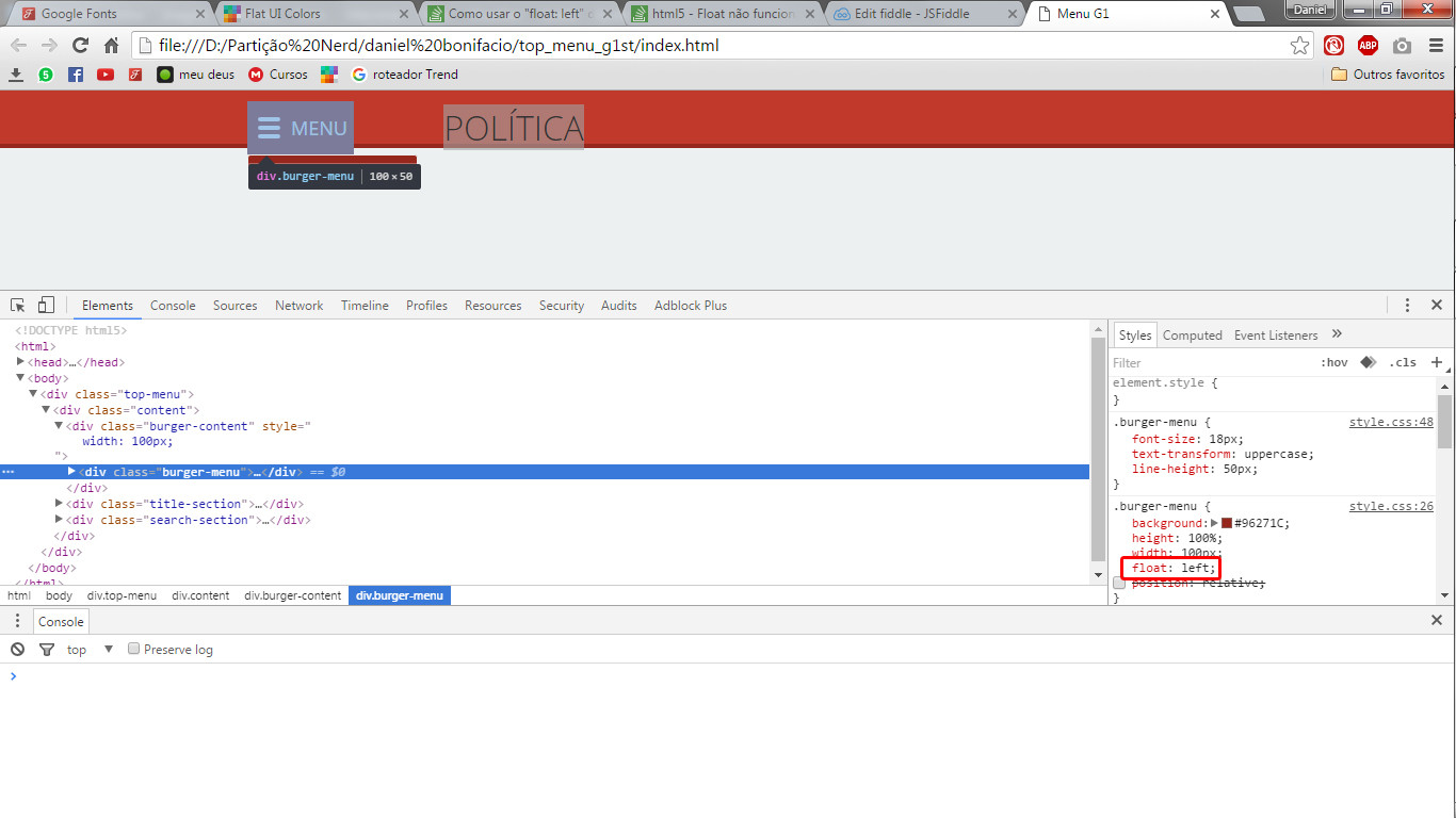
(image 1) Note that a margin appears that should not be here. sem float o menu fica normal, mas o resto fica todo estranho 
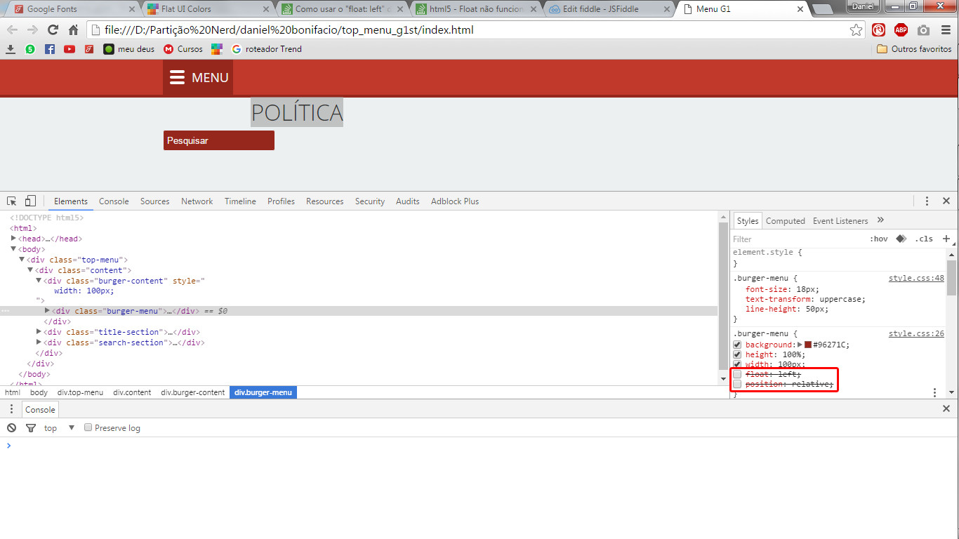
(image 2) A margin some, but since there is no float the other div is on the bottom line.

The purpose of the code is to make a top menu similar to this: inserir a descrição da imagem aqui

Shouldn’t he just play the Divs next to each other? How do I fix this? Why does he do this?

@import url(https://fonts.googleapis.com/css?family=Open+Sans+Condensed:300,700);
@import url(https://fonts.googleapis.com/css?family=Open+Sans:400,300,700,600);

*{margin: 0; padding: 0;}

body{
    background: #ecf0f1;
    color: #2c3e50;
    font-family: 'Open Sans', sans-serif;
}

.top-menu{
    width: 100%;
    height: 50px;
    background: #c0392b;
    border-bottom: 4px solid #96271C;
    color: #f2f2f2;
    position: fixed;
}

.top-menu .content{
    width: 900px;
    margin: 0 auto;
}

.burger-menu{
     background: #96271C;
     height: 100%;
     width: 100px;
     float: left;
     position: relative
}

.burger > div{
    width: 21px;
    height: 4px;
    border-radius: 2px;
    display: block;
    background: #fff;
    margin-bottom: 4px;
}

.burger{
    float: left;
    margin: 15px 10px;
}

.burger-menu{
    font-size: 18px;
    text-transform: uppercase;
    line-height: 50px;
}

.title-section{
    width: 300px;
    margin: 0 auto;
    float: left;
    display: block;
    position: relative;
}

.title-section .title{
    text-align: center;
    text-transform: uppercase;
    font-size: 32px;
    line-height: 50px;
    font-weight: 300;
}

.search-section{
    width: 160px;
    height: 30px;
    margin-top: 10px;
}

.search-section input, input:focus{
    width: 160px;
    height: 30px;
    background: #96271C;
    border-radius: 3px;
    border: 1px #ecf0f1 solid;
    padding:5px;
    color: #f2f2f2;
    outline: none;
}


::-webkit-input-placeholder {color: #f2f2f2;}
:-moz-placeholder {color: #f2f2f2;}
::-moz-placeholder {color: #f2f2f2;}
:-ms-input-placeholder {color: #f2f2f2;}
<!DOCTYPE HTML5>
<html>
    <head>
        <meta charset="utf-8">
        <title>Menu G1</title>
        <link rel="stylesheet" type="text/css" href="css/style.css">
        <script type="text/javascript" src="js/script.js"></script>
        <script type="text/javascript" src="https://code.jquery.com/jquery-2.2.4.min.js"></script>
    </head>
    
    <body>
        <div class="top-menu">
            <div class="content">
                <div class="burger-content">
                    <div class="burger-menu">
                            <div class="burger">
                            <div></div>
                            <div></div>
                            <div></div>
                        </div>menu
                    </div>
                </div>
              
                <div class="title-section">
                    <div class="title">Política
                        </div>
                </div>
                
                <div class="search-section">
                    <input type="text" placeholder="Pesquisar" name="pesquisa-menu">
                </div>
            </div>
        </div>
    </body>
</html>

  • I think it would be important you [Dit] the post and make it clear the result you want to get instead of wanting to use the float:left at any time. It may happen in your case the float:left not fit for it. Or if you just want to learn about the float, Then the question is already different, and the images up are no longer relevant. Remember that the more objective the question, the greater the chance of a good answer, because good answers depend on the community understanding the problem in fact, and not only the developments that the problem causes.

2 answers

2

The real usefulness of float is to make a block float on top of text block, such as those newspaper columns.

It does not serve to make layout, use it as a gambit since there was no standard to do this kind of thing, you can even make layout with Float but it is a horrible headache that only those who have done and had to maintain the code know.

Take a look at Flexbox, it solves part of the problem of layout, has some frameworks that implement it for you to use with Sass and Stylus, already has a good support of the browsers and it is a beautiful thing to work with it <3

  • Really, I remade the Layout using flexbox and is much easier to order! Thanks.

  • Brother, although you had the accepted in the answer and 2 positive, I believe you should review your concept about float... It allows the elements to float to their right or left, or float:None, which negates the flotation around them.. Positioned elements absolutely ignore the float property.

  • 1

    An addendum, flex css does not support all browsers. The damned IE6~9 do not support the command and even the most current version of IE still has some bugs. Older versions of the default android browser also do not support, but it is not a problem to be alarmed, Flex support reaches about 90% of users, it will only be a problem if you need to support old IE

  • connects in tip: https://www.youtube.com/watch?v=qBxGXb4iTQw&feature=youtu.be

2


FEIJAO WITH FLOAT RICE:

To illustrate let’s then create a div wrap, it will be the parent element that will serve as reference to contain the floating elements.

Inside this parent element we will have two box A and B, we will use them to play with the float. This will be our structure:

<div class="wrap">
  <div class="A">A</div>
  <div class="B">B</div>
</div>

.wrap{
  width:400px;
  border:1px solid green;
}
.A{
   display:block;
   background:red;
   padding:50px 0;
   width:120px;
}
.B{
   display:block;
   background:blue;
   padding:50px 0;
   width:120px;
   text-align:center;
}

Take a look at the link so you understand better: https://jsfiddle.net/ow6ds5bk/

First let’s float the two boxes to the left, then let’s put the float IN THE TWO ELEMENTS we want to float

.A{float:left}
.B{float:left}

If you look at our code https://jsfiddle.net/ow6ds5bk/3/ you will see that the elements floated as intended, but something is wrong. The parent element fell apart, and the rest of the page continued to float. Let’s fix this.

We will create a clear class, it will serve to reset the flotation after our boxes, so it will not affect the rest of the page and will also fix our parent element:

.clear{
  clear:both;
}

Now our html will look like this:

<div class="wrap">
  <div class="A">A</div>
  <div class="B">B</div>
  <div class="clear"></div>
</div>
<span>Float é fácil</span>

.wrap{
  width:400px;
  border:1px solid green;
}
.A{
  display:block;
  background:red;
  padding:50px 0;
  width:120px;
  text-align:center;
  float:left;
}
.B{
  display:block;
  background:blue;
  padding:50px 0;
  width:120px;
  text-align:center;
  float:left;
}
.clear{
  clear:both;
}

If you look at our page you will see that we have reached the desired structure: https://jsfiddle.net/ow6ds5bk/4/

You also need to be aware of the size of the elements, if the sum of the width of all the elements exceeds the width of the parent element, some things can be pushed down, see: https://jsfiddle.net/ow6ds5bk/5/

Every property that touches the dimension of the element should also be considered for the account: margin, padding, border, width, etc.

Now Let’s dare more, we want one element on the right and the other on the left. It is not difficult to just use the same logic:

<div class="wrap">
  <div class="A">A</div>
  <div class="B">B</div>
  <div class="clear"></div>
</div>
<span>Float é fácil</span>

.wrap{
  width:400px;
  border:1px solid green;
}
.A{
  display:block;
  background:red;
  padding:50px 0;
  width:120px;
  text-align:center;
  float:left;
}
.B{
  display:block;
  background:blue;
  padding:50px 0;
  width:120px;
  text-align:center;
  float:right;
}
.clear{
  clear:both;
}

Papaya with sugar right? Look at our example: https://jsfiddle.net/ow6ds5bk/7/

Cool, now let’s put the two elements right, just use the same previous logic right? WRONG: https://jsfiddle.net/ow6ds5bk/8/

See that the boxes were inverted, this happens because the box A is the first element to be displayed, so it will be the first floated to the right.

To solve this we will create an element that will float to the right, it will house our two boxes. The boxes will float to the left doing the effect we seek:

<div class="wrap">
  <div class="right-container">
    <div class="A">A</div>
    <div class="B">B</div>
    <div class="clear"></div>
  </div>
  <div class="clear"></div>
</div>

.wrap{
  width:400px;
  border:1px solid green;
}
.A{
  display:block;
  background:red;
  padding:50px 0;
  width:120px;
  text-align:center;
  float:left;
}
.B{
  display:block;
  background:blue;
  padding:50px 0;
  width:120px;
  text-align:center;
  float:left;
}
.right-container{
  float:right;
}
.clear{
  clear:both;
}

Look how our example has turned out https://jsfiddle.net/ow6ds5bk/6/ beautiful thing!

I think this is basic for working with float without being scared. But using float to build the layout of the site is not cool, there are many other alternatives you can and should use: grids, html frameworks, flex. Unless it is clear that you do not worry about despairing whenever your page is displayed in a different resolution.

Although not recommended, it is good to know. Goes that one day you need to maintain a site mounted with float?


UPDATING:

If you take a look at the code, you will see that I have made a mark in the code to define where the cleaning of the fluctuations should occur. But this is a very old technique, before CSS2, when we didn’t have the dials :before and :after .

We can use a more modern technique to perform the same function:

Just create the clearfix class:

.clearfix:before,
.clearfix:after {
   content: " ";
   display: table;
}

.clearfix:after {
   clear: both;
}

.clearfix {
   *zoom: 1;
}

Simply add the clear fix class to the parent element for the elements that will receive the float.

<div class="wrap clearfix">
  <div class="A">A</div>
  <div class="B">B</div>
</div>
<span>Float é fácil</span>

So you’ll have cleaner code. See how our example turned out: http://codepen.io/anon/pen/ezZGOw

Browser other questions tagged

You are not signed in. Login or sign up in order to post.