0
Hi I’m making a responsive site and I came across a problem, the desktop layout between the menus has the logo, but for mobile does not have the logo. As the menus are in a li, I wanted to remove the specific li of the logo when going to mobile and tablet. I tried to use window.width() but it didn’t work, so try to use a function using matchMedia but it didn’t work, could someone help me? Thank you
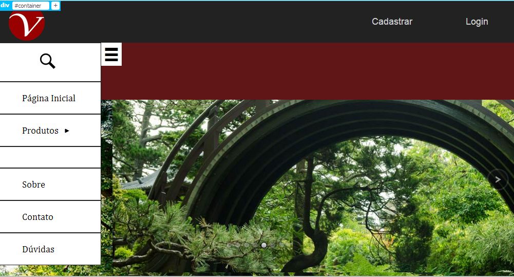
Image above with example of the space that is.
Html:
<nav class="nav">
<label class="menuMobile">☰</label>
<ul>
<li><a href="#"><img class="lupa" src="img/lupa.png" alt="Pesquisar" onClick="MostrarCampoPesquisa()"></a>
<div id="caixaPesquisa">
<form id="formPesquisa" action="" method="get">
<input id="pesquisa" type="text" value="" maxlength="150" placeholder="Pesquisar..." onBlur="EsconderCampoPesquisa()">
</form>
</div>
</li>
<li><a href="#">Página Inicial</a></li>
<li><a href="#">Produtos<img class="flechaVertical" src="img/flecha.png" alt="flecha"></a>
<ul>
<li><a href="#">Aparadores de Livros</a></li>
<li><a href="#">Caixinhas</a></li>
<li><a href="#">Chaveiros</a></li>
<li><a href="#">Decoração</a></li>
<li><a href="#">Pontos Turísticos</a></li>
<li><a href="#">Porta Celulares</a></li>
<li><a href="#">Porta Guardanapos</a></li>
<li><a href="#">Porta Retratos</a></li>
<li><a href="#">Relógios</a></li>
<li><a href="#">Topos De Bolos</a></li>
<li><a href="#">Veículos</a></li>
</ul>
</li>
<li><a href="#"><img id="navLogo" class="navLogo" src="img/logotipo.png" alt="Versatyll"></a></li>
<li><a href="#">Sobre</a></li>
<li><a href="#">Contato</a></li>
<li><a href="#">Dúvidas</a></li>
</ul>
</nav>
CSS:
.lupa{
    width:30px;
    height:30px;
    padding-left:35px;
}

.flechaVertical{
    width:8px;
    height:8px;
    padding-left:5px;
    padding-top:20px;
    position:absolute;
    -moz-transform:rotate(-90deg);
    -webkit-transform:rotate(-90deg);
    -o-transform:rotate(-90deg);
    -ms-transform:rotate(-90deg);
}

.navLogo{
    width:160px;
    height:90px;
    display:inline-block;
}

.menuMobile{
    width:40px;
    height:40px;
    position:fixed;
    margin-left:200px;
    display:block;
    text-align:center;
    background-color:#FFFFFF;
    font-size:30px;
    padding-top:5px;
    cursor:pointer;
    z-index:10;
}

.nav{
    width:200px;
    margin: 0;
    text-align: left;
    background-color: #FFFFFF;
    position: fixed;
}

.nav ul{
    list-style:none;
    padding:0;
    margin:0;
    position:relative;
}

.nav ul li{
    display:block;
    border: #222 1px solid;
}

.nav ul li a,visited{
    color:#000000;
    display:block;
    padding:20px;
    padding-left:45px;
    text-decoration:none;
}

.nav ul li a:hover{
    color: #990000;
    text-decoration: none;
}

/*------------------------------------*/
/* Nav Submenu */

.nav ul li:hover ul{
    display:block;
}

.nav ul ul{
    display:none;
    position:absolute;
    background-color:#FFFFFF;
    margin-left:200px;
    margin-top:-200px;
    overflow-y:scroll;
    height:550px;
}

.nav ul ul li{
    display:block;
    padding:8px;
}

.nav ul ul li a,visited{
    color:#000000;
    padding:0;
}

.nav ul ul li a:hover{
    color:#FFFFFF;
    background-color:#990000;
}
Jquery:
  $(document).ready(function(){

RemoveLi();

function RemoveLi(){
    if(window.matchMedia('(max-width: 1023px)').matches){
        $('.nav ul li:nth-child(4)').remove();
    }
}

});
I’m not wearing the bootstrap, thank you.
– Leonardo Silva