0
I can’t get Slide to take the entire home screen area, note that half of the Section "structure" is seen on the website home, I’ve tried everything, but I’m not good with CSS, unfortunately.
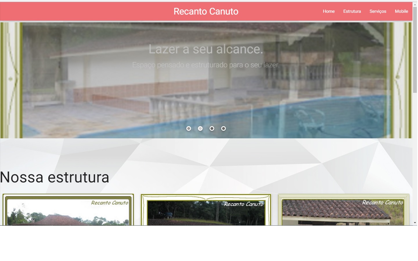
<div id="intro" class="section scrollspy">

      <div class="slider">
        <ul class="slides">
          <li>
            <img src="imagem"> <!-- random image -->
            <div class="caption center-align">
              <h3>Lazer a seu alcance.</h3>
              <h5 class="light grey-text text-lighten-3">Espaço pensado e estruturado para o seu lazer.</h5>
            </div>
    </div>
Functional example jsfiddle
Edit your question and provide more details if you will not end up receiving negative votes, because your question is unclear.
– Bruno Romualdo
You want the slide to occupy the entire screen, but when scrolling the page the other Ivs appear?
– Bruno Romualdo