"Hide" a cell from a table
Hide by keeping the space occupied by it:
td {
    visibility: hidden;
}
Hide content and space occupied by it:
td {
    display: none;
}
Using a table is the best solution?
Not. Use Divs.
I tried with DIVS, putting the logo with 1 absolute position, but when I move to the mobile version I can’t hide it.
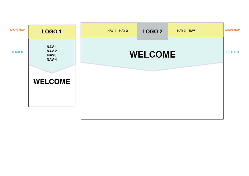
Use @media-queries and prioritize the layout for mobile devices, something like:
body { margin: 0; }
nav { position: relative; }
nav li { padding:0; margin:0; }
nav ul {
  background-color: #dbf7ee;
  border-bottom: 2px solid #ccc;
  list-style-type: none;
  margin: 0;
  padding: 20px 0 20px 0;
  text-align: center;
}
.logo-container {
  background-color: #ee4;
  height: 50px;
  position: relative;
}
.logo-container img {
  position: absolute; top: 0; left: 50%;
  margin-left: -25px;
  height: 50px; width: 50px;
}
.header-container { text-align:center; }


@media (min-width:767px){
  nav {
    background-color:#dbf7ee;
    width: 100%
  }
  nav ul {
    background-color: transparent;
    border: 0;
    margin: -50px 10% 0 10%;
    position: relative;
  }
  nav ul li {
    float: left; width: 20%;
  }
  nav ul li:nth-child(3) {
    margin-left: 20%;
  }
  .logo-container img {
    margin-left: -30px;
    height:60px; width:60px;
  }
  .header-container {
    background-color: #dbf7ee;
    border-bottom: 2px solid #ccc;
    padding: 20px 0;
  }
}
<nav>
  <div class="logo-container">
    <img src="http://cdn.sstatic.net/Sites/br/img/[email protected]?v=201ca43a8bd0&a">
  </div>
  <ul>
    <li>Nav 1</li>
    <li>Nav 2</li>
    <li>Nav 3</li>
    <li>Nav 4</li>
  </ul>
</nav>
<div class="header-container">
  <h1>Welcome</h1>
</div>
I don’t know what you mean by the example flanked by navigation. Do not use table to assemble the structure of your site, can be performed in the best way with use of DIV.
– Oracio
Put your current code to the question. D
– Giovanni Bernini